

Earlier this year, a friend of mine shared a massive poster he had been working on for theCopenhellfestival in Copenhagen, Denmark. The poster, an impressive2 x 12 meters, showcased a detailed chronology of significant cultural events from the past 50 years, with a particular focus on heavy metal rock — fitting, asCopenhellis a festival dedicated to that genre!
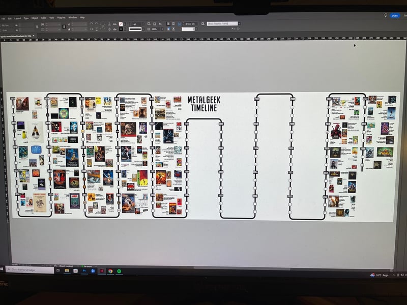
Ireallyloved the design — which featured a unique "snake timeline" layout. Inspired by this, I decided to create my own version using HTML and CSS, but with a twist — focusing on the "Best Picture" Oscar winners from 1972 onwards… and yes, I've seen them all!
Let's start by creating some semantic markup. This HTML will provide the structure for our timeline and will look good even without any CSS styling applied:

The Godfather
A powerful crime saga following the Corleone family's rise and near fall within organized crime
... and we get:
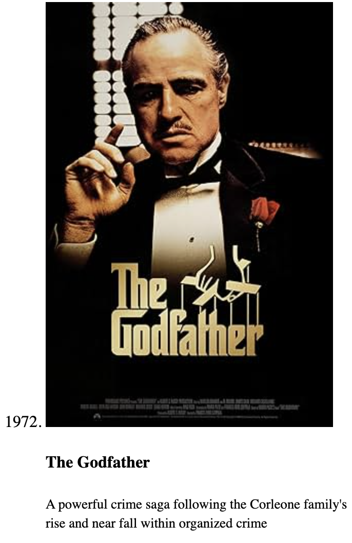
As you can see, the timeline looks quite presentable even with just the default browser styles!
Note:The value-attribute is only valid for
-tags when the parent is anordered list, .
We'll use ordered lists for each "column" in the timeline, and wrap those those in:
...
Each list item is a grid with two columns. The black line and the year are represented by ::before and ::after pseudo-elements, respectively. Both pseudo-elements are placed in the same grid cell (first column) using a 'grid stack' technique (grid-area: 1 / 1), which allows multiple elements to overlap within the same grid area:
li { display: grid; grid-template-columns: max-content 1fr; &::before { /* Vertical line */ content: ""; background: #000; grid-area: 1 / 1; margin-inline: auto; width: var(--bdw); } &::after { /* Year */ align-self: start; background-color: #000; border-radius: .175em; color: #FFF; content: attr(value); font-size: clamp(1rem, 0.2857rem + 2.2857vw, 2rem); font-weight: 900; grid-area: 1 / 1; padding-inline: .5ch; width: 5ch; } }
I'm gonna jump ahead a bit, and show how 3
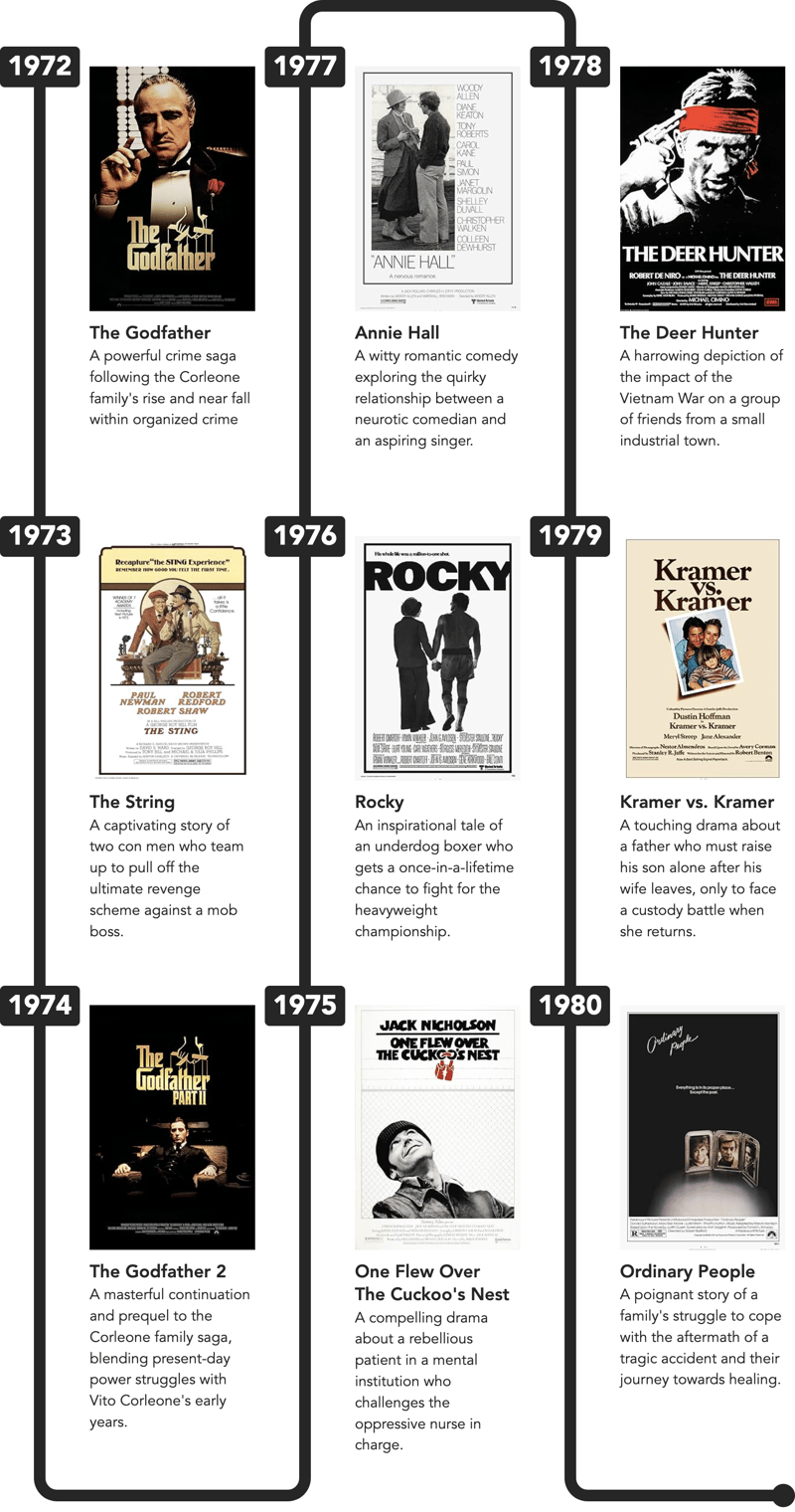
What we're missing, are the "wavy connectors". To create the 'wavy connectors' between timeline entries, I used a small 'hack' involving a 'dummy'
These will be placed at the very top and bottom of each
Now, the CSS for the connectors is quite complex, so I'll just show the structure with a few inline comments below — see the final CodePen-demo at the end and dive into the code:
ol { &:nth-of-type(odd) { li[value="0"] { &:last-of-type { /* Bottom Left Corner */ &::before { } } } /* FIRST COLUMN ONLY */ &:first-of-type { li[value="0"]:first-of-type { /* Hide Top Left Corner */ &::before { display: none; } } } &:not(:first-of-type) { li[value="0"] { &:first-of-type { /* Top Left Corner: Reverse */ &::before { } } } } &:last-of-type li[value="0"]:last-of-type i { ... } /* Round dot at the end of the last list */ &:last-of-type li[value="0"]:last-of-type i::after { ... } } /* EVEN COLUMNS */ &:nth-of-type(even) { li[value="0"] { &:first-of-type { /* Top Left Corner */ &::before { ... } } &:last-of-type { /* Bottom Left Corner: Reverse */ &::before { ... } } } } }
Phew! A lot of :first-of-type / :last-of-type-logic!
Additionally, all the CSS is also usinglogical properties, such as:
border-block-width: 0 var(--bdw); border-inline-width: var(--bdw) 0; border-end-start-radius: var(--bdrs);
Why is that?If you're working on a site with aright-to-lefttext-direction (dir="rtl"), everything will look weird, if you use properties that include left or right in the name (such as padding-left).
With logical properties, everything will look fine, when you switch text-direction:
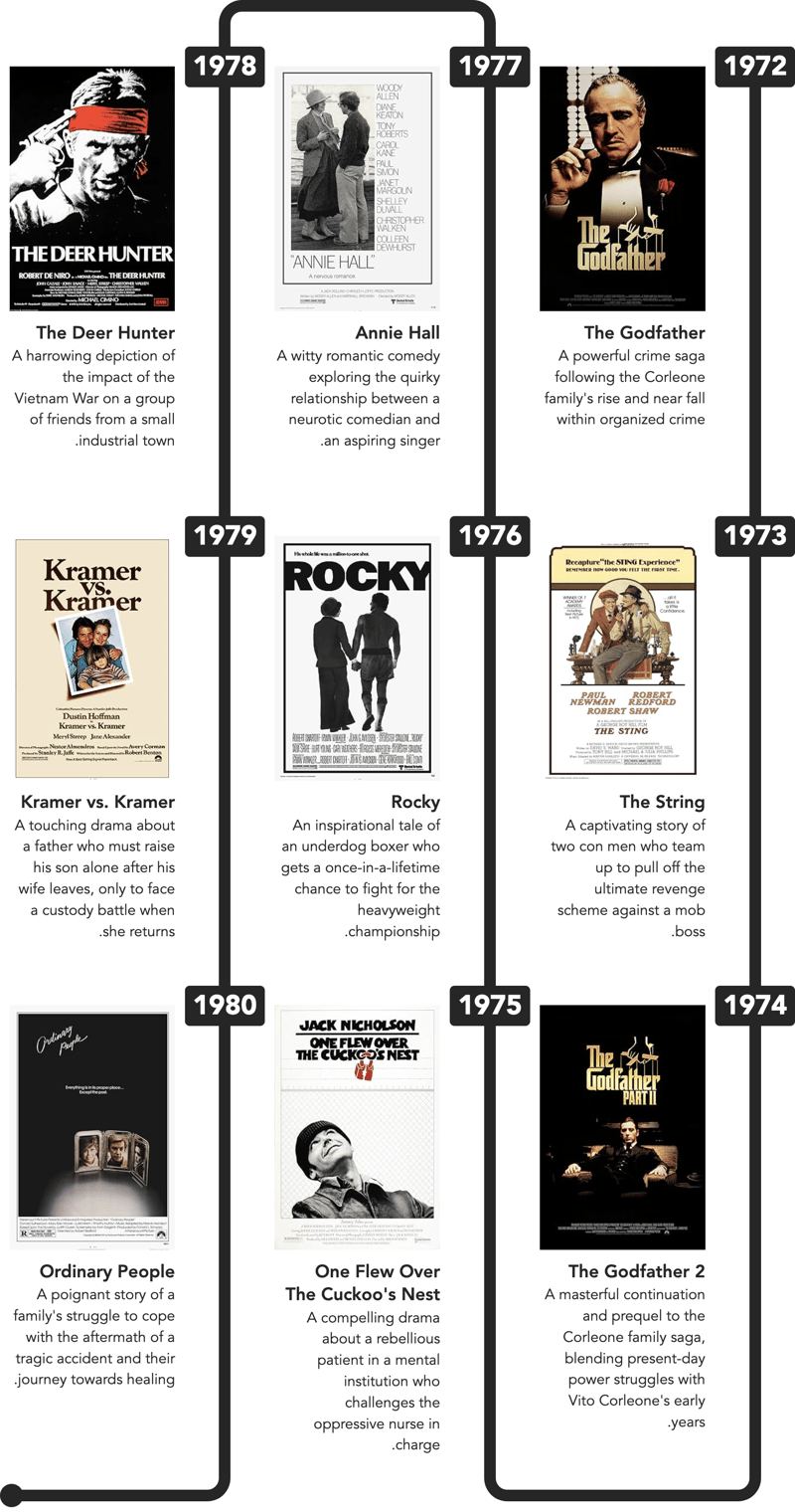
How cool is that! Now, let's add some more columns:
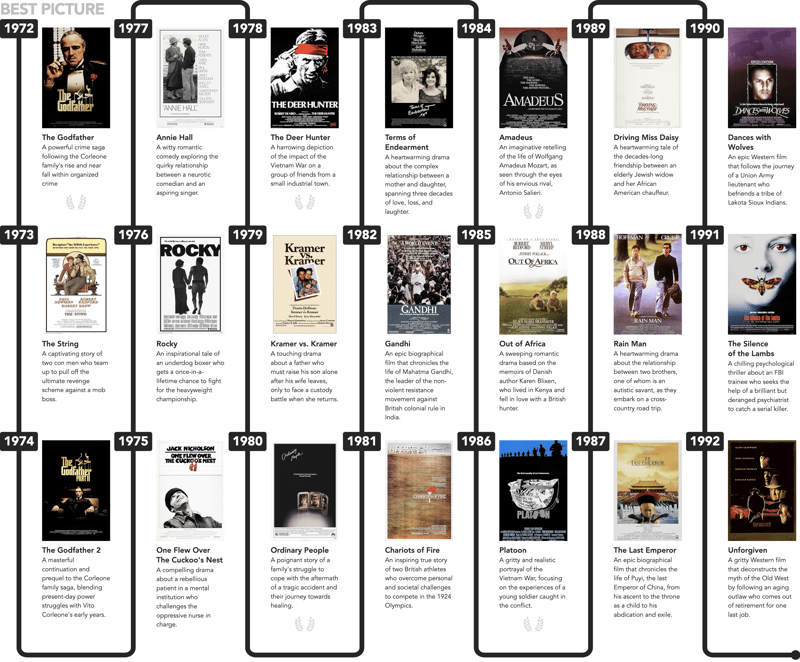
Notice how the "final round dot" automatically moves to the last column!
And that wraps up this tutorial.
Please open the demo in anew windowand resize to see the columns re-flow.
The above is the detailed content of And the Oscar Goes to … Coding a Chronology Component. For more information, please follow other related articles on the PHP Chinese website!


