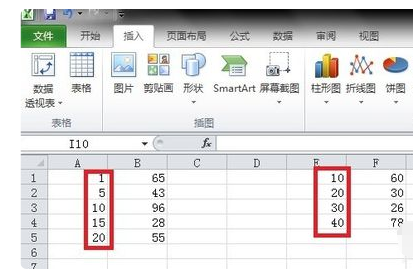
In Excel tables, we can display data through line charts or fan charts. Many users want to know how to make two lines in Excel line charts? Regarding this issue, let me share with you the specific operation method. I hope that today’s software tutorial can answer users’ questions. Let’s take a look at the detailed steps. How to make two lines in Excel line chart: 1. Compile two sets of data at random. The values and quantities of the abscissas of these two sets of data are different. It is required to make these two sets of data into a line chart.

2. First select the first set of data, click Insert>Scatter Plot> and select the scatter plot with straight lines and data markers (the second one in the second row).

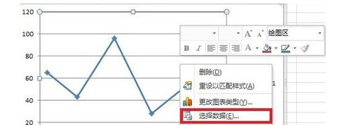
3. Select the generated scatter plot with straight lines, right-click and select Select Data.

4. Click Add in the pop-up Select Data Source dialog box, and enter the position of the second set of data x values in the x-axis series value in the pop-up Edit Data Series dialog box. Enter the Y-axis series value into the position of the y value of the second set of data, and click OK.

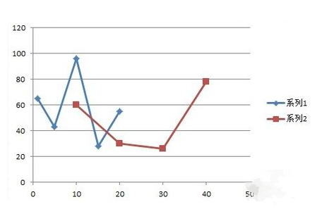
5. As you can see, the line graphs corresponding to the two sets of data have been added to one graph. The next step is to perform some simple beautification of the graph.

6. After selecting the graphic, right-click and in the format of the drawing area, you can modify the border style and color. Select the polyline and right-click to modify the line color and thickness in the format of the data series. After beautification, you can get a satisfactory double line chart.

The above is the detailed content of How to make two lines in Excel line chart How to display two lines in Excel line chart. For more information, please follow other related articles on the PHP Chinese website!

