This is a submission for Frontend Challenge v24.07.24, CSS Art: Recreation.
Creating a website for the New York Recreational Cricket League was a fantastic opportunity to combine my passion for web development with the vibrant spirit of recreational sports. I aimed to create a lively and engaging online presence that reflects the community and enthusiasm around cricket.
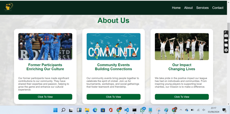
You can view the live site https://vickyfyn3.github.io/new-york/. Below are some screenshots showcasing various sections of the website:


The journey of building the New York Recreational Cricket League website involved several key steps and learning experiences:
I began by outlining the core sections of the website: Home, About, Services, and Contact Us. My goal was to ensure the site was user-friendly, visually appealing, and aligned with the league's dynamic nature. I used Font Awesome for icons and designed a responsive navigation bar that enhances the user experience.
For the About section, I implemented Flexbox to display the cards in a row, making the design more cohesive and engaging. This approach allowed for a responsive layout that adapts well to different screen sizes.
Ensuring consistency in the color scheme and design elements was crucial. I carefully selected colors and styles that reflect the energetic and welcoming environment of the cricket league. I also used the fa-dumbbell Font Awesome icon to creatively represent cricket training in the Services section.
To make the Contact section stand out, I designed a stylish contact form with fields for Name, Email, Subject, and Message. I used a bold Submit button with a gradient background for a modern touch. Additionally, I included contact details in a card layout with distinct backgrounds and embedded an interactive map for easy location access.
One of the challenges was ensuring the navbar remained fixed while scrolling. I achieved this by using CSS properties:
.navbar {
    position: fixed;
    top: 0;
    left: 0;
    width: 100%;
    z-index: 1000;
    background-color: #333;
    color: #fff;
    display: flex;
    align-items: center;
    justify-content: space-between;
    padding: 1rem;
}
Additionally, I adjusted the content below the navbar to prevent it from being hidden:
.content {
    margin-top: 60px; /* Adjust based on the height of your navbar */
}
Moving forward, I plan to add more interactive features and further optimize the website for performance. I also hope to gather feedback from the cricket league community to continuously improve the site.
The above is the detailed content of New York Recreational Cricket League Website Project. For more information, please follow other related articles on the PHP Chinese website!


