


Creating responsive layouts is a common challenge for web developers. In this blog, we'll explore how to achieve a specific responsive design using different CSS techniques, focusing on why CSS Grid is the best approach for this particular layout.
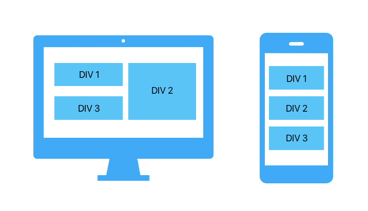
We need to create a layout where:
Flexbox is excellent for one-dimensional layouts but struggles with complex two-dimensional layouts like ours. Here's why:
 <div class="container">
   <div class="item">DIV 1</div>
   <div class="item">DIV 2</div>
   <div class="item">DIV 3</div>
 </div>
.container {
    display: flex;
    flex-wrap: wrap;
    gap: 10px;
    padding: 10px;
}

.item {
    background-color: #40c4ff;
    color: white;
    padding: 20px;
    text-align: center;
    box-sizing: border-box;
}

.item:nth-child(1),
.item:nth-child(3) {
    flex: 1 1 calc(50% - 10px);
}

.item:nth-child(2) {
    flex: 1 1 50%;
}

@media (max-width: 768px) {
    .item {
        flex: 1 1 100%;
    }
}
In this flexbox setup:
CSS Grid excels at creating two-dimensional layouts, making it perfect for this challenge.
 <div class="container">
   <div class="item">DIV 1</div>
   <div class="item">DIV 2</div>
   <div class="item">DIV 3</div>
 </div>
.container {
    display: grid;
    grid-template-columns: 1fr 1fr;
    grid-template-rows: auto auto;
    gap: 10px;
    padding: 10px;
}

.item {
    background-color: #40c4ff;
    color: white;
    padding: 20px;
    text-align: center;
    box-sizing: border-box;
}

.item:nth-child(1) {
    grid-column: 1 / 2;
    grid-row: 1 / 2;
}

.item:nth-child(2) {
    grid-column: 2 / 3;
    grid-row: 1 / 3;
}

.item:nth-child(3) {
    grid-column: 1 / 2;
    grid-row: 2 / 3;
}

@media (max-width: 768px) {
    .container {
        display: flex;
        flex-direction: column;
    }
    .item {
        width: 100%;
    }
}
While Flexbox is great for simpler, one-dimensional layouts, CSS Grid provides the power and flexibility needed for more complex, two-dimensional designs. By using CSS Grid, we can easily achieve the desired responsive layout with minimal code and maximum control.
Feel free to adapt this example to suit your own projects, and enjoy the benefits of using CSS Grid for your responsive layouts!
The above is the detailed content of Mastering Responsive Layouts: Achieving Complex Designs with CSS Grid. For more information, please follow other related articles on the PHP Chinese website!


![[Web front-end] Node.js quick start](https://img.php.cn/upload/course/000/000/067/662b5d34ba7c0227.png)


