Today you will learn the essentials of CSS positioning.
CSS positioning is a fundamental concept in web development that allows you to control the layout and placement of elements on your web pages.
In this guide, we'll explore the five main positioning types in CSS: static, relative, absolute, fixed, and sticky.
On my webite: antondevtips.com I already have blogs about CSS.
Subscribe as more are coming.
Static positioning is the default positioning for all HTML elements.
When an element is positioned statically, it is placed in the normal document flow, and its position is determined by the HTML structure and any margin or padding applied.
<!DOCTYPE html>
<html lang="en">
<head>
    <style>
        * {
            text-align: center;
        }

        .static-box {
            width: 100px;
            height: 100px;
            background-color: lightblue;
            margin-bottom: 10px;
        }
    </style>
</head>
<body>
    <div class="static-box">Box 1</div>
    <div class="static-box">Box 2</div>
    <div class="static-box">Box 3</div>
</body>
</html>

Relative positioning allows you to offset an element from its original position in the normal document flow.
The offset does not affect the position of other elements, and space originally occupied by the element is preserved.
The element can be moved using the top, right, bottom, and left properties.
<!DOCTYPE html>
<html lang="en">
<head>
    <style>
        .relative-box {
            display: inline-block;
            width: 100px;
            height: 100px;
            background-color: lightgreen;
            margin-bottom: 10px;
        }

        .box-2 {
            position: relative;
            top: 50px;
            left: 50px;
            background-color: coral;
        }
    </style>
</head>
<body>
    <div class="relative-box">Box 1</div>
    <div class="relative-box box-2">Box 2</div>
    <div class="relative-box">Box 3</div>
</body>
</html>

In this example, a "Box 2" element has a relative position and is moved by 50 px from the top and left corner of its original position.
As you can see, "Box 2" doesn't take space from the "Box 3" and space for the "Box 2" is preserved despite its position being updated.
Absolute positioning removes an element from the normal document flow, and no space is created for the element in the page layout.
The element is positioned relative to its closest positioned ancestor.
If no such ancestor exists, it is positioned relative to the initial containing block (usually the viewport).
<!DOCTYPE html>
<html lang="en">
<head>
    <style>
        * {
            text-align: center;
        }

        .relative-container {
            position: relative;
            width: 200px;
            height: 200px;
            background-color: lightgray;
        }

        .absolute-box {
            position: absolute;
            top: 30px;
            left: 30px;
            width: 100px;
            height: 100px;
            background-color: lightcoral;
        }

        .absolute-outside-box {
            position: absolute;
            top: 230px;
            left: 110px;
            width: 100px;
            height: 100px;
            background-color: bisque;
        }
    </style>
</head>
<body>
    <div class="relative-container">
        <div class="absolute-box">Absolute inside</div>
    </div>
    <div class="absolute-outside-box">Absolute outside</div>
</body>
</html>

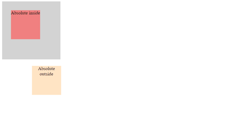
Here, you can see two elements with absolute position: one inside a container and the other on the root body level.
The inner box is positioned according to its relative element, and the outer is positioned within a viewport.
Fixed positioning removes an element from the normal document flow, and no space is created for the element in the page layout.
The element is positioned relative to the viewport, which means it stays in the same position even when the page is scrolled.
This is useful for creating fixed headers, footers, or sidebars.
<!DOCTYPE html>
<html lang="en">
<head>
    <style>
        .content-1 {
            height: 700px;
            background-color: burlywood;
        }

        .content-2 {
            height: 700px;
            background-color: darkseagreen;
        }

        .content-3 {
            height: 700px;
            background-color: lavender;
        }

        .fixed-box {
            position: fixed;
            bottom: 0;
            width: 100%;
            height: 50px;
            background-color: lightseagreen;
            color: white;
            text-align: center;
            line-height: 50px;
        }
    </style>
</head>
<body>
    <div class="content-1">Content 1</div>
    <div class="content-2">Content 2</div>
    <div class="content-3">Content 3</div>
    <div class="fixed-box">Fixed Footer</div>
</body>
</html>
In this example, you can see a fixed footer put on the bottom of the web page.

When you scroll down, the content is scrolled but the footer remains visible regardless of the scroll position.


Sticky positioning is a hybrid between relative and fixed positioning.
An element with sticky position behaves like a relatively positioned element until it crosses a specified threshold (top, right, bottom, or left), at which point it becomes fixed within its containing block.
<!DOCTYPE html>
<html lang="en">
<head>
    <style>
        * {
            text-align: center;
        }

        .sticky-header-1 {
            position: sticky;
            top: 0;
            width: 100%;
            height: 50px;
            background-color: darkgray;
            text-align: center;
            line-height: 50px;
        }

        .sticky-header-2 {
            position: sticky;
            top: 0;
            width: 100%;
            height: 50px;
            background-color: darkslateblue;
            text-align: center;
            line-height: 50px;
        }

        .sticky-header-3 {
            position: sticky;
            top: 0;
            width: 100%;
            height: 50px;
            background-color: mediumvioletred;
            text-align: center;
            line-height: 50px;
        }

        .content-1 {
            height: 700px;
            background-color: lightgray;
        }

        .content-2 {
            height: 700px;
            background-color: lightblue;
        }

        .content-3 {
            height: 700px;
            background-color: lightpink;
        }
    </style>
</head>
<body>
    <div class="sticky-header-1">Sticky Header 1</div>
    <div class="content-1">Content 1</div>

    <div class="sticky-header-2">Sticky Header 2</div>
    <div class="content-2">Content 2</div>

    <div class="sticky-header-3">Sticky Header 3</div>
    <div class="content-3">Content 3</div>
</body>
</html>
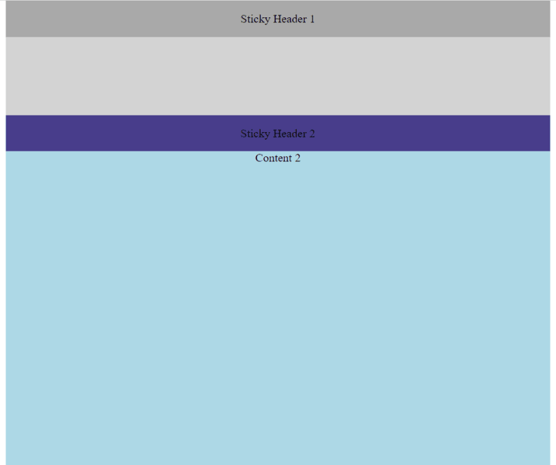
In this example, you can see a sticky header put on the top of the web page.

The difference between fixed and sticky HTML element you can see while scrolling down the page.

After you reach the second sticky header, the first one disappears from the screen:

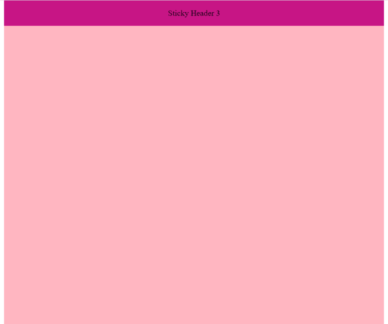
The same applies to the third sticky header:

Hope you find this blog post useful. Happy coding!
On my webite: antondevtips.com I already have blogs about CSS.
Subscribe as more are coming.
The above is the detailed content of The Basics of CSS Positioning: A Practical Guide. For more information, please follow other related articles on the PHP Chinese website!
 Usage of items in python
 How to get the address bar address
 Methods for reading and writing java dbf files
 How to check if mysql password is forgotten
 Is it legal to buy and sell Bitcoin on Huobi.com?
 What are the video formats
 What is the function of mobile phone NFC?
 The difference between php and js


