I probably came into contact with this concept last year. I briefly recorded it, but did not study it in depth. It coincides with the recent autumn recruitment, so I will write about it here to deepen my impression.
Elements in the page all have an implicit attribute Block Formatting Context (block-level formatting ization context) referred to as BFC.
What is the use of BFC? How to enable BFC? What happens after turning on BFC?
Here we first look at a few small situations. And throw out a few other questions
(1) 
p2
p3
.p1{ width: 50px; background-color: #bfc; margin-bottom:50px; } .p2{ width: 50px; height: 50px; background-color: #0000FF; margin-bottom:50px; color: #fff; } .p3{ width: 50px;height: 50px; background-color: #0000FF; margin:50px 0 50px 0; color: #fff; } .p4{width: 100px; height: 100px;background-color: #bfc; }
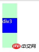
①Let’s take a look, there are four boxes here, the blue one is 50px; The margin-bottom is both 50px
It is obvious that the margins of the parent and child elements overlap, and the bottom margin from the bottom p is 50px instead of 100px.
②What about the sibling elements? The distance between p2 and p3 is also 50px, which means that the vertical margins between them are also collapsed.
Okay, then let’s discuss what situations will trigger the overlap of vertical margins.
①First of all, make it clear that the horizontal margins will not overlap under any circumstances, so the first point is vertical.
② Adjacent, what is adjacent is that the elements are not separated by clear, content, padding, and border. (We can clarify the principles of common methods of clearing floats later)
It can be seen from the code that p1 and p3, p2 and p3 are all adjacent relationships. So the vertical margins are collapsed.
\ welcome\| So suppose we have such a requirement that the vertical margins should not overlap (in practice, there is rarely such a requirement), then BFC comes in handy. Let’s see the effect first and then talk about how to do it.
After p1 and p3 turn on BFC (the overflow of p1 is auto or hidden, and p3 floats), we can see that the margins between p2 and p3 are added together. It’s not overlapping,
The bottom margins of p1 and p3 are also separated. To add, if the parent element turns on BFC, it can cancel the overlap of the margins with the adjacent child elements (the child does not need to be opened). It is fully enabled here to demonstrate the relationship between adjacent sibling elements
 time effect.
Adjacent]
If clear, content, padding, border are separated in the middle, the outer margins will still overlapWell, this is the first function of
turning on BFC: to prevent the margins of adjacent elements from overlapping.
In fact, as long as one of the adjacent elements has BFC turned on, of course, in this case, the floating problem must be considered, such as just now For example, if p3 turns on floating and p1 does not turn on BFC, a high degree of collapse will occur.
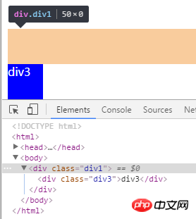
(2) 还是刚刚的例子,把p2和p4去掉,p3开启浮动,此时父元素p1发生高度塌陷
当我们开启p1的BFC后 成功解决由于浮动引起的高度塌陷。原理是开启了BFC的元素,其子元素也会参与到高度计算中。
即第二个作用就是避免浮动引起的高度塌陷
接下来来说说如何开启BFC:overflow(非visible)【注意在处理父子外边距折叠时应是父元素开启BFC】、float(非none)、position(非static和relative)、display(inlined-block、table-cell、table-caption)。其中之一即可。
兼容:在ie6中没有BFC,但有hasLayout,与BFC类似。开启:直接将元素的zoom设置为1。 zoom表示放大的意思,后面跟一个数字,即放大倍数。
那么有的时候的需求是父元素不能动overflow,那要解决高度塌陷怎么办,还有另外的清除浮动方案。
挺多的,百度都有,那这里就举一个最常用的例子吧。
.clear:after{ content: ''; clear: both; display: block; }
把这个类添加到高度塌陷的父元素上即可。
这里顺便讲讲这个做法的原理吧。
一个元素开启浮动后,其旁边的留白部分如果够后面的元素补上,后面的元素就会补上,后面的元素(一定要非浮动)加了clear后,就可以清除其周围浮动的效果,使其不会补到上面去,就可以把父元素的高度撑开。
利用这个原理,我们在父元素后面增加一个:after伪元素,让其清除浮动,又不至于补上浮动的留白,从css增加空的content对比直接增加空p的好处就是避免增加多余的dom节点。
The above is the detailed content of Regarding the issue of BFC and height collapse. For more information, please follow other related articles on the PHP Chinese website!


