Common design dimensions: 750 x 1334 / 640 x 1134, including the height of the signal bar at the top of the mobile phone.
Mobile H5 activity pages often need to be shared to various social apps, commonly used ones includeWeChat, QQ, etc.
When you use a mobile device to view the page, you will find that there is a top page in the WeChat browserNavigationbar, in the qq built-in browser there is not onlytop navigation, but alsooperation barat the bottom (the same is true for safari browser), these will occupy the design draft display area, so In thedesign process, you need to consider the amount of content, andreserve a certain amount of space at the bottom of the page, so that it will not be blocked in WeChat or QQ
. As shown below (QQ built-in browser): The page design size is 750 x 1334, the top occupies 150px, the bottom occupies 110px, and a total of 260px is occupied. Therefore, the design draft content should be controlled within the height of 1334-260=1074px when writing code. Use theChrome browser to simulate the device size and save the size (750*1074) for real-time viewing of the mobile page effect
. If the page has been written, you can only adjust the content according to the above size, reduce the spacing of elements, scale thepicturesize, etc.
Share it with me. Failed attempt:
#If the entire page is scaled (using the meta tag), according to the proportion of the design draft, the width will be smaller when the height is sufficient, and the sides will There is a white background;
Even if rem is used as the unit of the relevant spacing, there is no way to find a suitable ratio to switch between the two heights (WeChat/QQ), so it is uniformly adjusted to the appropriate With QQ, even if there is extra space under WeChat, the fixed bottom guidance downward arrow can make it not too abrupt.

.
 Code sample.png
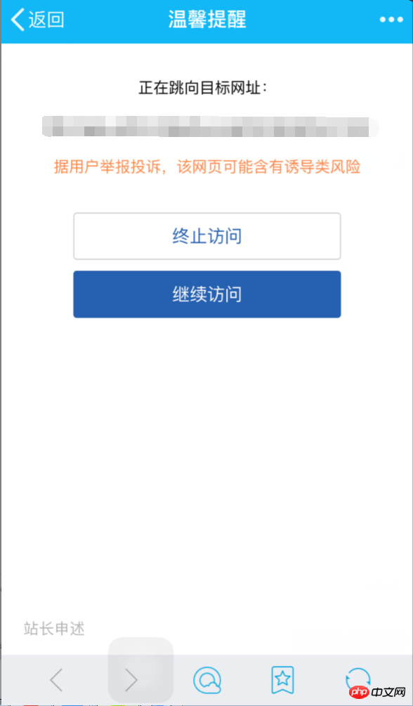
 Warm reminder in QQ
For example, if the QR code scan result is the download address of the application, you can use the micro download address of App Store to generate the QR code. This will not be a "warm reminder" .
If you plan to lay out first, and then use automated tools to put the images together to reduce the number of requests, please note: When writing CSS, the image width The height should be fixed, and only after the pictures are combined can the picture be displayed by positioning and displaying the width and height of the area.5. Use Gulp to combine images
For example, if the layout is
widthIf you directly copy the page link and share it with others, users who receive the link message on their mobile phones may see related information about the link. , such as page titles, descriptions, and images. The relevant information setting method is as follows:: 100%;
background-position: center;, use tools to merge the images Finally, other images will be displayed within the element area (100% width), which is not what we want to see.6. About link sharing-QQ
QQ中链接的标题由此处获取
interface
document:setShareInfo.Question
: Even if you use the above image setting method, the expected image still fails to be displayed?Solution: Make sure the link format you send will be omitted, such as:
somedomain/or somedomain/index , the correct one should besomedomain/index.html, so that the image can be correctly parsed.
如果是打开链接后,在QQ内置浏览器里选择将页面分享出去,那一般不会出错。
使用自动化工具 gulp-imagemin(教程) 来压缩图片,效果举例:101 KB => 80.7 KB。后来我使用了在线工具Tinypng 又进行了一次压缩,效果举例:(上面使用 gulp-imagemin 压缩过的图片)80.7 KB => 38.1 KB,可见光使用自动化工具来压缩是不够的,大部分图片仍存在较大的压缩空间,可以再扔到 Tinypng 里压缩一下看看。
在线的 Tinypng 可以无限次使用,如果想要使用其API来进行压缩自动化的话,可以使用 gulp-tinypng 等插件,但是有每月压缩图片数量限制,每月前500张图片免费,其他收费情况参考官网说明。使用其 API 还需要获取 APIKey,这里可以获取。
个人觉得想要免费的话使用 API 会有数量限制,时刻惦记着数量有点心累,不如直接使用在线工具,也不麻烦~
首屏 Loading,代码段分享,拿走即用~
function loading(){ function Load(){} Load.prototype.loadImgs = function(urls,callback) { this.urls = urls; this.imgNumbers = urls.length; this.loadImgNumbers = 0; var that =this; for(var i=0;i

         Copy after login
使用 CSS3 来制作动画效果的话,webkit前缀一定记得加,要不然在某些手机下动画效果是没有的。
如下:
-webkit-animation: f .8s 2s forwards ease-in-out; animation: f .8s 2s forwards ease-in-out; @-webkit-keyframes f { 0% { opacity: 0; -webkit-transform: translate3d(750px,0,0); transform: translate3d(750px,0,0) } to { opacity: 1; -webkit-transform: translateZ(0); transform: translateZ(0) } } @keyframes f { 0% { opacity: 0; -webkit-transform: translate3d(750px,0,0); transform: translate3d(750px,0,0) } to { opacity: 1; -webkit-transform: translateZ(0); transform: translateZ(0) } }
推荐使用自动化工具来处理未加前缀的 CSS 文件,如 gulp-autoprefixer。
你只需要 Swiper.js 和 Animate.css 即可打造(简单的)移动端 H5 活动页面~
Swiper 是纯javascript打造的滑动特效插件,面向手机、平板电脑等移动终端。
Animate.css 是纯 CSS 编写而成的动画库,包含多种常见的 CSS 动画。
引用Swiper.js,同时在 Animate.css 中寻找需要的动画效果复制粘贴进 css 文件即可,完全不必引用 Animate.css。
利用meta标签对页面进行缩放,使得我们可以直接根据设计稿来进行页面的编写,不用再进行单位的换算等等,省却了很多麻烦。
01:同一个页面里要是有两个二维码,长按扫描总是只能扫出 左侧/第一个 二维码。
解决:可视区域内只能出现一个二维码。
02:使用meta标签缩放页面后长按二维码图片无反应。
解决:使用了以下代码之后,就能长按识别二维码了~
< img style="right:0; top:0; height: auto;width: 100%;opacity: 0;position: absolute;" src="二维码图片地址"> < img src="二维码图片地址" title="qrcode" alt="qrcode">
The above is the detailed content of Things to note on H5 pages. For more information, please follow other related articles on the PHP Chinese website!


