


The so-called three-column adaptive layout refers to the fixed width on both sides and the adaptive block width in the middle. This question was also asked during the interview for NetEase internal push front-end engineers this year. I mainly divide it into two categories here, one is based on the traditional implementation of position, and the other is based on the new feature of CSS3, the flexible box model layout implementation.
1. Layout based on traditional attributes such as position and margin
There are also three methods here, namely absolute positioning method, Holy Grail layout, self-floating method.
1).Absolute positioning method
The principle of absolute positioning method is to use absolute positioning on the left and right sides, because absolute positioning separates it from the document flow, and the center behind it will naturally Flow to them, and then use the margin attribute to leave the width of the left and right elements, which can make the middle element adapt to the screen width.
The code is as follows:
    layout_box
  实现三列宽度自适应布局 我是左边 我是右边 我是中间
css code:
html,body{ margin: 0px;width: 100%; } h3{height: 100px;margin:20px 0 0;} #left,#right{width: 200px;height: 200px; background-color: #ffe6b8;position: absolute;top:120px;} #left{left:0px;} #right{right: 0px;} #center{margin:2px 210px ;background-color: #eee;height: 200px; }
The advantage of this method of layout is that the order of the three ps can be changed arbitrarily. The disadvantage is that because of absolute positioning, if there is other content on the page, the value of top needs to be handled carefully. It is best to initialize the css style, just like adding a title in the above example. If the style is not initialized, then The values on both sides and in the middle will not be aligned. In addition, as the browser window shrinks, compression will occur when it is smaller than 200px.
The result is as shown in the figure. You can see that the width of the middle column expands and contracts with the screen size.
2). Use the self-floating method
The principle of the self-floating method is to use float:left and float:right for left and right respectively. Float makes the left and right The element is out of the document flow, and the middle element is normally in the normal document flow. Use margin to specify the left and right margins to position it.
HTML code:
使用自身浮动法定位
我是左边
我是右边
我是中间
css code:
#left_self,#right_self{ width: 200px;height: 200px; background-color: #ffe6b8 } #left_self {float: left;} #right_self{float: right;} #center_self{margin: 0 210px;height: 200px; background-color: #a0b3d6}
The advantage of this layout method is that it is less affected by the outside world, but the disadvantage is that the order of the three elements must be placed in the center At the end, this is different from absolute positioning. Center occupies the document flow position, so it must be placed at the end. The position of the left and right elements does not matter. When the browser window is small, the right element will be knocked down to the next line.
3). Holy Grail Layout
The principle of Holy Grail layout is the negative margin method. To use the Holy Grail layout, you first need to include a p outside the center element. To include p, you need to set the float attribute to form a BFC and set the width, and this width must match the negative value of the margin of the left block. For the specific principle, please refer here. The Holy Grail layout is explained in great detail here.
Implementation code:
使用margin负值法进行布局
CSS code:
#wrap{ width: 100%;height: 100px; background-color: #fff;float: left;} #wrap #center{ margin:0 210px; height: 100px;background-color: #ffe6b8; } #left_margin,#right_margin{ float: left;width: 200px;height: 100px;background-color: darkorange } #left_margin {margin-left: -100%; background-color: lightpink} #right_margin{margin-left: -200px;}
This method is very common in website layout and is also a common test point for interviews. The advantage is that the three columns are interrelated and have certain Resistance. It should be noted that the middle part of the layout must be placed in the front, and the left and right order is not limited. For left fast margin, the negative value must be equal to the width of wrap.
Three methods to implement adaptive layout of three-column web page width are shown in the figure below.

2, css3 new feature
Wrap a layer of p around the periphery, set to display: flex ;Set flex: 1 in the middle; but the box models are close to each other by default, and you can use margin to control the margins.
Code:
css style:
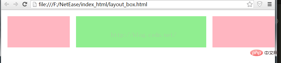
#box{width:100%;display: flex; height: 100px;margin: 10px;} #left_box,#right_box{width: 200px;height: 100px; margin: 10px; background-color: lightpink} #center_box{ flex:1; height: 100px;margin: 10px; background-color: lightgreen}
Note: center must be placed in the middle.
The rendering is as follows:
#The css layout has many other features. The next step is to study clearly the floating, and then study the position and display attributes.
Recommended tutorial: "CSS Tutorial"
The above is the detailed content of CSS implements three-column adaptive layout. For more information, please follow other related articles on the PHP Chinese website!


![[Web front-end] Node.js quick start](https://img.php.cn/upload/course/000/000/067/662b5d34ba7c0227.png)


