


This article introduces you to the CSS3 effect of moving menu buttons. It has certain reference value. Friends in need can refer to it. I hope it will be helpful to you.
I need to make a custom animated button effect, but the small front-end doesn’t know how to implement it. I took a look at the desired effect and wrote a simpledemofor him.
The designer gave two pictures, one is a menu icon like三, and the other is an icon that turns intoXwhen clicked. I hope there will be an animation switching effect between these two icons.
Because the icons are very simple, we can usecssto draw these two icons, and then create an animation transition effect. The code is as follows:
The.boxoutside is just to hold up the page and has no actual effect. What is useful is a.menu.
.box { margin: 200px; } .menu { width: 100px; height: 100px; position: relative; } .menu:before, .menu:after { content: ""; display: block; width: 100px; height: 16px; background: #000; border-radius: 8px; position: absolute; left: 0; -webkit-transition: all 0.15s ease-in-out; transition: all 0.15s ease-in-out; } .menu:before { top: 5px; box-shadow: 0 37px #000; } .menu:after { bottom: 5px; } .menu:hover:before { top: 42px; box-shadow: none; -webkit-transform: rotate(225deg); transform: rotate(225deg); } .menu:hover:after { bottom: 42px; -webkit-transform: rotate(135deg); transform: rotate(135deg); }
Key explanation:
An element is addedtransition: all 0.15s ease-in-out;Code like this , then when any of his attributes change, there will be a switching effect. For more information, please refer to the CSS3 transition attribute
Because there are three horizontal lines, the two pseudo-elements:beforeand:afterare not enough. I don't want to add another element to have more things to control. So, I used abox-shadow: 0 37px #000;shadow method to achieve the effect of the horizontal line in the middle.:beforeand:afterare placed above and below respectively.
When switchingX, there are only two elements, I just need to remove the shadow added abovebox-shadow: none;.
Then it’s time to change the position and add rotation. Location changes are not indicated. Rotation is implemented using thetransform: rotate(225deg);attribute. For more information, please refer to the CSS3 transform attribute
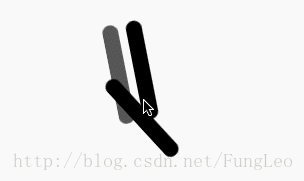
The final effect is as follows:
Okay, the effect is achieved. I put the above animation on the switch for 3 seconds in order to see the details of the animation clearly.
In fact, after understanding this idea, we can make many simple animation effects.
Recommended related articles:
Display in css: flex attribute to implement the code for vertical centering of elements
How to realize a single line of text scrolling upward Effect (with code)
The above is the detailed content of css3 realizes the effect of moving menu button (menu). For more information, please follow other related articles on the PHP Chinese website!
 A complete list of commonly used public dns
 mom.exe initialization error
 Zero-based Java self-study tutorial
 How many years do you have to pay for medical insurance to enjoy lifelong medical insurance?
 How to configure the pycharm environment
 How to open db file
 Three forms of conditional statements
 vscode Chinese setting method


![[Web front-end] Node.js quick start](https://img.php.cn/upload/course/000/000/067/662b5d34ba7c0227.png)


