


This article mainly introduces the parallax effect of APPLE TV poster based on jQuery and CSS3. Friends who need it can refer to
Use CSS and jQuery to achieve it, try to look the same as the original effect.
In this tutorial, I will use CSS, HTML and jQuery to create an approximate Apple TV parallax effect. If you are reading this, I assume you are familiar with the above three techniques. Have a basic understanding.
Without further ado, let’s start the first part.
HTML page
Our page structure is as follows:
First of all, we need A p with style class .poster contains 5 layers p of other styles. On top of these five layers p there's a shine p to add some sparkle.
CSS Part
First, add the following code to ensure that the height of the body part of the web page is the entire page height:
body, html { height: 100%; min-height: 100%; }
Give some background gradient colors to the body part:
body { background: linear-gradient(to bottom, #f6f7fc 0%,#d5e1e8 40%); }
In order to give the .poster a 3D rotation effect, the parent container needs to set the perspective and transformation Effect. As we can see, the parent container of p is the body itself, so add the following CSS code:
body { background: linear-gradient(to bottom, #f6f7fc 0%,#d5e1e8 40%); transform-style: preserve-3d; transform: perspective(800px); }
Now set the style and size of the card so that it fits on the page Center, add some rounded corners and shadow effects:
.poster { width: 320px; height: 500px; position: absolute; top: 50%; left: 50%; margin: -250px 0 0 -160px; border-radius: 5px; box-shadow: 0 45px 100px rgba(0, 0, 0, 0.4); overflow:hidden; }
In order to center the poster, you need to set the position value to absolute, top:50%, 'left: 50%', the upper margin value is a negative number that is half the height of p, and the margin value on the left is a negative number that is half the width of p. Something to remember is that the center of the .poster is also the center of the entire page.
Shadow effect
We can use the following CSS selector to select all layers:
p[class *= 'layer-']
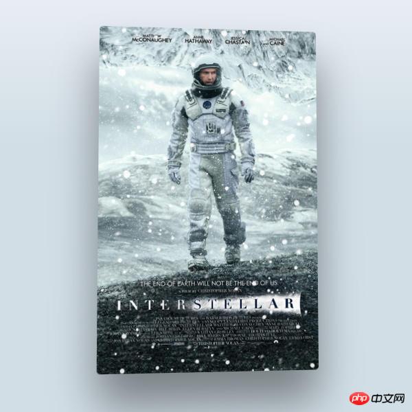
.poster has been designed, let’s see the effect.
So, CSS selects all p containing "layer-" in the class name.
Now, set the position value of all layers to absolute, the background-repeat value to no-repeat, the background-position to top left, and the size of the layer background to 100% width and automatic height.
p[class*="layer-"] { position: absolute; top: -10px; left: -10px; right: -10px; bottom: -10px; background-size: 100% auto; background-repeat: no-repeat; background-position: 0 0; transition:0.1s; }
Notice that the values of top, left, right, bottom are all -10px, the purpose is to make the size of the layer 20px larger than the poster, so that each When inspecting the layer, you will not see the edge of the layer.
The following is to add a background to each layer:
.layer-1 { background-image: url('http://designmodo.com/demo/apple-tv-parallax/images/1.png'); } .layer-2 { background-image: url('http://designmodo.com/demo/apple-tv-parallax/images/2.png'); } .layer-3 { top: 0; bottom: 0; left: 0; right: 0; background-image: url('http://designmodo.com/demo/apple-tv-parallax/images/3.png'); } .layer-4 { background-image: url('http://designmodo.com/demo/apple-tv-parallax/images/4.png'); } .layer-5 { background-image: url('http://designmodo.com/demo/apple-tv-parallax/images/5.png'); }
In the layer-3 part, the layer will not move, so the size does not need to be too large Big.
Complete the static effect
JavaScript part
Before you start, please make sure you have introduced jQuery library, otherwise an error will be reported.
The logic of the parallax effect is like this. Whenever the mouse moves, the transforms: translateY, rotate, rotateY properties of .poster will change according to the position of the cursor. The farther the cursor is from the upper left corner of the page, the more obvious the animation effect will be.
The formula is similar to this: offsetX=0.5-the position/width of the cursor from the top of the page.
In order to have a different value for each element, multiply the value returned by each cursor formula by a custom value, return the HTML code and add data-offset to each layer element that will have animation. =Properties of numbers.
The rules for each .layers are the same, but we apply them to the translateY and translateX properties.
The larger the value of the data-offset attribute, the more obvious the animation effect will be. You can change these values to experience it.
For the sake of code readability, we assign .poster to the $poster variable in JavaScript, .shine to the $shine variable, the $layer variable represents all layers, and w and h represent the width and height of the page.
var $poster = $('.poster'), $shine = $('.shine'), $layer = $('p[class*="layer-"]');
Now, we need to consider the problem of obtaining the cursor position when the cursor moves. We can use the mousemove event of $(window) to achieve this. This event will return a JavaScript object containing the position information we need and some other variables that we do not need yet.
$(window).on('mousemove', function(e) { var w=e.currentTarget.innerWidth,h=e.currentTarget.innerHeight; var offsetX = 0.5 - e.pageX / w, /* where e.pageX is our cursor X coordinate */ offsetY = 0.5 - e.pageY / h, offsetPoster = $poster.data('offset'), /* custom value for animation depth */ transformPoster = 'translateY(' + -offsetX * offsetPoster + 'px) rotateX(' + (-offsetY * offsetPoster) + 'deg) rotateY(' + (offsetX * (offsetPoster * 2)) + 'deg)'; /* apply transform to $poster */ $poster.css('transform', transformPoster); /* parallax foreach layer */ /* loop thought each layer */ /* get custom parallax value */ /* apply transform */ $layer.each(function() { var $this = $(this); var offsetLayer = $this.data('offset') || 0; /* get custom parallax value, if element docent have data-offset, then its 0 */ var transformLayer = 'translateX(' + offsetX * offsetLayer + 'px) translateY(' + offsetY * offsetLayer + 'px)'; $this.css('transform', transformLayer); }); });
The next step is to use the formulas explained above to calculate the values of offsetY and offsetX, and then apply the parallax effect to .posert and each poster layer .
Very cool, now we have a widget with parallax effect.
Basically completed
But it’s not finished yet, the glossy part on the poster has not been set yet
Now go back to the CSS part and give .shine p Absolute positioning, add a gradient color effect, set the z-index attribute value to 100, so that it is on top of all layers.
.shine { position: absolute; top: 0; left: 0; right: 0; bottom: 0; background: linear-gradient(90deg, rgba(255,255,255,.5) 0%,rgba(255,255,255,0) 60%); z-index: 100; }
There is already a nice glitter layer on the poster, but to achieve a more realistic effect, the lighting should change as the cursor moves.

更逼真些
我们怎么做呢?可能你还记得无聊的初三数学课,当你想着你在学一些你从来都不会用到的公式的时候,我们现在就用到了。
所以,倾斜的角度应该等于光标与海报中心形成三角形的角度的相反值。(还记得吧,海报的中心就是整个页面的中心啊,也就是页面宽度和高度的二分之一)
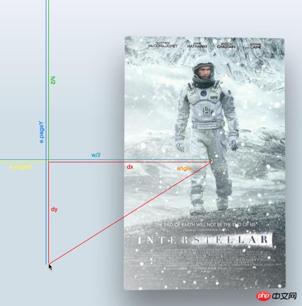
角度示意图
首先,找到光标与页面中心形成的三角形的直角边,光标与中心连线后作出一个直角三角形。
然后用 Math.atan2() 函数得到中心点的角度值。注意这个函数的返回值使用弧度值来表示的,所以我们得在CSS中转换成角的度数,用以下公式:
弧度值*180/pi = 角度值
var $poster = $('.poster'); var $shine = $('.shine'); var $layer = $('p[class *= "layer-"]'); $poster.data("offset",15); $(window).on('mousemove', function(e) { var w=e.currentTarget.innerWidth,h=e.currentTarget.innerHeight; var offsetX = 0.5 - e.pageX / w, /* where e.pageX is our cursor X coordinate */ offsetY = 0.5 - e.pageY / h, offsetPoster = $poster.data('offset'), /* custom value for animation depth */ transformPoster = 'translateY(' + -offsetX * offsetPoster + 'px) rotateX(' + (-offsetY * offsetPoster) + 'deg) rotateY(' + (offsetX * (offsetPoster * 2)) + 'deg)'; dy = e.pageY - h / 2, dx = e.pageX - w / 2, theta = Math.atan2(dy,dx), /* get angle in radians */ angle = theta * 180 / Math.PI; /* convert rad in degrees */ /* apply transform to $poster */ $poster.css('transform', transformPoster); /* parallax foreach layer */ /* loop thought each layer */ /* get custom parallax value */ /* apply transform */ $layer.each(function() { var $this = $(this); var offsetLayer = $this.data('offset') || 0; /* get custom parallax value, if element docent have data-offset, then its 0 */ var transformLayer = 'translateX(' + offsetX * offsetLayer + 'px) translateY(' + offsetY * offsetLayer + 'px)'; $this.css('transform', transformLayer); }); });
你会发现角度值的范围是从-180到180度,以下代码修复这个问题让角度值从0-360度:
if (angle < 0) { angle = angle + 360; }
现在角度有了,就可以随着光标的移动来动态改变渐变颜色的角度值:
$shine.css('background', 'linear-gradient(' + (angle - 90) + 'deg, rgba(255,255,255,' + e.pageY / h + ') 0%,rgba(255,255,255,0) 80%)');
以上就是本文的全部内容,希望对大家的学习有所帮助,更多相关内容请关注PHP中文网!
相关推荐:
The above is the detailed content of How to achieve the parallax effect of APPLE TV poster based on CSS3 and jQuery. For more information, please follow other related articles on the PHP Chinese website!


![[Web front-end] Node.js quick start](https://img.php.cn/upload/course/000/000/067/662b5d34ba7c0227.png)


