This time I will bring you Css to draw a fan-shaped pattern. What are theprecautions for drawing a fan-shaped pattern with Css? The following is a practical case, let's take a look.
Reading this article requires basic mathematical knowledge: central angle, radian system, trigonometric
function.
We have worked hard to achieve the following effects:

Of course you can embrace Svg... Here I will share how to create a circle with pure Css
Progress Bar, just three steps!

This item is 2 + 1 sandwich biscuits, the blue-green part is jam. It is obvious that the biscuit is made of two round p's. Let's focus on demonstrating how to make jam:

As shown in the picture, the large fan shape is composed of 6 small fans. , each small fan shape accounts for 1/15 of the entire round cake, and the large fan shape accounts for 6/15 of the entire round cake. We only need to construct a sector unit, copy it into 6 copies, rotate them at corresponding angles and connect them together.
How to construct a sector? Use triangles to disguise...

#How to calculate the width and height of a triangle? Assume the circle radius $radius is 100px and the fraction $count is 15. Then the central angle of the small sector is 360deg / 15, the height of the triangle is 100px, and the width is 2 * 100px * tan(360deg / 15 / 2). Among them, 360deg / 15 / 2 is converted into radians as PI / 15 (PI == 360deg / 2).
span { width: 0; height: 0; border: $radius solid transparent; $borderWidth: tan(pi() / $count) * $radius; border-left-width: $borderWidth; border-right-width: $borderWidth; }
Copy after login
Students who are not good at mathematics, please educate yourself...
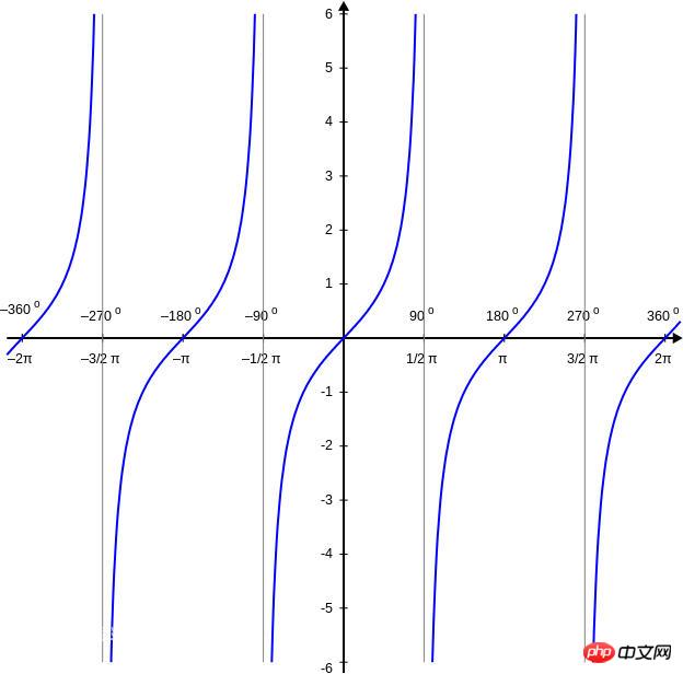
Special handling is required when $count is 1 or 2, because tan(PI) and tan(PI / 2) are Infinite value. If you don’t understand, please study the tangent function image:
Related code (where $diameter = 2 * $radius is the diameter of the circle):
span { @if $count == 1 { width: $diameter; height: $diameter; } @else if $count == 2 { width: $diameter; height: $radius; } @else { width: 0; height: 0; border: $radius solid transparent; $borderWidth: tan(pi() / $count) * $radius; border-left-width: $borderWidth; border-right-width: $borderWidth; } }
Copy after login
Finally, copy and rotate the sector units one by one:
@for $index from 0 to $count { span:nth-child(#{$index + 1}) { $transform: translate(-50%, 0) rotate(360deg / $count / 2 + 360deg * $index / $count); $origin: if($count == 2, bottom, center); -webkit-transform: $transform; transform: $transform; -webkit-transform-origin: $origin; transform-origin: $origin; } }
Copy after login
I believe you have mastered the method after reading the case in this article. For more exciting information, please pay attention to other related articles on the php Chinese website!
Recommended reading:
How to use linear-gradient linear gradient in CSS3
Hover makes the mask flash in css question
The above is the detailed content of CSS drawing fan pattern. For more information, please follow other related articles on the PHP Chinese website!


![[Web front-end] Node.js quick start](https://img.php.cn/upload/course/000/000/067/662b5d34ba7c0227.png)


