This article mainly introduces to you the relevant information on the method of using CSS position:sticky to achieve sticky layout. The editor thinks it is quite good, so I will share it with you now and give it as a reference. Let’s follow the editor to take a look, I hope it can help everyone.
Introduction
I wrote an article earlier to explain several commonly used attributes of position: "CSS Basics - Position Attribute Explanation"
Generally, we all know the following commonly used ones:
{
position: static;
position: relative;
position: absolute;
position: fixed;
}also said at https://developer.mozilla.org/zh-CN/docs/Web/CSS/position The following three values:
/* 全局值 */
position: inherit;
position: initial;
position: unset;
It is estimated that most of them have never used position:sticky. This attribute value is still in the experimental stage. How to describe it?
First look at position:sticky
sticky literally means sticky in English, so let’s call it sticky positioning. Let’s learn about the specific functions and practical scenarios of this experimental value.
This is a special positioning that combines the two positioning functions of position:relative and position:fixed, and is suitable for some special scenarios.
What is the combination of two positioning functions in one?
The element is first positioned according to the normal document flow, and then positioned relative to the flow root (BFC) and containing block (nearest block-level ancestor element) of the element in the flow.
Then, element positioning is relative positioning before crossing a specific threshold, and fixed positioning thereafter.
This specific threshold refers to one of top, right, bottom or left. In other words, sticky positioning can only take effect by specifying one of the four thresholds top, right, bottom or left. Otherwise the behavior is the same as relative positioning.
sticky: Object follows normal flow when normal. It is like a combination of relative and fixed. When it is on the screen, it is typed according to the normal flow. When it is scrolled out of the screen, it behaves like fixed. The performance of this attribute is the adsorption effect you see in reality.
Common scenarios: When the distance between the element and the top of the page viewport (Viewport, which is the reference for fixed positioning) is greater than 0px, the element is positioned in a relative position, and when the distance between the element and the page viewport is greater than 0px When it is less than 0px, the element behaves as fixed positioning and will be fixed at the top.
Code:
{
    position: -webkit-sticky;
    position: sticky;
    top: 0;
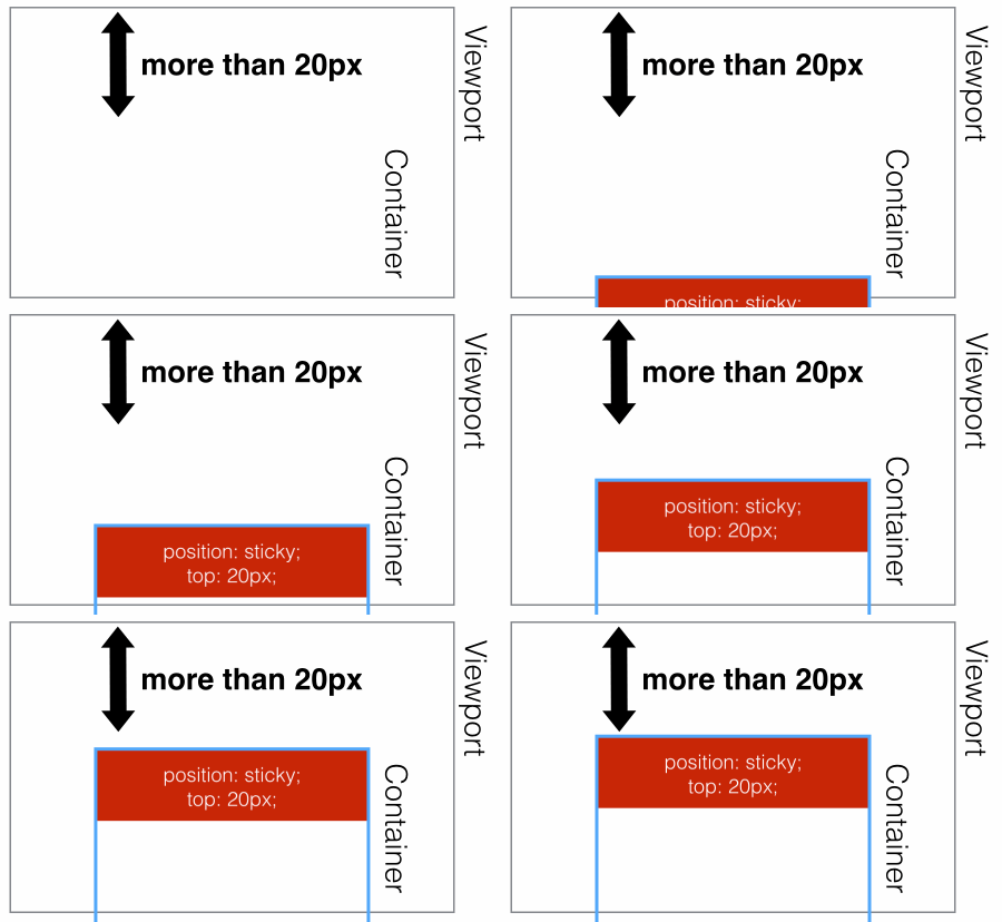
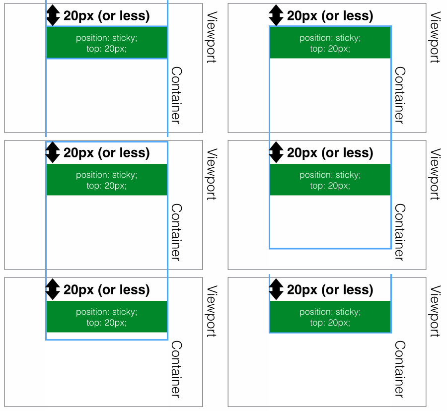
}It is expressed as shown below:
is greater than 20px from the top of the page, expressed as position:relative;
 ## The distance
x, which appears as position:fixed;
 Use
Use
to achieve head navigation bar fixationhtml code:
<p class="con">
    <p class="samecon">
        <h2>标题一</h2>
        <p>这是一段文本</p>
        <p>这是一段文本</p>
        <p>这是一段文本</p>
    </p>
    <p class="samecon">
        <h2>标题二</h2>
        <p>这是一段文本</p>
        <p>这是一段文本</p>
        <p>这是一段文本</p>
    </p>
    <p class="samecon">
        <h2>标题三</h2>
        <p>这是一段文本</p>
        <p>这是一段文本</p>
        <p>这是一段文本</p>
    </p>
    <p class="samecon">
        <h2>标题四</h2>
        <p>这是一段文本</p>
        <p>这是一段文本</p>
        <p>这是一段文本</p>
    </p>
    <p class="samecon">
        <h2>标题五</h2>
        <p>这是一段文本</p>
        <p>这是一段文本</p>
        <p>这是一段文本</p>
    </p>
    <p class="samecon">
        <h2>标题五六</h2>
        <p>这是一段文本</p>
        <p>这是一段文本</p>
        <p>这是一段文本</p>
    </p>
</p>.samecon h2{
position: -webkit-sticky;
position: sticky;
top: 0;
background:#ccc;
padding:10px 0;
}
Enable sticky positioning. Otherwise the behavior is the same as relative positioning.
and bottom are set at the same time, top takes effect with higher priority, ## When #left and right are set at the same time, left has higher priority.
overflow attribute of any parent node of the element must be visible , otherwise position:sticky will not take effect. An explanation is needed here:
overflow:hidden, then the parent The container cannot be scrolled, so the position:sticky element will not be scrolled and then fixed.
position:relative | absolute | fixed, the element will be positioned relative to the parent element Positioning, rather than relative viewprot positioning.
relative or fixed is determined based on whether the element reaches the set threshold. of. Compatibility
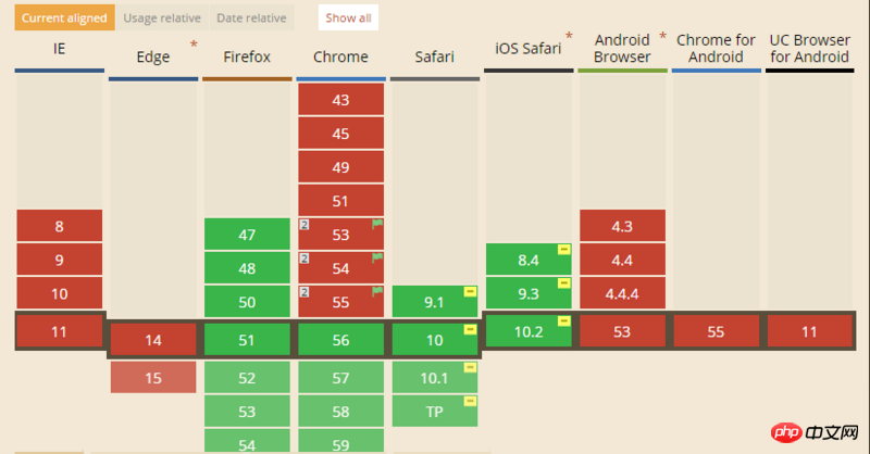
The compatibility of this attribute is not very good. It is still an experimental attribute and is not a standard recommended by W3C. 
CSS Sticky Footer Implementation Example Tutorial
JS method to solve position:sticky compatibility problem
The above is the detailed content of Detailed explanation of CSS using position:sticky to implement sticky layout examples. For more information, please follow other related articles on the PHP Chinese website!
 There are several ways to position CSS position
 Solution to computer black screen prompt missing operating system
 How to turn off real-time protection in Windows Security Center
 How to connect asp to access database
 File type introduction
 How to use imfinfo function
 Regular expression tool
 How to restore Bluetooth headset to binaural mode


