


We know that there are many chat bubbles on QQ, but WeChat only has a very simple one. This article mainly introduces the CSS3 imitation WeChat chat bubble example code, which has certain reference value. Interested friends can refer to it. Hope it helps everyone.
Now I will teach you how to use css3 to create a page that is the same as the WeChat chat interface.
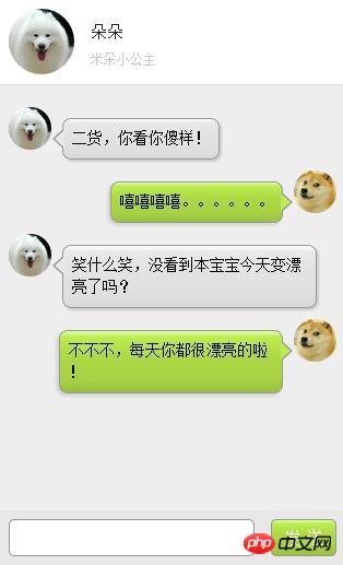
First of all, let me show you what the page looks like, as shown in the picture below:
The page roughly looks like this. Next, let’s learn the production steps together. Bar.
Part One: HTML
![]()
二货,你看你傻样!
![]()
嘻嘻嘻嘻。。。。。。
![]()
笑什么笑,没看到本宝宝今天变漂亮了吗?
![]()
不不不,每天你都很漂亮的啦!
Part Two: CSS3
PS (This is the most important part, so I’ll show you all the code!)
/* 微信气泡 */ p.speech { float: left; margin: 10px 0; padding: 8px; table-layout: fixed; word-break: break-all; position: relative; background: -webkit-gradient( linear, 50% 0%, 50% 100%, from(#ffffff), color-stop(0.1, #ececec), color-stop(0.5, #dbdbdb), color-stop(0.9, #dcdcdc), to(#8c8c8c) ); border: 1px solid #989898; border-radius: 8px; } p.speech:before { content: ''; position: absolute; width: 0; height: 0; left: 15px; top: -20px; border: 10px solid; border-color: transparent transparent #989898 transparent; } p.speech:after { content: ''; position: absolute; width: 0; height: 0; left: 17px; top: -16px; border: 8px solid; border-color: transparent transparent #ffffff transparent; } p.speech.right { display: inline-block; box-shadow: -2px 2px 5px #CCC; margin-right: 10px; max-width: 75%; float: right; background: -webkit-gradient( linear, 50% 0%, 50% 100%, from(#e4ffa7), color-stop(0.1, #bced50), color-stop(0.4, #aed943), color-stop(0.8, #a7d143), to(#99BF40) ); } p.speech.right:before { content: ''; position: absolute; width: 0; height: 0; top: 9px; bottom: auto; left: auto; right: -10px; border-width: 9px 0 9px 10px; border-color: transparent #989898; } p.speech.right:after { content: ''; position: absolute; width: 0; height: 0; top: 10px; bottom: auto; left: auto; right: -8px; border-width: 8px 0 8px 9px; border-color: transparent #bced50; } p .left { display: inline-block; box-shadow: 2px 2px 2px #CCCCCC; margin-left: 10px; max-width: 75%; position: relative; background: -webkit-gradient( linear, 50% 0%, 50% 100%, from(#ffffff), color-stop(0.1, #eae8e8), color-stop(0.4, #E3E3E3), color-stop(0.8, #DFDFDF), to(#D9D9D9) ); } p .left:before { content: ''; position: absolute; width: 0; height: 0; top: 9px; bottom: auto; left: -10px; border-width: 9px 10px 9px 0; border-color: transparent #989898; } p .left:after { content: ''; position: absolute; width: 0; height: 0; top: 10px; bottom: auto; left: -8px; border-width: 8px 9px 8px 0; border-color: transparent #eae8e8; } .leftimg { float: left; margin-top: 10px; } .rightimg { float: right; margin-top: 10px; } .leftd { clear: both; float: left; margin-left: 10px; } .rightd { clear: both; float: right; margin-right: 10px; } .leftd_h{ width: 39px; height: 39px; border-radius: 100%; display: block; float: left; overflow: hidden; } .leftd_h img{ display: block; width: 100%; height: auto; } .rightd_h{ width: 39px; height: 39px; border-radius: 100%; display: block; float: right; overflow: hidden; } .rightd_h img{ display: block; width: 100%; height: auto; }
Here Basically, it uses CSS pseudo-class elements to create small bubbles. There are many cases on the Internet where the user's chat avatar is used as the background image, but I feel that this is not very suitable in actual projects, so I made some modifications to make it more practical.
Related recommendations:
JavaScript imitation WeChat masturbation game sample code
Detailed explanation of Android high imitation WeChat chat interface example
An H5 page that imitates WeChat group chat
The above is the detailed content of Examples to explain how to imitate WeChat chat bubbles using CSS3. For more information, please follow other related articles on the PHP Chinese website!


![[Web front-end] Node.js quick start](https://img.php.cn/upload/course/000/000/067/662b5d34ba7c0227.png)


