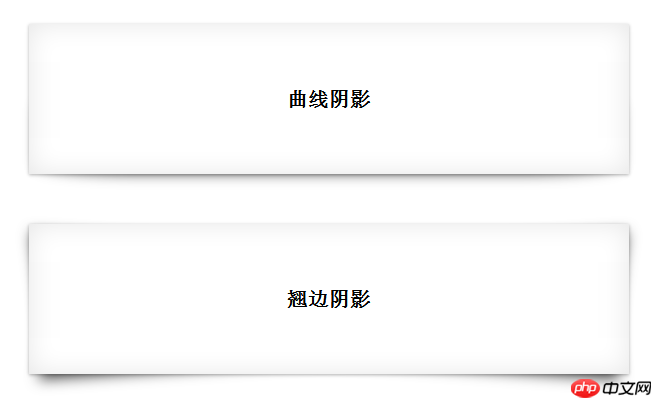
Often when we do some special shadow effects, the way of using pictures as backgrounds is actually very poor. Without considering adapting to old versions of browsers, we can use css3 to customize our own Desired shading style.
The following will take curve shadows and edge-warping shadows as examples to explain the process of customizing shadows.
Let’s take a look at the renderings first
Curve shadow can actually be achieved by overlapping double-layer shadows
We will cancel the shadow picture It should be easier to understand if you decompose it. The schematic diagram is as follows:

As shown above, under the basic shadow of Figure 1, just add a curved shadow.
1. The basic shadow in Figure 1 is easy to implement, inner shadow + outer shadow
.box-shadow1{ box-shadow: 0 1px 4px rgba(0,0,0,0.3),0 0 40px rgba(0,0,0,0.1) inset; }
2. Then use pseudo-classes to add an "adaptable" shadow behind the element. In order to be adaptable, We have to use relative positioning, and the implementation code is as follows
.box-shadow1{ position:relative; box-shadow: 0 1px 4px rgba(0,0,0,0.3),0 0 40px rgba(0,0,0,0.1) inset;}.box-shadow1:after{ content:""; position:absolute; background:transparent; top:50%; //设置宽高仅仅设置上下左右边距是为了让系统自动定位。 bottom: 1px; left: 10px; right: 10px; z-index: -1; //将副阴影置于主阴影下 box-shadow: 0 0 20px rgba(0,0,0,0.7); border-radius: 100px/10px;}
This way, the effect of curve shadow is achieved.
将box-shadow1作为类使用即可
Similarly, warping shadow can be superimposed on two parallelograms under the basic shadow.
Here we will go directly to the breakdown diagram and source code without further explanation


.box-shadow2{ position:relative; box-shadow: 0 1px 4px rgba(0,0,0,0.3),0 0 40px rgba(0,0,0,0.1) inset;} .box-shadow2:before,.box-shadow2:after{ content: ""; position:absolute; top:20px;bottom: 22px; background: transparent; box-shadow: 0 8px 20px rgba(0,0,0,0.7); z-index: -1; background: #fff; }.box-shadow2:before{ left: 22px; right:12px; transform: skew(-12deg) rotate(-4deg); }.box-shadow2:after{ left: 12px; right:22px; transform: skew(12deg) rotate(4deg); }
The above is the detailed content of Graphic and text code tutorial on how to use CSS3 to implement curve shadows and edge-warping shadows. For more information, please follow other related articles on the PHP Chinese website!


