
This article summarizes how to use the float attribute in CSS for layout. In fact, there are many articles on the Internet discussing this topic, but I feel that none of them get to the point. Let’s talk about a commonplace, CSS Float layout
Using CSS to lay out web pages is the basic skill of the front-end. What about two-column layout and three-column layout are also the basic questions of the front-end interview. Generally speaking, you can use the CSSposition property for layout, or the CSSfloat property for layout. The former is suitable for laying out the homepage, because the content on the homepage can often be fully controlled. The latter is suitable for layout templates where you have no control over the content filled in the template - for example, when editing a WordPress template, you certainly can't consider the length of each blog post. This blog post is to summarize how to use the float attribute in CSS for layout. In fact, there are many articles on the Internet discussing this topic, but I feel that none of them get to the point. Let’s talk about something old-fashioned, CSS’s Float layout.
Characteristics of p
The basic HTML element p of layout has several characteristics that will affect the subsequent layout. Note that the following features only apply to p that does not specify the width attribute and height attribute, because during the layout process with float, we only do this in specific positions (will be detailed later).
•An empty p has no height.
•The height of p with content depends on the height of the content.
•If the float attribute is not specified, the width of p will fill the width of the parent element (whether it is empty or not).
•If the float attribute is specified, the width of p will depend on the width of the inner element (so, an empty p will have neither height nor width after specifying the float attribute).
Many tutorials on the Internet often specify the width or height of p, and then explain the float attribute, which really interferes with my learning of layout. Remember, we only specify the width of p at a specific location.
Float layout process
In the practice process, I realized one thing, that is, p is rendered according to the order in the HTML document. In other words, we first decide the position of the previous p on the page, and then decide the position of the next p. Maybe this point is obvious, but it is really the key to understanding Float layout and is rarely mentioned in other tutorials on the Internet.
There is an HTML document like the following
The code is as follows:
这里是标题
侧边栏
侧边栏2:地图投影,是将地球表面投影到地图平面的过程,将地理坐标转换为平面直角坐 标的过程。因为毕业论文需要,我重新回顾了一下地图投影的知识并且作了比较全面且简洁的总 结。如果你之前未系统了解过地图投影,又对地图投影感兴趣,这篇博文也许能成为一篇简洁务 实的阅读材料。
这里是一些文字
再来一大段文字
地图投影,是将地球表面投影到地图平面的过程,将地理坐标转换为平面直角坐标的过程。 因为毕业论文需要,我重新回顾了一下地图投影的知识并且作了比较全面且简洁的总结。如果你 之前未系统了解过地图投影,又对地图投影感兴趣,这篇博文也许能成为一篇简洁务实的阅读材 料。
没人关注的页脚
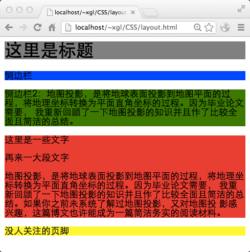
There are 5 p’s in total. In order to make these p’s have height and width, add them to Added some text. There aren't any float attributes yet, so each p takes up the entire width of the parent element, and the height is determined by the content within it. The rendering effect is as follows:
What does the browser do when an element has a float attribute? I think it is like this:
1. The rendering browser detects that this element has the float:right attribute,
2. Limits the width of p according to its content (rather than trying to fill the width of the parent element)
3. Break away from the document flow and select such a position for rendering:
1. First, it must be in an area not occupied by the document flow, otherwise it may overwrite the already rendered document.
2. Secondly, there are no other float elements.
3. Finally, the document flow will not be affected after rendering. The document flow will proceed as it should, but the content in the document will automatically bypass float elements.
Try to set the float:left attribute of p#sidebar:
The code is as follows:
#sidebar{ float: right; }
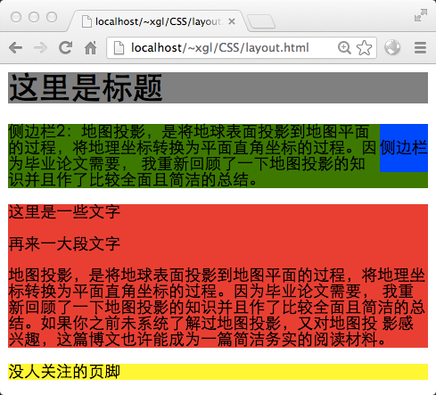
The sidebar does not float to the title bar. Even though there is no text to the right of the title bar. This is because the title bar is rendered before the sidebar. After the browser renders the title bar, it has forgotten whether there is content on the right side of the title bar, so it cannot float the sidebar to the title at the risk of overwriting the original content. on the bar. Next, the document flow is rendered the same way, except that the text bypasses the floated element, as if the floated element does not exist.
We want sidebar 2 to be on the left side of the page and sidebar 1 to be on the right side of the page. Because there is a lot of content in Sidebar 2, the width needs to be limited. For the sake of beauty, limit the width of 1 and assign the float attribute to sidebar 2.
The code is as follows:
#sidebar{ float: right; width: 100px; } #sidebar2{ float: left; width: 180px; }
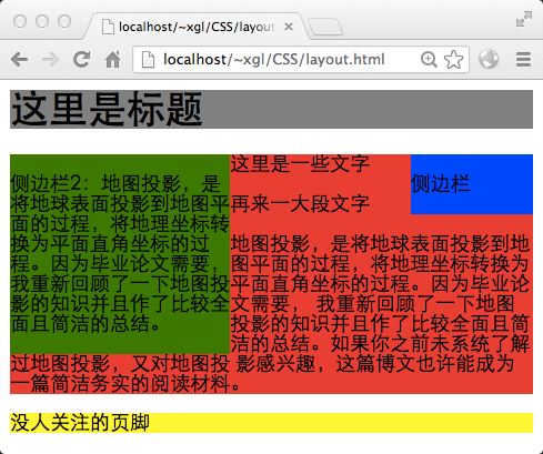
It looks a bit like a three-column layout. But we usually don’t want the middle column to extend below the sidebar when it is higher than the sidebar. The technique usually used at this time is to add margin attributes to the middle column, and the values on the left and right are the values of the two side columns.
code show as below:
#sidebar{ float: right; width: 100px; } #sidebar2{ float: left; width: 160px; } #content{ margin-left: 160px; margin-right: 100px; }
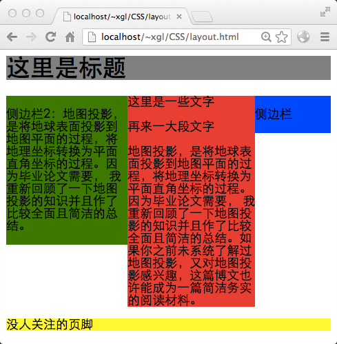
很好,一个三栏布局就完成了。虽然看上去很好,但是如果中栏的高度小于侧边栏会怎样?把中栏里的内容都删掉大部分,然后:
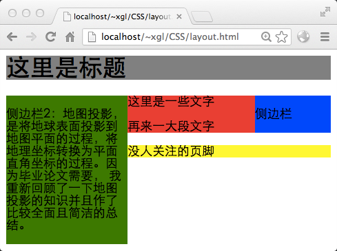
见鬼,页脚上去了……这可不是我希望的。那么还有一个技巧,就是在页脚使用clear属性。这个属性的作用就是,使文档流中元素在布局的时候,不允许左侧或右侧出现浮动元素。如果有,则在浮动元素的下方进行渲染。这里,为页脚添加clear属性。
代码如下:
#sidebar{ float: right; width: 100px; } #sidebar2{ float: left; width: 160px; } #content{ margin-left: 160px; margin-right: 100px; } #footer{ clear: both; }
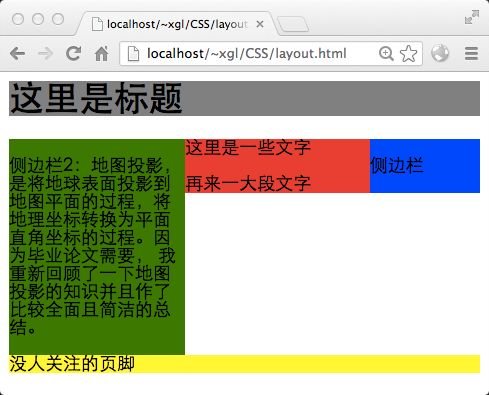
页脚也正常了,这样,一个三栏布局就最终完成了。
最后,再来看一个例子吧,这个例子将解释两个问题:
1.当可渲染区域去除掉已有的浮动元素,剩下的那一块区域,其顶部不足以容纳浮动元素时,浮动元素将放弃渲染在顶部,而渲染在前面那个浮动元素的下方。
2.在以上的情况下,两个浮动元素仍然不在文档流中,可能会产生一些诡异的现象。
恢复中栏的内容,并改写CSS代码如下:
代码如下:
#sidebar{ float: right; width: 200px; } #sidebar2{ float: left; width: 300px; }
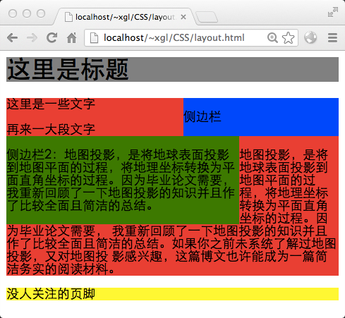
这张图就清晰地说明了浮动元素其实是不在文档流之中的。首先,浏览器页面没有500像素宽,所以侧边栏2没法在顶部渲染(侧边栏1的存在使空间不够了),这时文档流仅仅进行到标题栏。因此中栏从标题栏下方开始渲染,为了绕开两个侧边栏,只好先在左上角写几个字,然后到侧边栏2右侧憋屈地渲染,最后才正常地舒展开(你可以这样想象,绿色和蓝色的后面,其实是没有文字的红色)。
更多CSS Float布局过程与老生常谈的三栏布局 相关文章请关注PHP中文网!


