Speaking of CSS color, everyone is familiar with it. This article is my personal systematic summary and study of the CSS color system, which I would like to share with you.
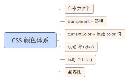
First use a picture to intuitively feel what content is roughly covered related to CSS colors.

The following content will probably be in this order. The content is very basic. You can optionally jump to the corresponding content. Read everywhere.
Well, color keyword Very understandable. It represents a specific color value, and it is not case sensitive. For example, red in color:red is a color keyword.
Before CSS3, that is, CSS Standard 2, there were a total of 17 basic colors, which are:

With CSS3, color keywords have been greatly expanded, reaching 147. The following is only a partial list:

Click me to view the complete CSS3 color keyword
It is worth noting that unknown keywords will invalidate CSS properties.
This test test3 here is to illustrate that when the color keyword passed in is wrong, the CSS property will be invalid instead of using the current The currentColor alternative. currentColor will be explained below.
All places where color values can be used, They can all be replaced by color keywords, so where can color values be used in CSS?
The color of the text color:red
element Background color background-color:red (including various gradients)
The border of the element border-color:red
The box shadow or text shadow of the element box-shadow:0 0 0 1px red | text-shadow:5px 5px 5px red
Used in some filters filter: drop-shadow(16px 16px 20px red)
## The color of the horizontal line
alt text. That is, when the image cannot be displayed, the text that appears instead of the image will inherit this color value.
##I won’t give examples of some of the more common ones. Let’s talk about the alt text and ul list items of
.
After testing, the color value of
For form controls
Transparent literally means transparent. It is used to represent a completely transparent color, that is, the color will appear to be the background color. can also be understood as the abbreviation of It is worth noting: Before CSS3, the transparent keyword was not a real color, only Used in #So what is the use of this transparent value? Simply list some examples:
This is The most common usage of transparent is for drawing triangles.
Combining the above figures 1 and 2, you can see that using a p with a height and width of 0, set its border, When the border color of any three sides is transparent, you can get a triangle with any orientation. As mentioned above, since transparent can be used in border and background in lower version browsers (IE78), this method has good compatibility and can be used in many scenarios. .
Buttons are a very important part of our web design, and the design of buttons is also closely related to user experience. Making it easier for users to click on buttons will undoubtedly improve the user experience, especially on the mobile side. Buttons are usually very small, but sometimes due to design draft restrictions, we cannot directly change the height and width of button elements. So at this time, is there any way to increase the click hotspot of the button without changing its original size? Here, we can easily achieve it with the help of a transparent border (I wrote in a previous article that it can also be achieved using pseudo elements), using a layer of transparent
Try to move the cursor close to ##Hmm, here we use border
transparent is used for background and can usually create a variety of background images. Here is a simple example, using transparent gradients to implement a corner-cut graphic:
Achieve the change from transparent color to solid color through Using the combination of transparent and gradient, you can also generate a variety of wonderful graphics. You can click below to see: CSS3 Wonderful Thoughts CSS3 Patterns Gallery
With box-shadow, using transparent on text can create a text glow For the effect, try hovering the following text with the mouse:
transparent In fact, there are many more functions. That’s all for now. Welcome to continue the discussion. .
Many people don’t know currentColor can be simply understood as the text color inherited or set by the current CSS tag, that is, the value of color. So how can it be used specifically? According to our principle of writing CSS DRY (Don't Repeat Yourself), using this keyword can greatly reduce the workload when modifying CSS. . Take an example:
#In the above example, I only wrote the color in color and used it in border and box-shadow currentColor property. As you can see, the color values of these two attributes are set to the values set in color. When we need to use this same color performance, it is better to use currentColor to facilitate future changes. However, currentColor is new to CSS3 and cannot be recognized by older browsers. So is it not possible to use it in older versions of browsers? It is not necessarily the case. There are still some special cases. Take a look at the following: ##As you can see, I only wrote the color in color above. The value of border is 1px solid, and the box-shadow does not have a color value, but it still shows the value of currentColor. This is because the border color and shadow color default to the text color of the current box, and border has good compatibility and can be supported up to IE6. Then what are the element color values that will be obtained or inherited in the element:
<input type="radio"> <input type="checkbox">, I haven’t found a good direct change yet. If you know the color method, I hope you can enlighten me.
transparent
rgba(0,0,0,0). background-color and border-color to represent a transparent color. In browsers that support CSS3, it is redefined as a real color, and transparent can be used wherever a color value is required, like the color attribute. transparent is used for border to draw triangles

transparent is used for border to increase the click hot area
border :20px solid transparent We can write like this: Btn, it will It is found that the mouse interactive response event hover has been triggered before reaching the colored area. This can be used to expand the clickable area of the button on the mobile terminal without changing the button itself. shape. Like this: 
to expand the mouse click area , however, the real situation is that sometimes our buttons must use borders, and borders can only be set once (multiple borders cannot be set like box-shadow and gradient), If you still need to use this method at this time, you can use inner shadow box-shadow to simulate a layer of border, like this: transparent is used for background to draw background images
linear gradient linear-gradient, change the four quarter sizes ( background-size: 50% 50%) graphics are combined together to generate a corner-cut graphics.
##transparent is used for text color
currentColor
This stuff. Like transparent, it is also a keyword and, as the name suggests, represents the current color. It comes from a self-property or inherits from its parent property.
alt text. That is, when the image cannot be displayed, the text that appears instead of the image will inherit this color value.
). (Without borders, the color will not be affected).
Compatibility of currentColor

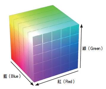
Let’s take a brief look at the color representation model. rgb() represents the red-green-blue (RGB) mode of the color, rgba() has one more a, indicating its transparency, and the value is 0 -1. The color model of rgb is usually represented by a cube: We know that usually we use When not using abbreviations, use hexadecimal symbols #RRGGBB, ##In #RRGGBB, RR represents the shade of red, and GG represents Shades of green, BB represents shades of blue. The values are from 00 - FF, and the larger the value, the darker the color. If rgb(RR,GG,BB) is used, RR takes the value 0~255 or percentage, 255 is equivalent to 100%, and F or in hexadecimal notation FF. If you understand the meaning of rgb(), it is actually very easy to remember commonly used color values. Like the RR mentioned above represents the depth of red, then understand and remember # It is so easy to represent FF0000 Remember the principle of color superposition: We can easily remember, #FF00FF
##hsl() and hsla() The advantage of hsl over rgb is that it is more intuitive: you can estimate the color you want and then fine-tune it. It's also easier to create matching color collections. The color model of hsl is usually represented by a cylinder:
Taking a button as an example, we use hsl color representation to represent the background color value of the button in the normal state. We hope that the background color will be darker when hovering, and the background color will be darker when active. Brighter color. If we use rgb notation, we need 3 completely different colors, but if we use hsl notation, we only need to change the l (light, brightness) value of the color value when hovering and active. Let’s take another look using an example that appeared above:
Here background:hsl(200, 60%, 60% ) During hover and active, I only changed the third value of the hsl color value to achieve the desired effect. Here are some tips. Some people may not know that during the development stage we only have one rgb value, but we want to convert it to an hsl value. It can be easily done using the chrome developer tools, as shown below. We only need to select the color value we want to convert, hold down the left key This is the end of this article, it is relatively basic, I hope someone will read it. If you still have any questions or suggestions, you can communicate more. It is an original article. The writing style is limited and the talent is shallow. If there is anything wrong in the article, please let me know. For more detailed explanations of CSS color systems and related articles, please pay attention to the PHP Chinese website!
rgb() and rgba()


as red. In the same way, we can get #00FF00 to represent green and #0000FF to represent blue. 
Superposition of red and blue represents purple, #FFFF00Superposition of red and green represents yellow, #00FFFFSuperposition of blue and green represents cyan. Except In rgb notation, colors can also be represented using hsl(). hsl() is defined as hue-saturation-lightness (Hue-saturation-lightness), hsla() has one more a, indicating its transparency, with a value of 0-1. .

#In fact, for our front-end, it is more convenient to use hsl to represent colors. Conversion from rgb to hsl
shift, and click on the color representation box to convert:


