Although designers rarely write the actual content of the website themselves, they are still crucial to the overall quality of the content. The role of the designer is to ensure that the content is presented in a way that is easy to read. There are many ways to ensure that your fonts are easy to read and use, but instead of giving you some rules and regulations on what you should and shouldn’t do, I will give you some examples and analysis of smart use of fonts.
Carefully considered examples of fonts
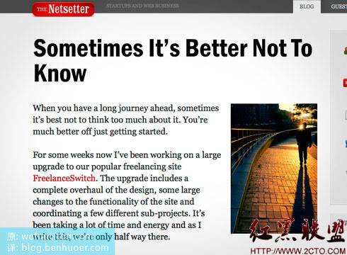
Big, beautiful fonts on The Netsetter
Titles are important in web design, and this is especially true for blog design. It has recently become popular to use large, bold fonts for titles. There are many benefits to doing this, not only improving the usability of specific blocks of content, but also helping to organize space and structure in the design. Netsetter does a great job here, as you can see the title is very readable with a large font and lots of white space around it.

White space and character spacing
Viget’s website is a perfect example of how important fonts really are to web design. The screenshot below, from their portfolio page, once again shows how large fonts can help create open space. Even with this crisp thin line style, they used wide white spaces. Another nice touch is their excellent choice of line height [whitespace]. The line spacing is set much larger than the default value, which greatly enhances text readability. Maybe you can try this technique in your own designs next time.

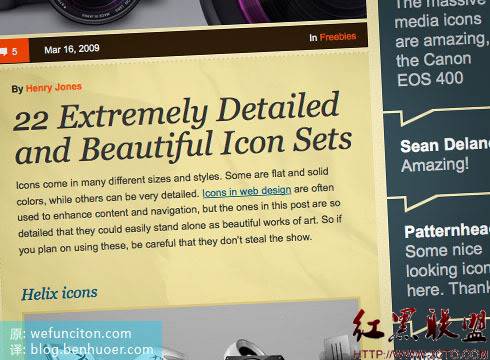
Web Design Ledger, fonts that match the mood
Finding the perfect font requires constant trial and error, or you still have to Fonts can be chosen based on the “mood” they represent. The example below, Web Design Ledger, gives people a retro and old-fashioned feel, while also being full of open emotions and modernity. The key to his success lies in choosing fonts that evoke corresponding emotions in people. Henry Jones (the site’s designer) chose Georgia, a popular traditional serif font for the title, which helped achieve a nostalgic retro feel. The modern feel comes from a completely different font than the title - the main content uses Helvetica, a sans-serif, slippery, open font.

Quick decisions on font selection in web design
After reading so many good examples above, you should be more comfortable choosing fonts in the future. But why do they feel so good? How should you use it in your own design next time? Is
readable?
Don’t be afraid to try bold fonts
Have you considered spacing?
Spacing plays a big role in readability
What emotion does your font give people?
Make sure the font selection suits your design style
There is a lot to be said for this, but I am no expert on this and I have only just learned how to appreciate a well-used font.
The above is the content of High-Quality Web Design: Examples and Tips Three (Tips on Text Arrangement and Font Selection). For more related content, please pay attention to the PHP Chinese website (m.sbmmt.com)!
 vue common instructions
 How to turn on and off Douyin Xiaohuoren
 Computer prompts that msvcr110.dll is missing and how to solve it
 What is mobile HD
 vim save and exit command
 The difference between wildcard masking and unmasking
 Detailed explanation of Linux fork function
 python environment variable configuration


