Found a total of 10000 related content


Vue and ECharts4Taro3 Advanced Tutorial: How to implement real-time charts with dynamic data updates
Article Introduction:Vue and ECharts4Taro3 Advanced Tutorial: How to implement real-time charts with dynamic data updates Introduction: In modern front-end development, real-time charts are very important for data visualization. As a popular JavaScript framework, Vue provides concise and efficient data binding and component development capabilities. ECharts4Taro3 is a multi-terminal chart component library based on Taro3 and ECharts4 packages. This article will introduce how to use Vue and ECharts4
2023-07-20
comment 0
2606

How to use the php interface and ECharts to generate dynamically updated real-time statistical charts
Article Introduction:How to use the PHP interface and ECharts to generate dynamically updated real-time statistical charts requires specific code examples. With the continuous development of technology, data analysis and visualization have become one of the indispensable tools for modern enterprises and institutions. As a popular JavaScript data visualization library, ECharts has become one of the preferred tools for data visualization. By combining the PHP interface with ECharts, you can achieve more flexible and dynamic data visualization effects. This article will introduce how to use the php interface
2023-12-17
comment 0
1137

What are the methods of data visualization?
Article Introduction:Data visualization methods include static charts, dynamic charts, geographical visualization, 3D visualization, interactive visualization, text visualization and big data visualization, etc. Detailed introduction: 1. Static charts are one of the most common data visualization methods. By using various chart libraries, we can create various static charts, such as line charts, bar charts, pie charts, etc.; 2. Dynamic charts can be used in time Changes in the data are shown on the axis. By using JavaScript libraries, we can create various dynamic charts, such as line charts that update in real time, dynamic maps, and more.
2023-08-22
comment 0
7425

In-depth study of Matplotlib drawing: example analysis and skill sharing
Article Introduction:Play with Matplotlib drawing methods: detailed examples and skill sharing Matplotlib is a powerful Python drawing library that can be used to generate various static, dynamic, and interactive data visualization charts. This article will introduce you to several commonly used Matplotlib drawing methods, and share some examples and techniques. Line chart A line chart is one of the most common chart types in Matplotlib and can be used to present trends in data over time. Here is a simple line chart drawing example: i
2024-01-13
comment 0
1044

How to make a line chart in WPS How to make a line chart in WPS
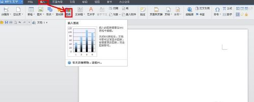
Article Introduction:Many users are using WPS software in their offices, but do you know how to create a line chart with WPS? Next, the editor will bring you the method of making a line chart with WPS. Users who are interested in this can take a look below. How to create a line chart in WPS? How to make a line chart with WPS Open the WPS text software, click "Insert" - Chart in the menu bar, as shown in the figure. At this time, a histogram will appear in the WPS text software, and the WPS table software will automatically open, and a histogram will also be generated in the WPS table. In the WPS spreadsheet software, click the column chart just inserted to make it selected, and then click "Insert" - Chart in the menu bar. The "Chart Type" dialog box pops up. Find "Collapse" in the list box.
2024-08-13
comment 0
645


How to add high and low point connecting lines to PPT line chart
Article Introduction:How to add high and low point connecting lines to PPT line chart? Recently, a user asked this question. In daily study and office work, sometimes you need to make a PPT line chart. When making it, you want to add high and low points connecting lines. How should you do it? In response to this problem, this article brings a detailed introduction to the method and shares it with everyone. Let’s take a look. Method for adding high and low point connections to a PPT line chart: 1. Open PPT and create a blank document. 2. Click [Insert]-[Chart]-[Line Chart]. 3. Click [OK] to get the default style line chart. 4. Enter the data to make the line chart in the Excel table. At least two columns of data are required, and then the line will be automatically generated as the data changes. 5. Close
2024-08-29
comment 0
547

How to add high and low point connecting lines to PPT line chart
Article Introduction:How to add high and low point connecting lines to PPT line chart? Recently, a user asked this question. In daily study and office work, sometimes you need to make a PPT line chart. When making it, you want to add high and low points connecting lines. How should you do it? In response to this problem, this article brings a detailed introduction to the method and shares it with everyone. Let’s take a look. Method for adding high and low point connections to a PPT line chart: 1. Open PPT and create a blank document. 2. Click [Insert]-[Chart]-[Line Chart]. 3. Click [OK] to get the default style line chart. 4. Enter the data to make the line chart in the Excel table. At least two columns of data are required, and then the line will be automatically generated as the data changes. 5. Close
2024-08-29
comment 0
687

How to create a business-style bold edge area chart in Excel charts
Article Introduction:As shown in Figure 1, it is a set of original data. Select the second column of data and insert the line chart to get a line chart. However, the X-axis data has not been added yet. You need to select the chart data and go to Design-Select Data. -Horizontal axis label-Select the year column data in this example. After completion, you will get the line chart shown in Figure 2. The first step is to generate a line chart. This step is to generate an area chart, as shown in Figure 1. Select the data column again, Ctrl+C to copy, select the chart area, Ctrl+V to paste, and then find an identical curve. The original curve is covered, as shown in Figure 2. Select the data in legend 2 and change the chart type to area chart to get a rough area chart with line (Figure 1). Adjust the coordinate axis format and set the position coordinate axis to [at scale]
2024-04-17
comment 0
1220

European-Italian Exchange updates K-line chart at several points
Article Introduction:The K-line chart of Euro-Italian Exchange is updated every 1 minute. The K-line is updated every minute, showing the price fluctuations within the latest minute, helping traders track market dynamics and formulate trading strategies in real time.
2024-08-06
comment 0
1064

How to mark polylines in Auto CAD2020 - How to mark polylines in Auto CAD2020
Article Introduction:Many players are not familiar with how to mark polylines in AutoCAD 2020 when using AutoCAD 2020 software? Today’s article brings you the method to mark polylines in AutoCAD 2020. Interested users can take a look below. Open cad2020 graphics Click to open cad2020 graphics. Draw a polyline arrow Click to draw a polyline arrow. Click to mark the dimensions. Click to mark the dimensions.
2024-03-04
comment 0
1309

How to draw a line chart based on tabular data How to draw a line chart based on tabular data
Article Introduction:Sometimes we draw bar charts, line charts, Gantt charts, pie charts and other graphics in Excel tables to better show changes in data. But there are still many friends who don’t know how to draw it. In this tutorial, the editor will show you how to make a line chart from Excel table data. If you are interested, don’t miss it! Operation method 1. Open the Excel data table. 2. Select all table contents, and then click Insert - Line Chart on the menu bar. 3. Select a line chart you like and click on it. 4. Then, a line chart with consistent data will be automatically generated in the Excel table.
2024-08-27
comment 0
905

How to create dynamic statistical charts using Vue
Article Introduction:How to use Vue to create dynamic statistical charts In modern web development, dynamic statistical charts are a very common requirement. Vue is a popular JavaScript framework that can be easily integrated with other libraries and plug-ins to help us create dynamic statistical charts. This article will introduce how to use Vue and a library called Chart.js to create dynamic statistical charts. Chart.js is a simple and easy-to-use data visualization library that supports various types of charts, including bar charts, line charts, pie charts, etc. Step 1: Install and
2023-08-19
comment 0
1358
