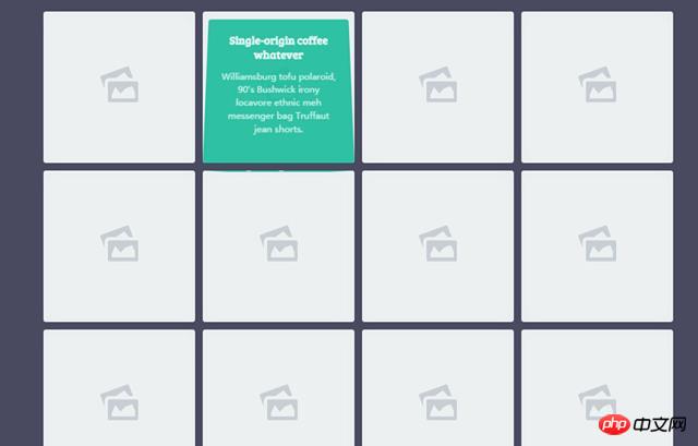
This article mainly introduces in detail CSS3 to create cool 3D animation of mouse over pictures with direction sensing. It has certain reference value and is compatible with the latest mainstream browsers. For those who are interested, You can refer to
This is a cool 3D animation special effect with direction sensing that the mouse slides over the picture using CSS3 and a little JS. In the special effects, when the user's mouse slides over the picture in the grid, a 3D flip animation will appear on the content mask layer in the grid, and it has direction sensing and can start flipping from the direction of the mouse entry. The effect is very cool. .
##Online preview Source code download
Usage
HTML structure
The HTML structure of the direction-sensitive mouse-over animation uses the HTML structure of an unordered list to create a grid layout. Each
element is a grid. Each grid uses an element as a placeholder, which is actually a small icon of a picture. In addition, p.info is the mask layer to be flipped in 3D.
<p class='container'>
<ul>
<li>
<a class='normal' href='#'>
<svg viewBox='0 0 80 76' x='0px' y='0px'>
<g>
<path d='M 68.9708 24.8623 L 60.4554 2.3018 ...... 68.0625 Z'></path>
</g>
</svg>
</a>
<p class='info'>
<h3>...</h3>
<p>....</p>
</p>
</li>
......
</ul>
</p> Copy after login
The entire grid layout is made using an unordered list, and all li elements are left floating.
ul {
  padding: 0;
  margin: 0 0 50px;
}
ul:after {
  content: "";
  display: table;
  clear: both;
}

li {
  position: relative;
  float: left;
  width: 200px;
  height: 200px;
  margin: 5px;
  padding: 0;
  list-style: none;
}
li a {
  display: inline-block;
  vertical-align: top;
  text-decoration: none;
  border-radius: 4px;
}
Copy after login
li {
  -webkit-perspective: 400px;
          perspective: 400px;
}
Copy after login
.info {
  -webkit-transform: rotate3d(1, 0, 0, 90deg);
          transform: rotate3d(1, 0, 0, 90deg);
  width: 100%;
  height: 100%;
  padding: 20px;
  position: absolute;
  top: 0;
  left: 0;
  border-radius: 4px;
  pointer-events: none;
  background-color: rgba(26, 188, 156, 0.9);
}
Copy after login
.in-top .info {
  -webkit-transform-origin: 50% 0%;
          transform-origin: 50% 0%;
  -webkit-animation: in-top 300ms ease 0ms 1 forwards;
          animation: in-top 300ms ease 0ms 1 forwards;
}

.in-rightright .info {
  -webkit-transform-origin: 100% 0%;
          transform-origin: 100% 0%;
  -webkit-animation: in-rightright 300ms ease 0ms 1 forwards;
          animation: in-rightright 300ms ease 0ms 1 forwards;
}

.in-bottombottom .info {
  -webkit-transform-origin: 50% 100%;
          transform-origin: 50% 100%;
  -webkit-animation: in-bottombottom 300ms ease 0ms 1 forwards;
          animation: in-bottombottom 300ms ease 0ms 1 forwards;
}

.in-left .info {
  -webkit-transform-origin: 0% 0%;
          transform-origin: 0% 0%;
  -webkit-animation: in-left 300ms ease 0ms 1 forwards;
          animation: in-left 300ms ease 0ms 1 forwards;
}

.out-top .info {
  -webkit-transform-origin: 50% 0%;
          transform-origin: 50% 0%;
  -webkit-animation: out-top 300ms ease 0ms 1 forwards;
          animation: out-top 300ms ease 0ms 1 forwards;
}

.out-rightright .info {
  -webkit-transform-origin: 100% 50%;
          transform-origin: 100% 50%;
  -webkit-animation: out-rightright 300ms ease 0ms 1 forwards;
          animation: out-rightright 300ms ease 0ms 1 forwards;
}

.out-bottombottom .info {
  -webkit-transform-origin: 50% 100%;
          transform-origin: 50% 100%;
  -webkit-animation: out-bottombottom 300ms ease 0ms 1 forwards;
          animation: out-bottombottom 300ms ease 0ms 1 forwards;
}

.out-left .info {
  -webkit-transform-origin: 0% 0%;
          transform-origin: 0% 0%;
  -webkit-animation: out-left 300ms ease 0ms 1 forwards;
          animation: out-left 300ms ease 0ms 1 forwards;
}
Copy after login
JavaScript
This special effect uses JavaScript to obtain the direction of the mouse entering the grid, and add the corresponding class for the corresponding grid animation. The getDirection() function is the direction function.
var getDirection = function (ev, obj) {
    var w = obj.offsetWidth,
        h = obj.offsetHeight,
        x = ev.pageX - obj.offsetLeft - w / 2 * (w > h ? h / w : 1),
        y = ev.pageY - obj.offsetTop - h / 2 * (h > w ? w / h : 1),
        d = Math.round(Math.atan2(y, x) / 1.57079633 + 5) % 4;
    return d;
};
Copy after login
var nodes = document.querySelectorAll('li'),
    _nodes = [].slice.call(nodes, 0);
var addClass = function (ev, obj, state) {
    var direction = getDirection(ev, obj), class_suffix = '';
    obj.className = '';
    switch (direction) {
    case 0:
        class_suffix = '-top';
        break;
    case 1:
        class_suffix = '-right';
        break;
    case 2:
        class_suffix = '-bottom';
        break;
    case 3:
        class_suffix = '-left';
        break;
    }
    obj.classList.add(state + class_suffix);
};
_nodes.forEach(function (el) {
    el.addEventListener('mouseover', function (ev) {
        addClass(ev, this, 'in');
    }, false);
    el.addEventListener('mouseout', function (ev) {
        addClass(ev, this, 'out');
    }, false);
});
Copy after login
Related recommendations:
Use CSS3 to realize the super cool Black Cat Sheriff homepage
How to use CSS3 to make a simple 3d translucent cube picture
The above is the detailed content of How to use CSS3 to create a cool 3D animation with direction sensing when the mouse slides over an image. For more information, please follow other related articles on the PHP Chinese website!


 css3 tutorial
 What are the css3 gradient properties?
 How to solve the WerFault.exe application error
 The difference between flutter and uniapp
 How to speed up web pages
 Digital currency quantitative trading platform
 How much is Dimensity 6020 equivalent to Snapdragon?
 How to introduce external css into html


