


This article mainly introduces how to use the bootstrap time control daterangepicker and various small bug fixes. It has a certain reference value. Interested friends can refer to the
Dual calendar time period selection plug-in. — Daterangepicker is a time control in the later stage of the bootstrap framework. It can set multiple time period options or customize the time period. The user can choose the start time and end time. The maximum span of the time period can be set in the program.
1. Reference
daterangepicker relies on monent.js and jquery. Therefore, monent.js, jquery, and bootstrap must be introduced before daterangepicker is introduced during use.
<script type="text/javascript" src="jquery.js"></script>
<script type="text/javascript" src="moment.js"></script>
<script type="text/javascript" src="daterangepicker.js"></script>
<link rel="stylesheet" type="text/css" href="bootstrap.css" />
<link rel="stylesheet" type="text/css" href="daterangepicker-bs3.css" />
Or when using modular programming, such as seaj.js, add
define("gallery/daterangepicker/1.3.7/daterangepicker",["jquery","moment","./daterangepicker-bs3.css"],
function(a){a("jquery");window.moment=a("moment"),a("./daterangepicker-bs3.css"),in front of the entire code compression (you can Add the source code of daterangepicker.js) (I encountered it in the project at the moment, I worked it out by myself, it can be used; it is not yet clear and needs improvement)
Add
at the enddefine("gallery/daterangepicker/1.3.7/daterangepicker-bs3.css",[],function(){
seajs.importStyle(".daterangepicker{position:absolute;color:inherit;.........}"
)})
})2. Use
In use, you need to pay attention to the parameter configuration of datetimepicker (this can be found on the official website), here I want to It is explained that you can download the source code from the official website and configure the parameters according to its demo to understand its various uses
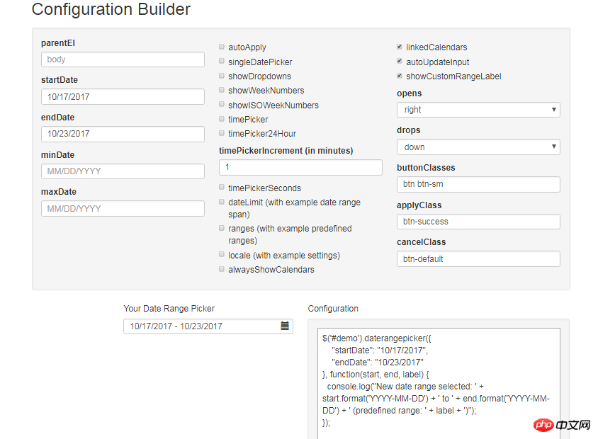
By selecting in the above check box, you can configure different parameter. Here is a brief explanation of the parameters I used in the project and how to use them.
Due to the entire system of the project, there are double dates or single dates, or there are time, minutes and seconds or no time, minutes and seconds. Therefore, pairwise combinations are divided into four situations.
So I use the following:
/**
* 日历
* @param obj eles 日期输入框
* @param boolean dobubble 是否为双日期(true)
* @param boolean secondNot 有无时分秒(有则true)
* @return none
*/
function calenders(eles,dobubble,secondNot){
var singleNot,formatDate;
if(dobubble ==true){
singleNot = false;
}else{
singleNot = true;
}
if(secondNot ==true){
formatDate = "YYYY-MM-DD HH:mm:ss";
}else{
formatDate = "YYYY-MM-DD";
}
$(eles).daterangepicker({
"singleDatePicker": singleNot,//是否为单日期
"timePicker": secondNot,//时间显示与否
"timePicker24Hour": secondNot,//是否按24小时式来显示
"timePickerSeconds": secondNot,//是否带秒
"showDropdowns":true,//是否显示年月下拉选项,可以快速定位到哪一年哪一月
"timePickerIncrement" :1,
"linkedCalendars": false,//是否开始和结束连动,建议设为false,不然日期一直跳来跳去,首次使用者会觉得用户体检极度不佳
"autoApply":true,//是否自动应用,不带时分秒的都可以实现在选择完日期后自动关闭,带时分秒时不会自动关闭
"autoUpdateInput":false, //是否自动应用初始当前日期
"locale": {
"direction": "ltr",
"format": formatDate,
"separator": "~",
"applyLabel": "Apply",
"cancelLabel": "Cancel",
"fromLabel": "From",
"toLabel": "To",
"customRangeLabel": "Custom",
"daysOfWeek": [
"Su",
"Mo",
"Tu",
"We",
"Th",
"Fr",
"Sa"
],
"monthNames": [
"一月",
"二月",
"三月",
"四月",
"五月",
"六月",
"七月",
"八月",
"九月",
"十月",
"十一月",
"十二月"
],
"firstDay": 1
}
}, function(start,end, label) {
if(secondNot ==true&&dobubble ==true){
$(eles).val($.trim(start.format('YYYY-MM-DD HH:mm:ss')+'~'+end.format('YYYY-MM-DD HH:mm:ss')));
}else if(secondNot ==false&&dobubble ==true){
$(eles).val($.trim(start.format('YYYY-MM-DD')+'~'+ end.format('YYYY-MM-DD')));
}else if(secondNot ==false&&dobubble ==false){
$(eles).val(start.format('YYYY-MM-DD'));
}else if(secondNot ==true&&dobubble ==false){
$(eles).val(start.format('YYYY-MM-DD HH:mm:ss'));
}
});
//清空
$(document).off('click','.clearBtns').on('click','.clearBtns',function(){
$(eles).val('');
})
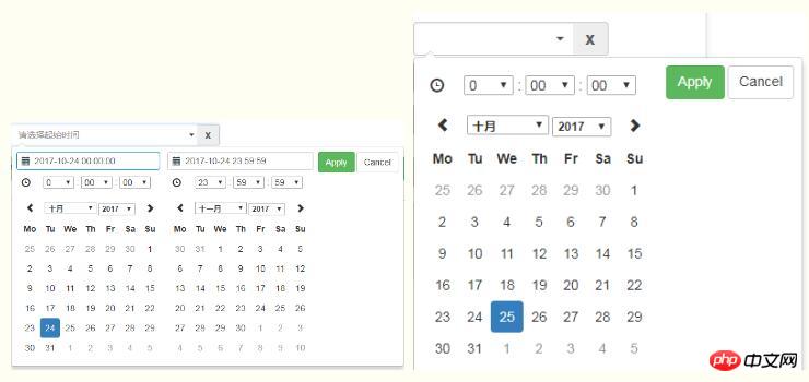
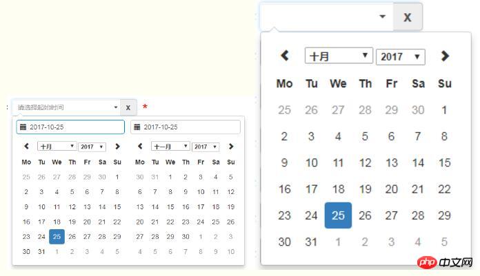
}Since daterangepicker does not have its own clearing function, and in the project requirements, sometimes the date box needs to be empty , so I added a cross button behind the input box. As shown below, the code to achieve clearing
can be used as a reference (this has various implementation methods)
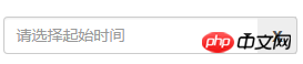
<p class="input-group">
 <input type="text" name="extractionDate11" id="extractionDate11" class="form-control dateStart" placeholder="请选择起始时间" readonly size="30">
 <p class="input-group-addon clearBtns">x</p>
 </p>
 <span class="caret"></span>
For references in various situations:
Single date without hours, minutes and seconds: calenders("#bgrq",false,false);
Single date with hours, minutes and seconds: calenders ('#inputDate',false,true);
Double dates without hours, minutes and seconds: calenders('#extractionDate11',true,false);
Double dates with hours, minutes and seconds: calenders( '#extractionDate11',true,true);
3. Problem Solving
1. Click on the drop-down date box, click on the blank space, and the date box will close , value-passing problem
Because the function of daterangepicker is: after clicking on the drop-down date box, click elsewhere on the page, the date box is closed, and the previously selected date value is automatically saved to the date box. , and according to our habits, such an operation is equivalent to canceling, so make a modification in the source code:
Search for the outsideClick method in the source code:
Replace this.hide() .
outsideClick: function(e) {
 var target = $(e.target);
 // if the page is clicked anywhere except within the daterangerpicker/button
 // itself then call this.hide()
 if (
 // ie modal dialog fix
 e.type == "focusin" ||
 target.closest(this.element).length ||
 target.closest(this.container).length ||
 target.closest('.calendar-table').length
 ) return;
 // this.hide();
 if (this.isShowing){
 $(document).off('.daterangepicker');
 $(window).off('.daterangepicker');
 this.container.hide();
 this.element.trigger('hide.daterangepicker', this);
 this.isShowing = false;
 }
 this.element.trigger('outsideClick.daterangepicker', this);
},At the same time, the changes in the show method must be made, otherwise when the user selects a double date, if only one date is selected and then the blank space is clicked, the next time When I click on the input box again, an error is reported and it can no longer be used.
/*this.oldStartDate = this.startDate.clone();
this.oldEndDate = this.endDate.clone();
this.previousRightTime = this.endDate.clone();*/

this.oldStartDate = this.startDate;
this.oldEndDate = this.endDate;
this.previousRightTime = this.endDate;
2. The problem that the date is initially empty
Daterangepicker will automatically assign the current date to the bound input box at the beginning. That is, the parameter "autoUpdateInput": true/false, when it is true, the date will be automatically added, and when false is selected, it will initially be empty, but in some cases it will not be automatically applied after selecting the date later. So we need to make some modifications (this is borrowed from this blog) Here we are a little clearer
(Quote: Here we can use the autoUpdateInput attribute, autoUpdateInput is used to open and close the daterangepicker selection, whether to automatically pass the value Go to the input[text] DOM attribute. By setting the initial autoUpdateInput to false, the initial value can be empty. This is only when the placeholder set in the input can be displayed normally. But after setting this attribute, no matter how the date of daterangePikcer is selected, There will be no value passed to the input, that is, there is no way to display the selected date normally, so you have to call $(id).data('daterangepicker').autoUpdateInput=true at the appropriate moment. That's it. Author Initially set to, the initial default value is empty. When the input of daterangepicker is clicked, autoUpadateInput=true, but when the input appears, it will automatically have a value regardless of whether the date is selected. So in order to modify this problem, I made it in the source code of daterangepicker. Of course, you can also change the required onclick event.
In the source code, when autoUpdateInput is set to false, we want to change autoUpdateInput back when clicking OK, selecting the date and clicking range. , so set the this.autoUpdateInput=true attribute in three places)
1) In the clickRange method around line 1210: Add the following code to compare it as follows:
clickRange: function(e) {
 var label = e.target.getAttribute('data-range-key');
 this.chosenLabel = label;
 if (label == this.locale.customRangeLabel) {
 this.showCalendars();
 // } else {
 }else if (!this.endDate && date.isBefore(this.startDate)) {
 this.autoUpdateInput=true;
  //special case: clicking the same date for start/end,
  //but the time of the end date is before the start date
  this.setEndDate(this.startDate.clone());
 } else { // picking end
 this.autoUpdateInput=true;


 var dates = this.ranges[label];
 this.startDate = dates[0];
 this.endDate = dates[1];

 if (!this.timePicker) {
  this.startDate.startOf('day');
  this.endDate.endOf('day');
 }

 if (!this.alwaysShowCalendars)
  this.hideCalendars();
 this.clickApply();
 }
},2)、在1340行左右,两处添加 this.autoUpdateInput=true; 请对照以下:
} else if (!this.endDate && date.isBefore(this.startDate)) {
this.autoUpdateInput=true;
//special case: clicking the same date for start/end,
//but the time of the end date is before the start date
this.setEndDate(this.startDate.clone());
} else { // picking end
this.autoUpdateInput=true;
if (this.timePicker) {
var hour = parseInt(this.container.find('.right .hourselect').val(), 10);
if (!this.timePicker24Hour) {
var ampm = this.container.find('.right .ampmselect').val();
if (ampm === 'PM' && hour < 12)
hour += 12;
if (ampm === 'AM' && hour === 12)
hour = 0;
}3)、在1400行左右,给clickApply方法中添加 this.autoUpdateInput=true;
clickApply: function(e) {
 this.autoUpdateInput=true;
 this.hide();
 this.element.trigger('apply.daterangepicker', this);
 },
以上就是本文的全部内容,希望对大家的学习有所帮助,更多相关内容请关注PHP中文网!
相关推荐:
关于Bootstrap中form和navbar使用方法的解析
The above is the detailed content of How to use bootstrap time control daterangepicker. For more information, please follow other related articles on the PHP Chinese website!


![[Web front-end] Node.js quick start](https://img.php.cn/upload/course/000/000/067/662b5d34ba7c0227.png)


