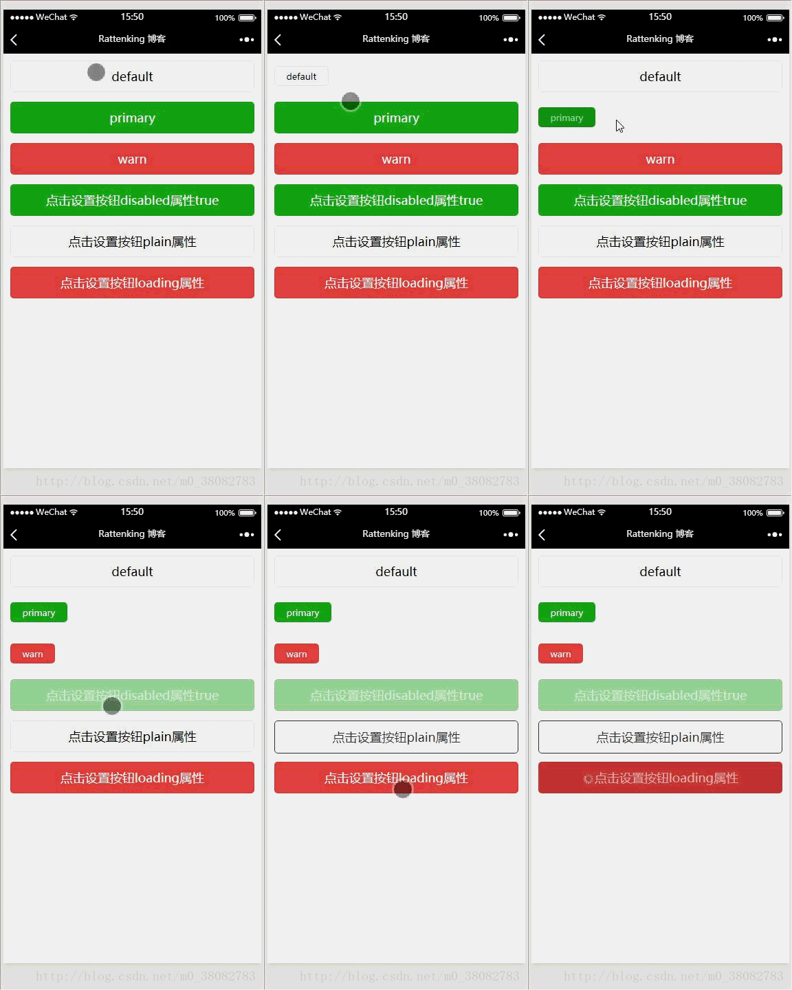
This article mainly introduces the use of the WeChat applet button component in detail. It has certain reference value. Interested friends can refer to it.
This article shares the WeChat applet button with everyone. How to use the component is for your reference. The specific content is as follows
Display rendering

Common attributes of button component
size: default, mini—default is a block-level button, mini is a small button
type: primary, default, warn—primary is submitted successfully, default is gray, warn Warning color
plain: true, false—whether the button is hollow and the background color is transparent
WXSS
.tui-btn-group{ padding: 10px; } .tui-btn-content{ height: 60px; line-height: 60px; } /** 修改button默认的点击态样式类**/ .button-hover { background-color: red; } /** 添加自定义button点击态样式类**/ .other-button-hover { background-color: blue; }
JS
var types = ['default', 'primary', 'warn'] var pageObject = { data: { defaultSize: 'default', primarySize: 'default', warnSize: 'default', disabled: false, plain: false, loading: false }, setDisabled: function (e) { this.setData({ disabled: !this.data.disabled }) }, setPlain: function (e) { this.setData({ plain: !this.data.plain }) }, setLoading: function (e) { this.setData({ loading: !this.data.loading }) } } //循环给'default', 'primary', 'warn'按钮创建函数 for (var i = 0; i < types.length; ++i) { (function (type) { pageObject[type] = function (e) { var key = type + 'Size' var changedData = {} changedData[key] = this.data[key] === 'default' ? 'mini' : 'default' this.setData(changedData) } })(types[i]) } Page(pageObject);
The above is what I compiled for everyone. I hope it will be helpful to everyone in the future.
Related articles:
What are the differences between let and var defining variables in js? Nuxt.js Vue server-side rendering exploration VUE personal summary (problems encountered)The above is the detailed content of Instructions for using button components in WeChat mini programs. For more information, please follow other related articles on the PHP Chinese website!
 What is the difference between css framework and component library
 string to int
 Web page opens slowly
 How to solve deletefile error code 5
 What are the international mailboxes?
 Change word background color to white
 The difference between pascal language and c language
 How to execute scheduled tasks in java


