Green is a more moderate color between yellow and blue (warm and cold), which makes green the most peaceful, stable, generous and tolerant character. It is a soft, quiet, contented, graceful and popular color. It is also one of the most widely used colors on web pages.
Green is closely related to human beings. It is the natural color of eternal prosperity, represents life and hope, and is also full of youthful vitality. Green symbolizes peace and security, development and vitality, comfort and tranquility, and relaxation. With rest, it can relieve eye fatigue.
It has a certain feeling related to nature and health, so it is often used on sites related to nature and health. Green is also often used in some companies’ public relations or educational sites.
Green can make our mood particularly bright. Yellow-green represents freshness, calmness, ease, peace, softness, spring, youth, and upgraded psychological feelings.
Below we will do different examples and analyzes based on color combinations such as adjacent colors with different attributes of the green system, high purity and low purity of the same color, contrasting colors, etc.

Green color analysis:
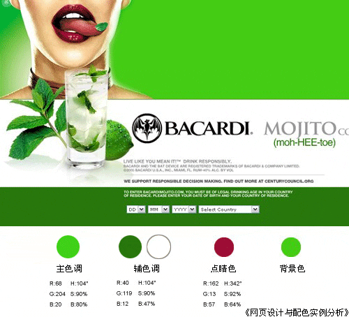
From the main colors in the picture above, It can be seen from the numerical value of the secondary hue HSB mode that the two colors only differ in brightness, and the displayed hue and saturation are the same. True green is 120 degrees. In terms of RGB values, these two colors are mixed with other colors to varying degrees, so they are slightly different from true green. Due to the characteristics of green itself, the entire webpage looks very stable and comfortable.
The auxiliary color only reduces the brightness, giving the page a sense of layering and space.
The white block surface brings out the best of the green characteristics and enhances the visual rhythm.
The finishing touch of color perfectly reflects the wonderful touch of "the finishing touch", which is extremely tempting. The entire page suddenly becomes vivid and refreshing, enhancing the expressive power of the page theme.
Conclusion:
The main and auxiliary colors belong to the same color green system. Through the change of different brightness, the change can be more gradual and gentle, but also more obvious. It reflects the color layering of the page. If it is not analyzed and judged through numerical values, some friends may judge based on experience, and it is easy to mistakenly believe that the purity of the two colors may be different except for the brightness. At this time, it is easy to get the correct conclusion by using the numerical mode appropriately.
The entire page has very few colors: emerald green for the largest color block, white for the second area, and dark green for the third area, but the effect obtained is strong and eye-catching, fully displaying the product theme. Purpose.
Dark green gives people a psychological feeling of lushness, health, maturity, stability, life, and openness.

Green system analysis: (High purity color matching: green contrast color combination )
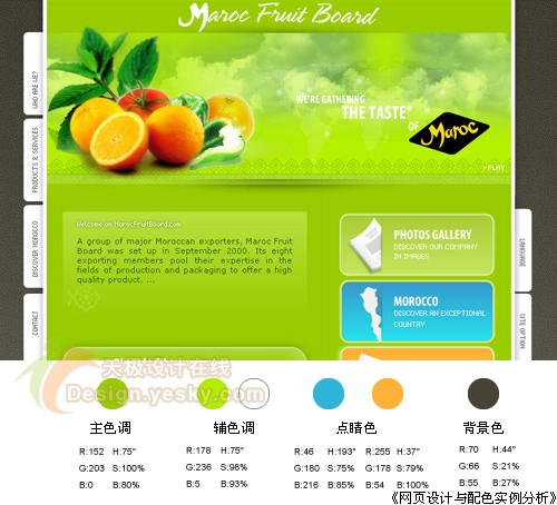
HSB value H shows that 60 degrees is true yellow, and the main and auxiliary colors are only tilted a little bit towards green - H is 75 degrees. A large area of yellow-green with slightly lower brightness is the main color, but the saturation is very high, reaching 100%. The auxiliary colors use tender green and white to increase the brightness. These two auxiliary colors not only increase the layering of the page, but also It can give the entire page a translucent color scheme and enhance the green characteristics. The dark brown background undoubtedly makes all the solid colors in the foreground shine brightly on the stage.
This page has two sets of small contrasting colors, one is yellow-green and orange-red, and the other is orange-yellow and sky blue. Strictly speaking, these two sets of colors are not contrasting colors, because there are so many colors. Some deviations. Although their saturation is reduced, they are enough to constitute the loudest tones in this page, making the entire page very active and vivid.
Conclusion:
The main and auxiliary colors of yellow and green are not dazzling when used in large areas, but make the page look very energetic and energetic.
When appropriately using contrasting color combinations of different purity, which are not strictly contrasting colors, the main role that can usually be played is to clarify the relationship between primary and secondary. Although the contrast characteristics of non-"standard" contrasting colors are weakened and the page colors look easy to coordinate and soft, they can still highlight the theme. → An example of a light green webpage of the same color:

Green color analysis: ( Similar color (light green)
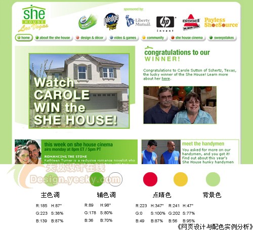
The main color green attribute is light green with high brightness. As mentioned earlier, usually the higher the brightness, the lower the saturation, and the lower the saturation, the lower the page color. Reduce the color, unless the color itself has its own characteristics, and add a large area of auxiliary color white, the entire page looks very light, soft, tranquil, and even warm.
Gradient light green is used on the page, making the entire page visually softer and more comfortable.
Although the accent color only appears on the main logo and only a little on the buttons, it also brings some color highlights to the entire page. In particular, the H value of the red HSB mode shows that the color is close to true red, and the saturation reaches the highest value. Another key color is yellow, which visually appears on the page as a contrasting color of green and red, which plays a role in relaxing the vision. Because on the color wheel, yellow is the transition color between green and red.
Conclusion:
Light green has a feeling of elegance, rest, security, harmony, tranquility and softness.
The gradient effect can further deepen this impression. However, when there are too many light colors in the page color scheme, the entire page will easily appear "grey". This requires adding an appropriate amount of slightly higher purity colors, such as the auxiliary color green block in the lower left corner. Appropriate bright accents can be very good. Solve this problem.