News from this site on January 17, at this year’s CES 2024, Honda showed off a series of new electric vehicles with an updated “H” logo.
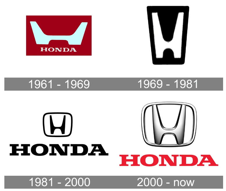
In the latest official announcement, Honda finally announced the logo change. gave up the skeuomorphic metallic logo and chose a flatter and simpler symbol version . This new version actually dates back to the brand’s original logo from 1961.

Honda says the current "H" logo has a rich history, dating back to 1981. In order to adapt to the development of the next generation of electric vehicles, Honda decided to design a new "H" logo to express Honda's determination to pursue transformation and its corporate attitude of transcending Honda's roots and constantly pursuing new breakthroughs. The new design expression is like two outstretched hands, representing Honda's commitment to enhancing the possibilities of mobility and sincerely serving the needs of Honda electric vehicle users. This new "H" logo will be used on Honda's next generation of electric vehicles, including Honda 0 Series models (Note from this site: Honda announced two concept cars at CES 2024).

Judging from the historical changes of Honda Logo, it indeed confirms the saying that "popularity is a circle". The official found it from the original version of the Logo. It’s just more concise. Do you think this new logo looks good?

The above is the detailed content of Honda redesigned its logo using a flat skeuomorphic style, inspired by the original logo design in 1961. For more information, please follow other related articles on the PHP Chinese website!
 How much is Snapdragon 8gen2 equivalent to Apple?
 How to resolve WerFault.exe application error
 absolutelayout
 Mongodb and mysql are easy to use and recommended
 number_format usage
 rgb to hexadecimal conversion
 How to make charts and data analysis charts in PPT
 What are the commonly used third-party libraries in PHP?


