SVG supported masks
SVG supports a variety of mask effects. Using these features, we can create many cool effects. As for whether mask is called "mask" or "mask" in Chinese, we won't distinguish it. Here we call it mask.
Mask types supported by SVG:
1. Clipping path (clipping path)
The clipping path is a graphic composed of path, text or basic graphics. All graphics within the clipping path are visible, and all graphics outside the clipping path are invisible.
2. Mask/mask
A mask is a container that defines a set of shapes and uses them as a semi-transparent medium that can be used to combine foreground objects and background.
An important difference between the clipping path and other masks is that the clipping path is a 1-bit mask, which means that the object covered by the clipping path is either fully transparent (visible, located inside the clipping path), or fully opaque (Invisible, outside the clipping path). The mask can specify the transparency at different locations.
Clip path of the window - overflow and clip properties
The overflow attribute and clip attribute of the HTML element jointly set the clipping behavior of the content of the element. Similarly, in SVG, these two attributes can also be used.
overflow = visible | hidden | scroll | auto | inherit
The overflow attribute defines the behavior to be taken when the content of the element exceeds the element's border.
This attribute can be used for elements that can create new windows (svg, symbol, image, foreignObject), pattern and marker elements. The value meaning of this attribute is as follows:
visible: Display all content, even if the content is already outside the element's border, this is the default value.
hidden: Hide content beyond the clipping path. The clipping path is specified by the clip property.
scroll: Use the form of a scroll bar to present excess content.
auto: Use browser-defined behavior, this seems unreliable.
This attribute is basically the same as the attribute of the same name in CSS2, except that in SVG, there are some different processing processes:
1. The overflow attribute is for elements other than creating new windows (svg, symbol, image, foreignObject) , elements other than pattern and marker elements have no effect.
2. The clipping path corresponds to the window. When a new window is created, a new clipping path is created. The default clipping path is the viewport boundary.
clip =
This attribute can be used for elements that can create new windows (svg, symbol, image, foreignObject), pattern and marker elements. This property has the same parameters as the CSS2 property of the same name. auto means that the clipping path is consistent with the window border. When using graphics as parameters (setting the top, right, bottom and left values of the cropping rectangle), you can use user coordinate values (that is, coordinates without units). For example:
The clipping path of the object - clipPath element
The clipping path is defined using the clipPath element and then referenced using the clip-path attribute.
clipPath can contain path elements, text elements, basic graphic elements (circle, etc.) and use elements. If it is a use element, it must directly reference path, text or basic graphic elements, and cannot reference other elements.
Note that the clipping path is just a one-bit mask layer, the path is the union of all the elements it contains. Objects in this collection can be displayed, objects not in this range will not be displayed. The algorithm that determines whether the specific decision point is within the range is specified by the "clip-rule" attribute.
For graphic objects, the clipping path is equal to the union of the clipping path set by its own clip-path and the clipping paths of all outer elements (including the clipping paths set by clip-path and overflow). Note a few points:
1. The clipPath element itself does not inherit the clipping path defined by clipPath from the outer node.
2. The clipPath element itself can set the clip-path attribute. The effect is the intersection of two paths.
3. The child elements of the clipPath element can set the clip-path attribute: the effect is the union of the two paths.
4. An empty clipping path will cut off all content within the element.
Let’s take a look at several important attributes:
clipPathUnits = "userSpaceOnUse(Default value) | objectBoundingBox"
This attribute defines the coordinates used by the clipPath element System, these two values we are all familiar with, are the user coordinate system of the element that refers to the current clipping path and the bounding box scale value.
The clipPath element is never rendered directly, but is referenced through clip-path, so setting the display attribute of the clipPath element has no effect.
clip-path = "
Needless to say, this attribute is used to reference the clipping path , it should be noted here that all container elements, basic graphic elements and clipPath elements can use this attribute.
clip-rule = "nonzero(Default value) | evenodd | inherit"
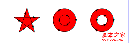
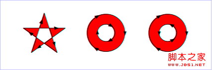
This attribute is used to determine which points belong to the points inside the clipping path. For simple closed shapes, this is easy to determine, but for complex shapes with holes inside, there is a difference. The value of this attribute has the same meaning as the value of fill-rule:
nonzero: The algorithm used for this value is: emit a line in any direction from the point to be determined, and then calculate the direction of the intersection of the graph and the line segment. ; The calculation result starts from 0, and every time a line segment at an intersection is from left to right, add 1; every time a line segment at an intersection is from right to left, decrease 1; after calculating all intersections, If the result of this calculation is not equal to 0, then the point is within the graph and needs to be filled; if the value is equal to 0, then the point is outside the graph and does not need to be filled. Look at the example below:

evenodd: The algorithm used for this value is: launch a line in any direction from the point to be determined, and then calculate the number of intersections between the graph and the line segment. If the number is an odd number, change the point within the graph. Filling is required; if the number is an even number, the points are outside the graphic and do not need to be filled. Look at the example below:

The clip-rule attribute can only be used on internal graphic elements of the clipPath element. For example, the following settings work:
Mask - mask element
In SVG, you can specify any graphic element or g element as a mask for the rendered object to combine the rendered objects. into the background.
The mask is defined with the mask element. When using the mask, you only need to reference the mask in the mask attribute of the object.
The mask element can contain any graphic elements and container elements (such as g).
In fact, everyone knows the effect of the mask. It basically calculates a final transparency based on the color and transparency of each point in the mask, and then when rendering the object, mask this with different transparency on the object. The mask layer reflects the blocking effect of the mask. For rendering objects, only the parts within the mask will be rendered according to the transparency of the points on the mask, and the parts not within the mask will not be displayed. Look at the example below: