


Using 3d transform, we can move elements to the x-axis, y-axis and z-axis. The following are some methods of CSS3 3D transform-
The following methods are used to call 3D transform-
| Sr.No. | Value and Description |
|---|---|
| 1 | matrix3d(n,n, n,n,n,n,n,n,n,n,n, n,n,n,n,n) is used to transform elements using the 16 values of the matrix |
| 2 | translate3d(x,y,z) Used to transform elements using the x-axis, y-axis and z-axis |
| translateX(x) | For transforming elements using the x-axis |
| translateY(y) | Used to transform elements using the y-axis |
| translateZ(z) | Used to Transform elements using the y-axis |
<!DOCTYPE html>
<html>
<head>
<style>
body {
   font-family: "Segoe UI", Tahoma, Geneva, Verdana, sans-serif;
}
.container {
   display: inline-block;
   width: 200px;
   height: 200px;
   border: 1px solid #CCC;
   margin-left: 20px;
}
.rotateX {
   width: 100%;
   height: 100%;
   background: rgb(52, 0, 241);
   transform: perspective(600px) rotateX(85deg);
}
.rotateY {
   width: 100%;
   height: 100%;
   background: rgb(55, 0, 255);
   transform: perspective(600px) rotateY(75deg);
}
.translateZ{
   width: 100%;
   height: 100%;
   background: rgb(55, 0, 255);
   transform: perspective(600px) translateZ(-200px);
}
</style>
</head>
<body>
<h1>3D transform function example</h1>
<div class="container">
<div class="rotateX"></div>
</div>
<div class="container">
<div class="rotateY"></div>
</div>
<div class="container">
<div class="translateZ"></div>
</div>
</body>
</html>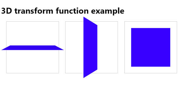
The above is the detailed content of Using CSS3 3D transform functions. For more information, please follow other related articles on the PHP Chinese website!


![[Web front-end] Node.js quick start](https://img.php.cn/upload/course/000/000/067/662b5d34ba7c0227.png)


