otive graphs graphically represent the cumulative distribution function (CDF) of a set of data, sometimes called a cumulative frequency curve. It is used to examine data distribution and discover patterns and trends. Matplotlib, Pandas, and Numpy are some of the libraries and tools provided by Python for creating otive graphics. In this tutorial, we will look at how to use Matplotlib to generate ogive graphics in Python.
To create a cumulative curve chart, we need to import the required libraries. In this example we will use Matplotlib, Pandas and Numpy. Matplotlib is a popular data visualization library for creating interactive charts and graphs in Python. Numpy, on the other hand, is used to perform complex mathematical operations. Pandas is another widely used Python library specialized for data manipulation and analysis.
plt.plot(*np.histogram(data, bins), 'o-')
In this syntax, 'data' is the data set used to create the cumulative curve chart. The frequency distribution of the data is determined by the 'np.histogram' function, which also returns the histogram's values and bin boundaries. Use 'plt.plot' to create a cumulative curve plot, using the ' 'o-' ' format string to plot the data points and connect them with lines. The '*' operator then passes the histogram values and bin bounds as separate arguments to 'plt.plot'.
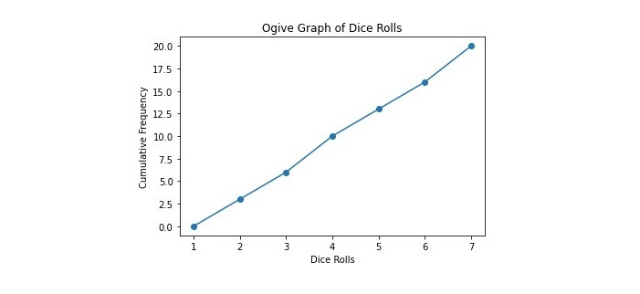
This is a simple example that creates an ogive plot to visualize the cumulative frequency distribution of a list of dice throws.
import numpy as np
import matplotlib.pyplot as plt

# List of dice rolls
rolls = [1, 2, 3, 4, 5, 6, 3, 6, 2, 5, 1, 6, 4, 2, 3, 5, 1, 4, 6, 3]

# Calculate the cumulative frequency
bins = np.arange(0, 8, 1)
freq, bins = np.histogram(rolls, bins=bins)
cumulative_freq = np.cumsum(freq)

# Create the ogive graph
plt.plot(bins[1:], cumulative_freq, '-o')
plt.xlabel('Dice Rolls')
plt.ylabel('Cumulative Frequency')
plt.title('Ogive Graph of Dice Rolls')
plt.show()
First, we created an ogive plot to visualize the cumulative frequency distribution of a set of dice throw results, by importing the necessary modules NumPy and Matplotlib. Then, the code defines a set of dice rolling results and uses NumPy's histogram function to generate a "histogram" of the data, specifying the number of groups and value range of the data. Next, use NumPy’s ‘cumsum’ function to represent the cumulative frequency of the data.
Finally, use Matplotlib's "plot" function to plot the cumulative frequencies as a logarithmic plot, with the upper limit of each bin used as the x-axis, forming an ogive plot. The resulting ogive plot shows the cumulative frequency distribution of dice throws, where the x-axis represents the values rolled and the y-axis represents the cumulative frequency of those values up to a certain point. This graph can be used to analyze the frequency and distribution of dice throws.

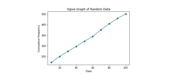
This example demonstrates an ogive plot for visualizing the distribution of 500 random numbers between 0 and 100.
import numpy as np
import matplotlib.pyplot as plt

# Generate random data
data = np.random.randint(0, 100, 500)

# Calculate the cumulative frequency
bins = np.arange(0, 110, 10)
freq, bins = np.histogram(data, bins=bins)
cumulative_freq = np.cumsum(freq)

# Create the ogive graph
plt.plot(bins[1:], cumulative_freq, '-o')
plt.xlabel('Data')
plt.ylabel('Cumulative Frequency')
plt.title('Ogive Graph of Random Data')
plt.show()
In this example, we first use NumPy to generate a data set containing 500 random numbers between 0 and 100. Then use NumPy to calculate the cumulative frequency of the data, and the interval width of each frequency is 10. Finally, use Matplotlib to plot the relationship between the cumulative frequency and the upper limit of each interval to generate an ogive plot. This example demonstrates how to create an ogive plot using Python and randomly generated data.

We learned to use the Matplotlib module to create cumulative curve plots in Python, which is a simple process using the matplotlib library. By loading your data, calculating cumulative frequencies, and plotting the results, you can easily visualize the distribution of your data set and identify any patterns or trends. You can customize your graphics with labels, titles, and styles to make them more visually appealing and informative. Cumulative line graphs are useful tools in statistical analysis and can represent a variety of data, from income distributions to test scores.
The above is the detailed content of How to create a cumulative curve graph in Python?. For more information, please follow other related articles on the PHP Chinese website!