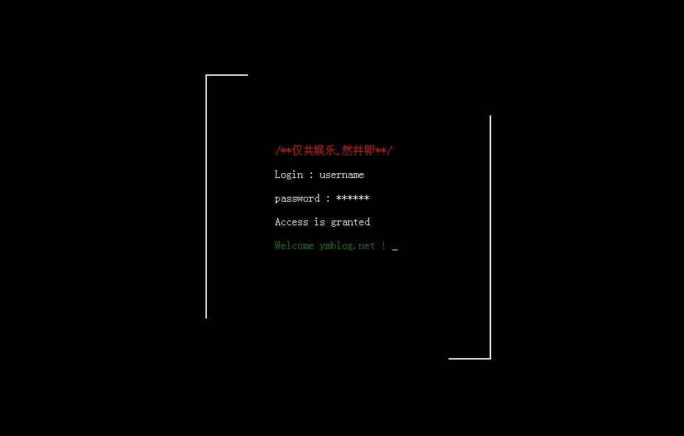
Attached to you is the rendering:

When I was working on a project recently, I needed to achieve a typing effect where characters appear one by one. I used the clip css animation of CSS to achieve it. Combined with the typewriter effect I wrote, the whole thing
When combined, the effect is great.
Let’s talk about this line first. We will see that it is a line. In fact, it is a border that is regularly displayed and hidden. Then the after and before attributes must come to mind here.
Let’s consider after for now.
Create a box first, and then a border
 <div class="box"></div>
 .box:before{
 content: '';
 position: absolute;
 width:px;height: px;border:px red solid;
 left:-px;top:-px;
 z-index: ;
}The next thing to do is to show and hide it regularly. The clip attribute is used here. I talked about it in this article: The implementation principle of the CSS circular percentage progress bar.
Let’s talk about how to implement this here. First of all, I want this to display the top border-left-bottom-right, so there is a loop. According to clip, rect (top, right, bottom,
Left), for example, if the top border is displayed, then it is:
clip:rect(px,px,px,px);
We just need to use animation to display it in sequence
@-webkit-keyframes clipMe{
%{ clip: rect(px, px, px, px); }
%{ clip: rect(px, px, px, px); }
%{ clip: rect(px, px, px, px); }
%{ clip: rect(px, px, px, px); }
%{ clip: rect(px, px, px, px); }
} Then call the display in after:
.box:after{
-webkit-animation:clipMe s linear infinite;
}Of course, it’s ok if we add an identical before. Their time interval is s. Note here that if you delay s, then what you will see in s is the entire
A border appears, change it to delay-s here, and this problem will be solved perfectly.
.box:before{
-webkit-animation:clipMe s -s linear infinite;
}/***************************************************************/
Let’s talk about the typewriter. The typewriter is nothing more than constantly replacing the displayed characters and displaying them on the screen. First, get the content in the box,
<div class="box">
<span>/**仅共娱乐,然并卵**/</span>
<p>Login : Jmingzi</p>
<p>password : ******</p>
<p>Access is granted</p>
<span>Welcome ymblog.net !</span>
</div>
After obtaining, replace the display one by one,
var t = setInterval(function(){
str = con.substr(, strlen) + "_";
me.obj.html(str);
//内容打印完毕
if(strlen == con.length){
clearInterval(t);
}
strlen = strlen + ;
}, me.speed);
Here I just encapsulate it into a class to facilitate initialization of some parameters. The complete code:
//初始化工作,获取几段文字内容,将它们隐藏后逐个显示即可
$(function(){
function Type(obj, speed, welcome){
this.obj = obj;
this.speed = speed;
this.welcome = welcome;
}
Type.prototype = {
init : function(){
var str = this.obj.html();
this.obj.html(this.welcome);
this.add(str);
},
add : function(con){
var me = this;
var str;
var strlen = ;
var t = setInterval(function(){
str = con.substr(, strlen) + "_";
me.obj.html(str);
//内容打印完毕
if(strlen == con.length){
clearInterval(t);
}
strlen = strlen + ;
}, me.speed);
}
}
var a = new Type($('.box'), , '正在初始化...');
a.init();
});The above is the entire content of this article, I hope it will be helpful to everyone


