ROC Analysis and area under the curve (AUC) are widely used tools in data science, borrowed from signal processing, to evaluate the quality of models under different parameterizations, Or compare the performance of two or more models.
Traditional performance metrics, such as precision and recall, rely heavily on the observation of positive samples. Therefore, ROC and AUC evaluate quality using true positive and false positive rates, taking into account both positive and negative observations.
There are multiple steps in the process from decomposing a problem to using machine learning to solve it. It involves data collection, cleaning and feature engineering, building the model, and finally, evaluating the model performance.
When you evaluate the quality of a model, you typically use metrics such as precision and recall, also known as confidence and sensitivity, respectively, in the field of data mining.
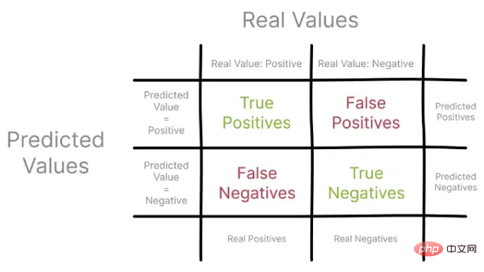
These metrics compare predicted values to actual observations, usually from a holdout set, visualized using a confusion matrix.

Let’s first focus on accuracy, also known as positive predictive value. Using a confusion matrix, you can construct Precision as the ratio of all true positives to all predicted positives.

Recall, also known as true positive rate, represents the ratio of true positives to all observed and predicted positives.

Using different sets of observations in a confusion matrix to describe Precision and Recall, you can start to understand how these metrics inform the model Performance view.
It is worth noting that Precision and Recall only focus on positive examples and predictions, without considering any negative examples. Furthermore, they do not compare the model's performance to the median scenario, which is just a random guess.
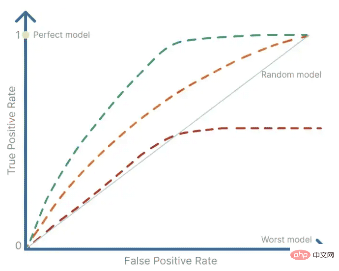
ROC is a summary tool used to visualize the trade-off between Precision and Recall. ROC analysis uses an ROC curve to determine how much of a binary signal's value is contaminated by noise, i.e., randomness. It provides a summary of sensitivity and specificity for a continuous predictor over a range of operating points. The ROC curve is obtained by plotting the false positive rate on the x-axis against the true positive rate on the y-axis.
Because the true positive rate is the probability of detecting a signal, and the false positive rate is the probability of a false positive, ROC analysis is also widely used in medical research to determine the threshold that reliably detects disease or other behavior.

A perfect model would have a false positive rate and a true positive rate equal to 1, so it would be the single operating point in the upper left corner of the ROC plot. And the worst possible model will have a single operating point in the lower left corner of the ROC plot where the false positive rate equals 1 and the true positive rate equals 0.
The random guessing model has a 50% chance of correctly predicting the outcome, so the false positive rate will always equal the true positive rate. This is why there is a diagonal line in the graph, which represents a 50/50 probability of detecting signal versus noise.
To fully analyze the ROC curve and compare the performance of the model with several other models, you actually need to calculate the area under the curve (AUC), also in the literature is called the c statistic. The area under the curve (AUC) has a value between 0 and 1 because the curve is plotted on a 1x1 grid and parallel to signal theory, it is a measure of signal detectability.
This is a very useful statistic as it gives us an idea of how well the model ranks real observations versus false observations. It is actually a normalized version of the Wilcoxon-Mann-Whitney rank sum test, which tests the null hypothesis where two ordered measurement samples are drawn from a single distribution.
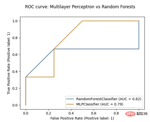
To plot a ROC curve and calculate the area under the curve (AUC), you decide to use SckitLearn's RocCurveDisplay method and compare a multilayer perceptron to a random forest model in an attempt to solve the same classification task.
import matplotlib.pyplot as plt
from sklearn.ensemble import RandomForestClassifier
from sklearn.metrics import roc_auc_score, RocCurveDisplay
def plot_roc(model, test_features, test_targets):
    """
    Plotting the ROC curve for a given Model and the ROC curve for a Random Forests Models
    """
    # comparing the given model with a Random Forests model
    random_forests_model = RandomForestClassifier(random_state=42)
    random_forests_model.fit(train_features, train_targets)
    rfc_disp = RocCurveDisplay.from_estimator(random_forests_model, test_features, test_targets)
    model_disp = RocCurveDisplay.from_estimator(model, test_features, test_targets, ax=rfc_disp.ax_)
    model_disp.figure_.suptitle("ROC curve: Multilayer Perceptron vs Random Forests")
    plt.show()
# using perceptron model as input
plot_roc(ml_percetron_model, test_features, test_targets)
The above is the detailed content of What are python model performance ROC and AUC. For more information, please follow other related articles on the PHP Chinese website!


