Soon, Stable Diffusion was discovered for a new purpose -
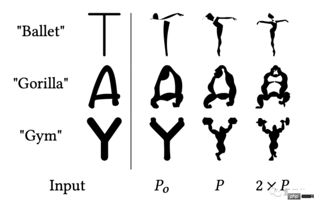
The most critical "combination of form and meaning" in designing a LOGO is clearly understood by it. I saw Cat drawing a cat head in seconds:

## Yoga shop YOGA The letters are transformed into human form, and the style is absolutely correct:

It’s okay to design only one of the characters. For example, draw the D of Dog as a dog:
It’s really simple and expressive, isn’t it?
Even when faced with Chinese fonts, AI can understand the meaning very well and quickly draw the LOGO image that Party A wants to convey:

If you open a store and use this, why do you need to spend tens or hundreds of dollars to design a LOGO? (doge)
Although there have been many AIs that designed LOGOs before, judging from the effect generated this time, it is really a bit different.
Keep part of the flavor of the original font
In fact, before this study, there were already many studies considering how to use AI to design LOGOs.
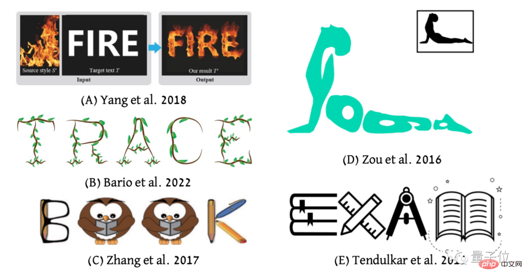
From the effect point of view, it can be mainly divided into three categories:
The first is to use the font as the shape restriction to transfer the picture style (as shown in Figure AB); the second is to use the picture style as the basis, Migrate fonts to pictures (Figure D); third, associate the shapes and fonts of different pictures to generate a color or black and white "image splicing" style LOGO design (Figure CE).

However, compared with the LOGO designed by humans below, the effect of the AI design above cannot be said to be unsightly, but it seems to be a little less meaningful:

After a thorough investigation, the authors found that LOGOs designed by humans are not "obscene and unobtrusive".
Human designers will retain the original font features so that people can recognize the word at a glance, and then add a little innovation, such as changing the J in Jazz to a musical instrument, but other people can still recognize it at a glance. Recognize the shape of the "JAZZ" font.
Generally speaking, it is to retain part of the "flavor" of the font while adding a certain sense of design.

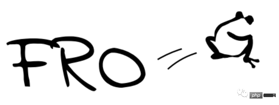
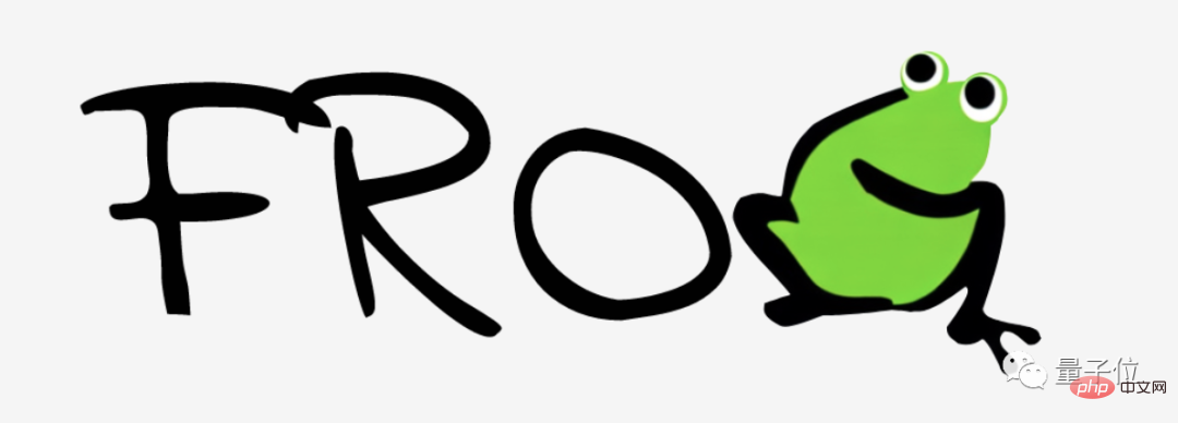
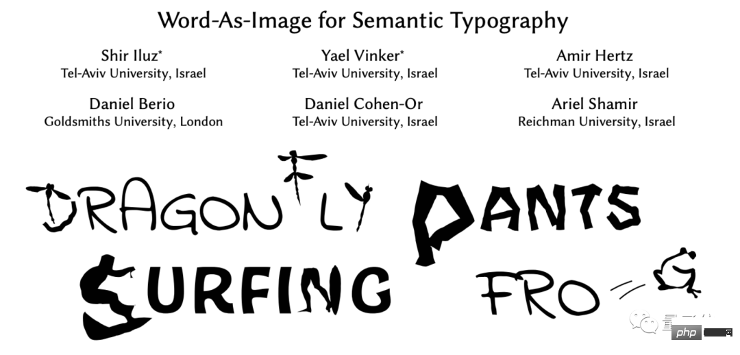
For example, this is the "FROG" design generated by Stable Diffusion. FRO is still the shape of the original font, only G becomes a little frog jumping out:

If you use Stable Diffusion 2 for further post-processing, you can further realize the coloring function and look more vivid:

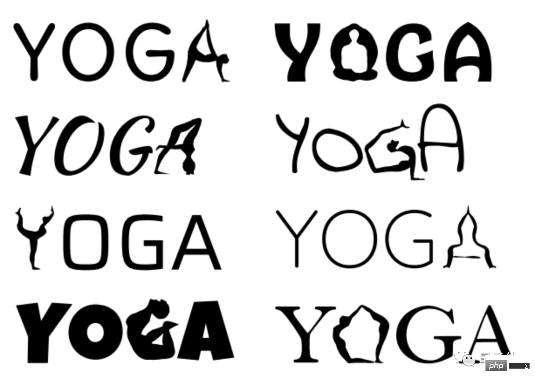
The style of the generated LOGO can also change with the change of the original design font.
For example, these are different yoga LOGOs generated in 8 fonts, each style is different:

In contrast, other AI models When generating fonts, I prefer to keep my own style (manual dog head):

So, how does this magical font design AI create it?
Using Bezier curves to adjust letter shapes
In order to retain the style of the original font to a certain extent and only change certain letters in the word, the authors came up with a "fine-tuning" The letter shape method -
is to let the AI learn to use Bezier curves to slightly deform letters in different fonts.
(Friends who have used the "pen" in PS should be familiar with Bezier curves. Use it to control the mouse to draw some magical curves)
The specific number of control points will be iteratively transformed according to the complexity of the letters and the font style until the designed letters meet the requirements. Orange is the initial point, and blue is the subsequent control points added:

#How much influence does the number of control points have on the generation effect?
For example, this is the effect of using different numbers of control points to generate letters. If the number is too small, the designed image shape will be unclear; but if the number is too large, it will easily distort the original shape of the font:

Based on this core design idea, the authors combined Stable Diffusion and CLIP to design an entire font design AI model:

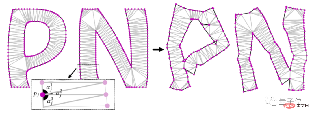
Among them, the ACAP (as conformal as possible) loss function is based on the Delaunay triangulation algorithm, which further constrains the letter shape.
For example, this is the form of PANTS (pants) before and after deformation. You can see that ACAP retains the font effect while retaining the form of the pants:

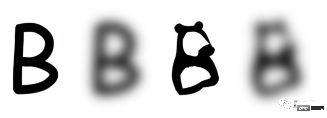
At the same time, in order to further preserve the font form, the authors used a low-pass filter to ensure that the adjusted letters do not deviate too much from the original letters. For example, this is the adjusted form of B in Bear:

Applying this set of models, the speed of generating each letter is also pretty good.
On an RTX 2080 GPU, it takes about 5 minutes to generate a single-letter LOGO design.
Introduction to the authors
Although the papers posted by the authors on the project homepage are anonymous:

But on arXiv, the authors Their names have been made public. They are from Tel Aviv University in Israel, Reichman University (Leichman University), and Goldsmiths College, University of London:

Co-author Shir Iluz, Master of Science in Electronics and Electrical Engineering from Tel Aviv University. His current research direction is generative AI, and his areas of interest are deep learning and computer vision.

##Co-author Yael Vinker, a doctoral student in computer vision at Tel Aviv University, received his undergraduate and master's degrees in computer science from the Hebrew University of Israel. His current research direction is also in deep learning and Computer Vision.

It seems that the 2 million yuan that Lei Jun spent on designing the Xiaomi LOGO was spent too early
Thesis address: https://arxiv.org/abs /2303.01818
Project address: https://wordasimage.github.io/Word-As-Image-Page/
The above is the detailed content of The effect of free AI LOGO design is amazing, Lei Jun spent 2 million too early. For more information, please follow other related articles on the PHP Chinese website!


