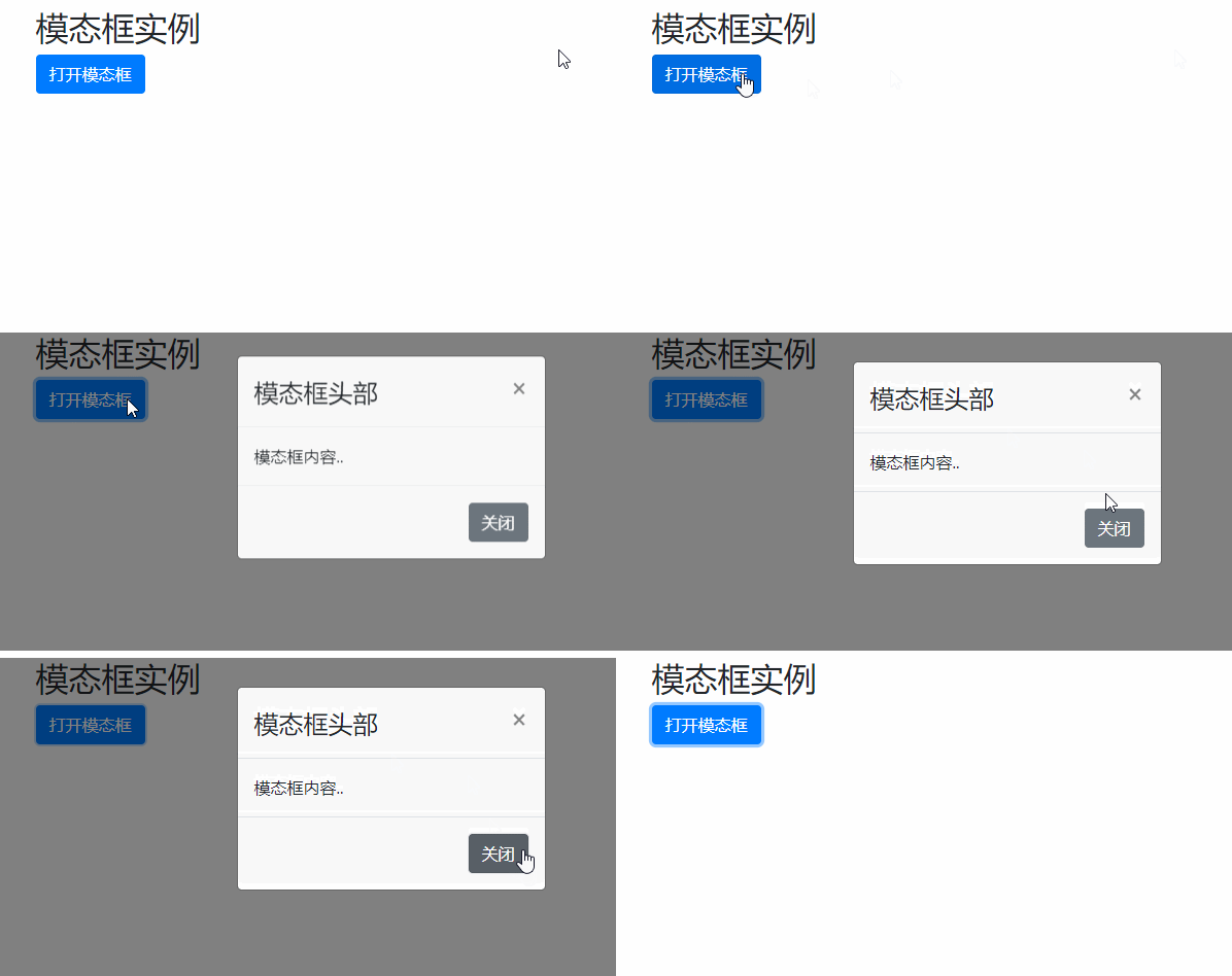
Bootstrap’s modal box is overlaid on the parent form and is a child form; the purpose of the modal box is to display content from a separate source without leaving the parent form. There are some interactions, subforms can provide information interaction, etc. You can create a small modal box by adding the ".modal-sm" class, and create a large modal box by adding the ".modal-lg" class.

The operating environment of this tutorial: Windows 10 system, bootstrap version 5, DELL G3 computer
Modal is a subform that covers the parent form. Typically, the purpose is to display content from a separate source that can have some interaction without leaving the parent form. Subforms can provide information interaction, etc.
How to create a modal box
The following example creates a simple modal box effect:
<!DOCTYPE html>
<html>
<head>
<title>Bootstrap 实例</title>
<meta charset="utf-8">
<meta name="viewport" content="width=device-width, initial-scale=1">
<link rel="stylesheet" href="https://cdn.staticfile.org/twitter-bootstrap/4.3.1/css/bootstrap.min.css">
<script src="https://cdn.staticfile.org/jquery/3.2.1/jquery.min.js"></script>
<script src="https://cdn.staticfile.org/popper.js/1.15.0/umd/popper.min.js"></script>
<script src="https://cdn.staticfile.org/twitter-bootstrap/4.3.1/js/bootstrap.min.js"></script>
</head>
<body>
<div class="container">
<h2>模态框实例</h2>
<!-- 按钮:用于打开模态框 -->
<button type="button" class="btn btn-primary" data-toggle="modal" data-target="#myModal">
打开模态框
</button>
<!-- 模态框 -->
<div class="modal fade" id="myModal">
<div class="modal-dialog">
<div class="modal-content">
<!-- 模态框头部 -->
<div class="modal-header">
<h4 class="modal-title">模态框头部</h4>
<button type="button" class="close" data-dismiss="modal">×</button>
</div>
<!-- 模态框主体 -->
<div class="modal-body">
模态框内容..
</div>
<!-- 模态框底部 -->
<div class="modal-footer">
<button type="button" class="btn btn-secondary" data-dismiss="modal">关闭</button>
</div>
</div>
</div>
</div>
</div>
</body>
</html>Output result:

Modal box size
We can create a small modal box by adding the .modal-sm class, and the .modal-lg class can create A large modal box.
The size class is placed after the .modal-dialog class of the
<!DOCTYPE html>
<html>
<head>
<title>Bootstrap 实例</title>
<meta charset="utf-8">
<meta name="viewport" content="width=device-width, initial-scale=1">
<link rel="stylesheet" href="https://cdn.staticfile.org/twitter-bootstrap/4.3.1/css/bootstrap.min.css">
<script src="https://cdn.staticfile.org/jquery/3.2.1/jquery.min.js"></script>
<script src="https://cdn.staticfile.org/popper.js/1.15.0/umd/popper.min.js"></script>
<script src="https://cdn.staticfile.org/twitter-bootstrap/4.3.1/js/bootstrap.min.js"></script>
</head>
<body>
<div class="container">
<h2>模态框实例</h2>
<!-- 按钮:用于打开模态框 -->
<button type="button" class="btn btn-primary" data-toggle="modal" data-target="#myModal">
打开模态框
</button>
<!-- 模态框 -->
<div class="modal fade" id="myModal">
<div class="modal-dialog modal-sm">
<div class="modal-content">
<!-- 模态框头部 -->
<div class="modal-header">
<h4 class="modal-title">模态框头部</h4>
<button type="button" class="close" data-dismiss="modal">×</button>
</div>
<!-- 模态框主体 -->
<div class="modal-body">
模态框内容..
</div>
<!-- 模态框底部 -->
<div class="modal-footer">
<button type="button" class="btn btn-secondary" data-dismiss="modal">关闭</button>
</div>
</div>
</div>
</div>
</div>
</body>
</html>Output result:

Related recommendations :bootstrap tutorial
The above is the detailed content of Where is the modal box of bootstrap?. For more information, please follow other related articles on the PHP Chinese website!
 Today's Toutiao gold coin is equal to 1 yuan
 How to configure the path environment variable in java
 What are the microcontroller programming software?
 Tutorial on making word document tables
 Cancel WeChat campaign
 How to export excel files from Kingsoft Documents
 How to use php web page source code
 How to set path environment variable