


This article brings you relevant knowledge about Python, which mainly organizes issues related to the basic parameters of matplotlib.pyplot drawing, including figure, xlabel, grid, etc., as follows Let's take a look, I hope it will be helpful to everyone.

[Related recommendations: Python3 video tutorial ]
The matplotlib library is a Python library Data visualization tool for drawing two-dimensional and three-dimensional charts
Features:
Use simple drawing statements to achieve complex drawing effects
Use interactive operations to achieve increasingly sophisticated graphic effects
Use embedded LaTex Output printing-level charts, scientific expressions and symbolic text
Achieve fine control over the components of the chart
Three drawing interfaces
pyplot: oriented to the current chart
axes: object-oriented
Pylab: following the matlab style
This article uses plot drawing (Displays the trend change of variables) to display the basic parameters of the drawing, using numpy The library obtains the drawing data (randomly), and the final graphics are not carefully thought out. Everything is mainly about displaying graphics parameters! ! !
Library used:
import matplotlib.pyplot as plt
import numpy as np
Usage: plt.plot(x, y, c, ls, lw, label, alpha, **kwargs)
x, Y: x, y axis value
C: Set color
LS: Line style of the folding diagram
# LW: The line width of the folding map
## Label: The label text of the markup content
## Alpha: Transparency
**kwargs: Specify the line2D attribute to be used
Usage: figure(num=None, figsize=None, dpi=None, facecolor=None,
edgecolor=None, frameon=True, FigureClass=Figure, clear=False, **kwargs)
num :
If this parameter is not provided, a new figure object will be created and the figure count will be increased. A numerical value that is stored in a numeric property of the figure object. If this parameter is present and a figure object corresponding to id exists, the figure object for id is activated. If the figur object corresponding to id does not exist, create it and return it. If the value of num is a string, the window title is set to this string
figsize: width and height in inches, the default value is rc figure.figsize (1 inch Equal to 2.54 cm)
dpi: figure resolution, the default value is rc figure.dpi
facecolor: Background color
plt.figure(figsize=(10, 10))
x = np.linspace(0.05, 10, 1000)  # 在0.05到10的区间中,等差选取1000个,端点不属于
y = np.sin(x)
plt.rcParams['font.sans-serif'] = ['SimHei']
plt.rcParams['axes.unicode_minus'] = False
plt.plot(x, y,
         color='red',
         ls='-',
         label='sinx')
plt.show()
 xlim() and ylim():Set the numerical display range of x and y axes
How to use :plt.xlim(xmin,xmax)
xmin:x 轴上的最小值
xmax:x 轴上的最大值
使用方法:plt.xlabel(fontsize, verticalalignment, horizontalalignment, rotation, bbox)
fontsize:数字或者(small,large,medium)
verticalalignment:距离坐标轴的位置(top,bottom,center,baseline)
hoizontalalignment:位置(center,right,left)
ratation:位置(vertical,horizontal,vertical)
bbox:添加边框
使用方法:plt.grid(linestyle, color)
使用方法:plt.axhline(y, c, ls, lw, label)
y:水平参考线的出发点
plt.figure(figsize=(10, 10))
x = np.linspace(0.05, 10, 1000)  # 在0.05到10的区间中,等差选取1000个,端点不属于
y = np.sin(x)
plt.rcParams['font.sans-serif'] = ['SimHei']
plt.rcParams['axes.unicode_minus'] = False
plt.plot(x, y,
         color='red',
         ls='-',
         label='sinx')
plt.xlim(1, 10)
plt.ylim(-1, 1)
plt.xlabel('x轴')
plt.ylabel('y轴')
plt.grid(ls=':',
         color='blue')  # 设置网格,颜色为蓝色
plt.axhline(0.5, color='green', lw=2, label="分割线")  # 绘制平行于x轴的水平参考线,绿色,名称
plt.show()
(上图中绿色的线即为axjline()添加的参考线)
使用方法:plt.axvspan( xmin, xmax ,facecolor, alpha)
xmin:参考区域的起始位置
xmax:参考区域的终止位置
facecolor:参考区域的填充颜色
alpha:参考区域填充颜色的透明度,[0~1]
注:其使用方法也可以用在 axhspan()上
在上一段代码添加
plt.axvspan(xmin=2,
            xmax=5,
            facecolor='r',
            alpha=0.2)  # 绘制垂直于x轴的参考区域
即得到(注意:此段是区域)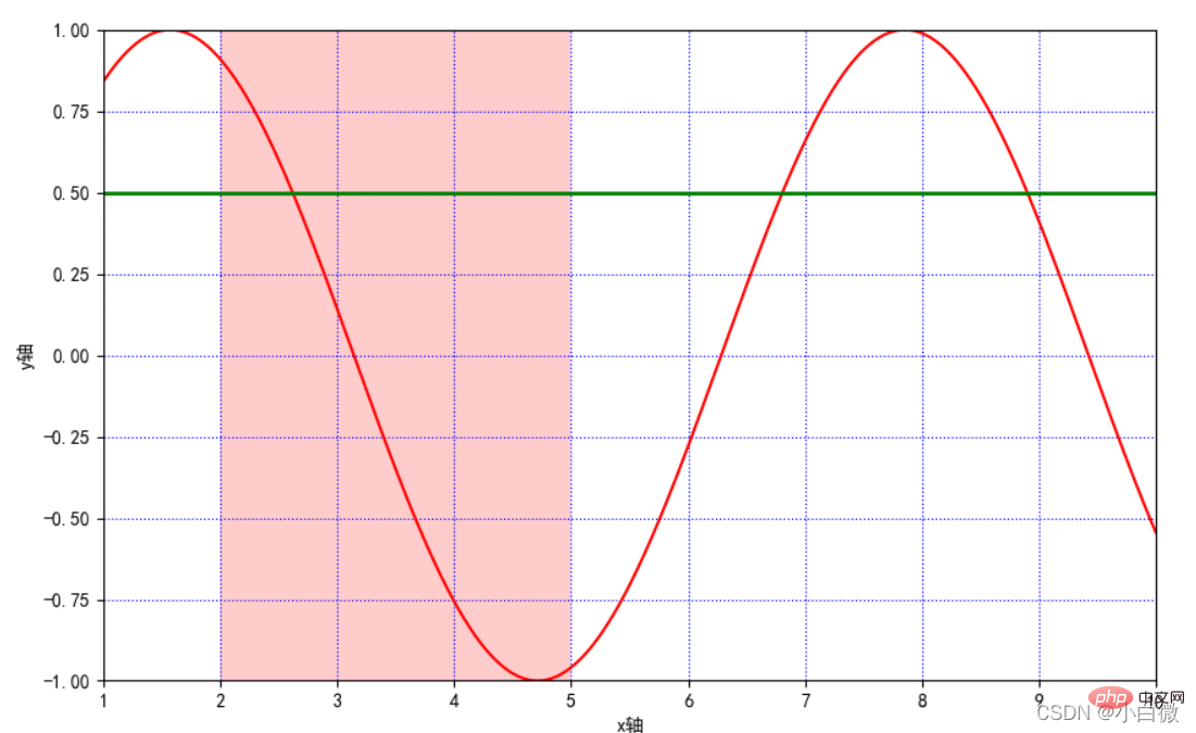
获取或设置当前 x 轴或 y 轴刻度位置和标签(即设置 x 或 y 轴的标 签)
可以理解为设置xilim和ylim一样的效果,但可以指定范围和距离
plt.xticks(list(range(0, 12, 1))) # 调整刻度范围和刻度标签
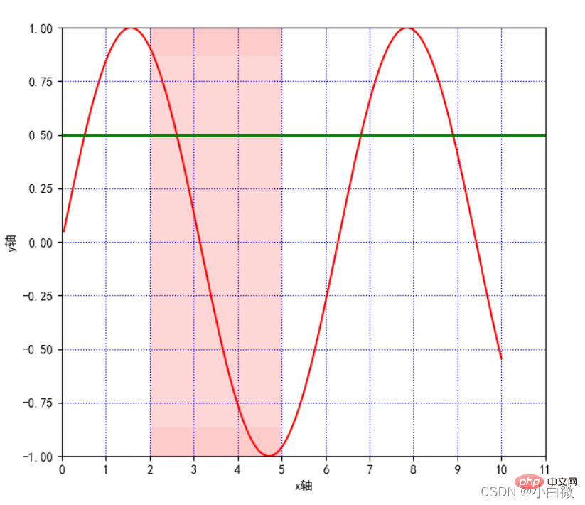
注意看x轴,从原来的0~10到现在的0~11,可以通过设置第三个参数设置步长,这里设置为1
函数方法:plt.annotate()
s:注释文本内容
xy:被注释的坐标点
xytext:注释文字的坐标位置
weight: Set the font line style (Ultralight, light, normal, regular, book, medium, roman, semibold, demibold, demi, bold, heavy, extrabold, black)
color: Set the font color; you can also set the RGB or RGBA type color; but it must be a floating point number between [0,1]
xycoords= The parameters are as follows
figure points: The points in the lower left corner of the figure
figure pixels: the pixels in the lower left corner of the figure
figure fraction: the lower left part of the figure
axes points: points at the lower left of the coordinate axis
axes pixels: the pixels at the lower left of the coordinate axis
data: Use the coordinate system of the annotated object
Arrow props: arrow parameters, parameter type is dictionary dict
width: the width of the arrow
headwidth: The width in points at the bottom of the arrow
headlength: the length of the arrow
shrink: part of the total length, "shrunk" from both ends
facecolor: arrow color (if the arrowstyle keyword is set, none of the above parameters can be used, but
To use these:
## because ##
##
##
####
####
#### 这里的黄色箭头和蓝色细长线即为参数方法添加的参数,实际使用过程中根据自己的实际所需使用,可以认为添加对图像的一些解释 (boxstyle:方框外形;circle:椭圆;darrow:双向箭头;larrow:箭头向左;rarrow:箭 头向右;round:圆角矩形;round4:椭长方形;roundtooth:波浪形边框 1;sawtooth: 波浪形边框 2;square:长方形) 函数方法:plt.text() x,y:表示坐标轴上的值
weight:
ultralightlight
normal
regular
book
medium
roman
semibold
demibold
demi
bold
heavy
extrabold
black
xycoodrds: figure points:图左下角的点
figure pixels:图左下角的像素
figure fraction:图的左下部分
axes points:坐标轴左下的点
data:使用被注释对象的坐标系统 arrowprops:箭头参数,参数类型为字典 dict
width:箭头的宽度
headwidth:箭头底部以点为单位的宽度
headlength:箭头的长度
shrink:总长度的一部分,从两端“收缩”
facecolor:箭头颜色 bbox:给标题增加外框
boxstyle:方框外形
circle:椭圆
darrow:双向箭头
larrow:箭头向左
rarrow:箭头向右
round:圆角矩形
round4:椭长方形
roundtooth:波浪形边框 1
sawtooth:波浪形边框 2
square:长方形
这里设置在坐标(1,1)上,即文字下面y=sinx的蓝色字段 使用方法:plt.legeng() 图例在图中的地理位置:
best
upper right
upper left
lower left
lower right
right
center left
center right
lower center
upper center
center plt.table(cellText=None, cellColours=None, cellloc='right' ,colWidths=None,
rowLabels=None,
rowColours=None,
collLabels=None,
colColours=None,
collloc='center', loc='bpttpm', bbox=None, edges='closed', **kwargs) cellText:表格单元格文本。类型为二维字符串列表
cellColours:表格单元格背景色。类型为二位颜色值列表
cellloc:表格单元格文本的对齐方式。默认值为right colWidths:表格单元格宽度。类型为浮点数列表
rowLabels:表格行表头文本。类型为字符串列表
rowColours:表格行表头背景色。类型为颜色列表
colLabels:表格列表头文本。类型为字符串列表
colLoc:表格行表头文本对齐方式。默认 right colColours:表格列表头背景色。类型为颜色列表
loc:单元格相对于子图的位置
bbox:绘制表格的边界框,如果此参数不为 None,将会覆盖 loc 参数
edges:单元格边线,该属性会影响各类单元格背景色 这串代码用于显示中文字符 无论画什么图,最后都得使用plt.show()用于展示图片,否则输出为空 【相关推荐:Python3视频教程 】plt.annotate('local',
xy=(2, 1),
xytext=(0.5, 0.5),
weight='bold',
color='red',
xycoords="data",
arrowprops=
dict(arrowstyle="->", connectionstyle='arc3', color='b'),
bbox=
dict(boxstyle="rarrow",
pad=0.6,
fc="yellow",
ec='k',
lw=1,
alpha=0.5)
)Copy after login
2.9 bbox:给标题增加外框
2.10 . text():添加图形内容细节的无指向型注释文本(水印)
plt.text(1, 1,
"y=sinx",
weight='bold',
color ='b')
Copy after login
2.11. title():添加图形内容的标题
plt.title("正弦函数")Copy after login
2.12. legend():标示不同图形的文本标签图例
plt.legend(loc="lower left") # 设置图例位置
Copy after login
2.13 table():向子图中添加表格
3. 完整代码显示
import matplotlib.pyplot as plt
import numpy as np
plt.figure(figsize=(10, 10))
x = np.linspace(0.05, 10, 1000) # 在0.05到10的区间中,等差选取1000个,端点不属于
y = np.sin(x)
plt.rcParams['font.sans-serif'] = ['SimHei']
plt.rcParams['axes.unicode_minus'] = False
plt.plot(x, y,
color='red',
ls='-',
label='sinx')
plt.xlim(1, 10)
plt.ylim(-1, 1)
plt.xlabel('x轴')
plt.ylabel('y轴')
plt.grid(ls=':',
color='blue') # 设置网格,颜色为蓝色
plt.axhline(0.5, color='green', lw=2, label="分割线") # 绘制平行于x轴的水平参考线,绿色,名称
plt.axvspan(xmin=2,
xmax=5,
facecolor='r',
alpha=0.2) # 绘制垂直于x轴的参考区域
plt.axhspan(ymin=(-3**0.5)/2,
ymax=(3**0.5)/2,
facecolor='w',
alpha=0.2)
plt.legend(loc="lower left") # 设置图例位置
plt.annotate('local',
             xy=(2, 1),
             xytext=(0.5, 0.5),
             weight='bold',
             color='red',
             xycoords="data",
             arrowprops=
             dict(arrowstyle="->", connectionstyle='arc3', color='b'),
             bbox=
             dict(boxstyle="rarrow",
                  pad=0.6,
                  fc="yellow",
                  ec='k',
                  lw=1,
                  alpha=0.5)
             )
plt.xticks(list(range(0, 12, 1))) # 调整刻度范围和刻度标签
plt.text(1, 1,
         "y=sinx",
         weight='bold',
         color ='b')
plt.title("正弦函数")
plt.show()Copy after loginplt.rcParams['font.sans-serif'] = ['SimHei']
plt.rcParams['axes.unicode_minus'] = False
Copy after login4.折线图的线条风格
   -:实线样式
   --:短横线样式
   -.:点划线样式
   ::虚线样式
    .:点标记
    O:圆标记
    V:倒三角标记
    ^:正三角标记
    <:左三角标记
    >:右三角表示
    1:下箭头标记13
    2:上箭头标记
    3:左箭头标记
    4:右箭头标记
    S:正方形标记
    p:五边形标记
    *:星形标记
    H:六边形标记
    +:加号标记
    X:x 标记
    D:菱形标记
    |:竖直线标记
    _:水平线标记
Copy after login5. 常用颜色缩写
b 蓝色
g 绿色
r 红色
c 青色
m 品红色·
y 黄色
k 黑色
w 白色
Copy after login
The above is the detailed content of Detailed explanation of the basic parameters of matplotlib.pyplot in Python visualization summary. For more information, please follow other related articles on the PHP Chinese website!


![[Web front-end] Node.js quick start](https://img.php.cn/upload/course/000/000/067/662b5d34ba7c0227.png)


