In bootstrap, rasterization refers to dividing a row of the browser into 12 columns, and then allocating the column width occupied by the corresponding elements according to the needs of the developed page; that is, dividing according to the size of the device. Segments, each segment has a fixed width, and responsive layout is achieved through percentages and media queries.

The operating environment of this tutorial: Windows10 system, bootstrap5 version, DELL G3 computer
In bootstrap, the principle of rasterization is to segment according to the size of the device, with a fixed width for each segment, and to implement responsive layout through percentages and media queries; this allows the same set of pages to adapt to devices with different resolutions.
Basic principle of grid layout: Grid divides the page into a certain number (assumed to be n) of basic width columns in the horizontal direction
Then the developer can add content to the page as needed The corresponding element is set so that it should occupy m columns wide. (m
My understanding: Rasterization is to divide a row of the browser into 12 columns and allocate the columns yourself.
Overview of Grid System
Grid System (Grid Systems) is a clear and neat design style that uses a fixed grid. Carry out web page layout. The grid system was first used in printing media. A printing layout is divided into several grids, which is very convenient for typesetting.
Later, the grid system was applied to web page layout. When using the responsive grid system for page layout, the web page can display different page structures according to different display terminals. For example, some modules will be arranged differently or hidden on small-screen devices.
Basic usage of Bootstrap grid system.
1. The Bootstrap grid system defines different classes for different screen widths. Just add the class name directly to the element.
2. Rows must be contained in a layout container so that they can be properly arranged and padded.
3. A group of columns can be created in the horizontal direction through rows, and only columns can be used as direct child elements of rows.
4. Use the style .row for rows and the style .col-*-* for columns. The content should be placed in the columns. When the number of columns is greater than 12, another row will be arranged.
Student Information Form Case
Case implementation ideas:
1. First, you need to create a p element with the class name row in the layout container as Row;
2. Then create columns inside the row container. The rows and columns in a layout container form a grid system.
3. The rows and columns in the grid system are similar to the rows and columns in the table.
1. Write HTML code
    <p>
        </p><p>
            </p><p>姓名</p>
            <p>年龄</p>
            <p>性别</p>

        <p>
            </p><p>张三</p>
            <p>25</p>
            <p>男</p>
2. Write CSS style
    .row {
        background-color: #eee;
        font-size: 30px;
    }
    .col-md-4 {
        border: 1px solid #fff;
        text-align: center;
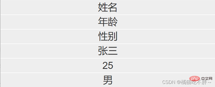
}When the browser display width is greater than 992px, the effect is as follows:
When the browser width is greater than 768px, the effect is as follows: 
When the browser width is less than 768px, the effect is as follows: 
Related recommendations: bootstrap tutorial
The above is the detailed content of what is bootstrap rasterization. For more information, please follow other related articles on the PHP Chinese website!
 How to restore normal printing when the printer is offline
 Which is more difficult, c language or python?
 What is the difference between php5 and php7
 How pycharm runs python files
 What should I do if my QQ account is stolen?
 Window.setInterval() method
 The role of server network card
 How to convert html files to pdf files