


How to implement responsive layout in css

How to implement responsive layout in css: 1. Use flex layout, which has the advantages of simple code and convenient layout; 2. Use absolute layout, combined with media to achieve responsive layout; 3. Use grid layout, which has the advantages It is easy to write; 4. Use float layout, which has the advantage of better compatibility.

The operating environment of this tutorial: Windows 7 system, CSS3&&HTML5 version, Dell G3 computer.
A brief introduction to the four ways of responsive layout
Total html code
<body>
<div class="box">
<div class="left">left</div>
<div class="center">中间</div>
<div class="right">right</div>
</div>
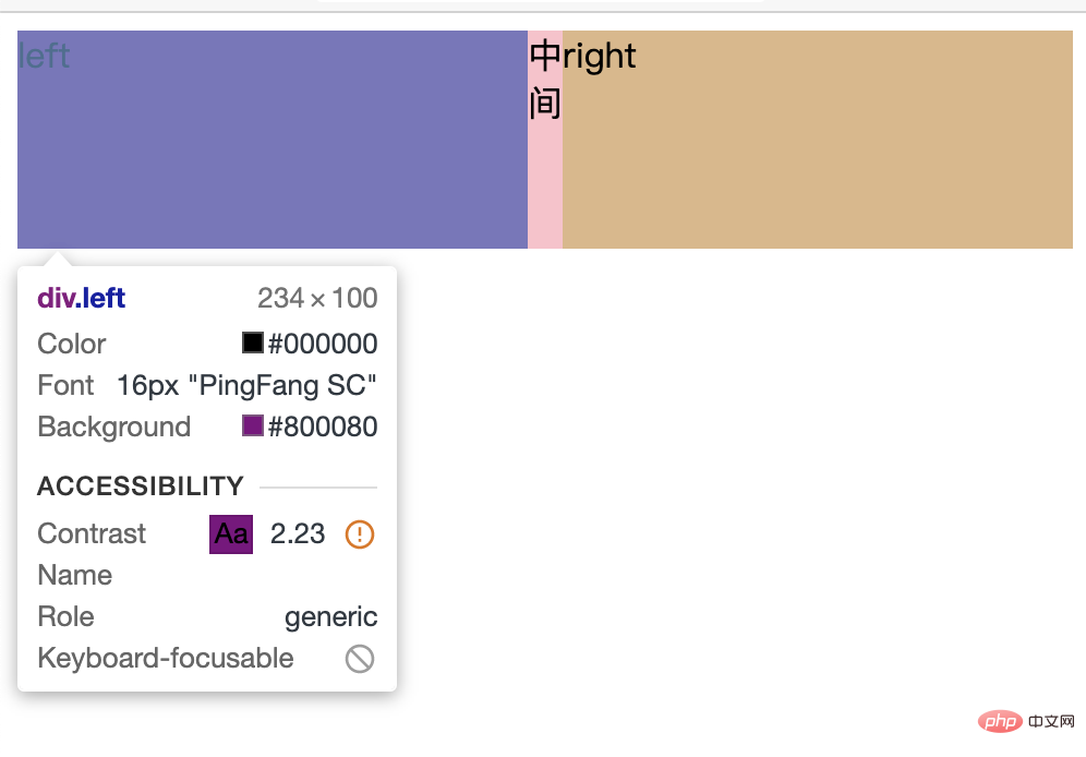
</body>flex Layout
.box{
    width: 100%
    height: 100px;
    display: flex;
}
.left{
    width: 300px;
    background-color: purple;
}
.center{
    flex: 1;
    background-color: pink;
}
.right{
    width: 300px;
    background-color: burlywood;
}
Advantages
- Simple code and convenient layout
Disadvantages
- If there is content in the middle, it will not be smaller when reduced to the minimum
- And the width of the left and right sides will become smaller
Absolute layout
.box{
    position: relative;
    width: 100%;
    height: 100px;
}
.left{
    position: absolute;
    left: 0px;
    width: 300px;
    background-color: pink;
}
.right{
    position: absolute;
    right: 0px;
    width: 300px;
    background-color: pink;
}
.center{
    position: absolute;
    left: 300px;
    right: 300px;
    background-color: burlywood;
}
@media (max-width: 600px){
    .left,.right{
       /* 平分屏幕 */
        width: 50%;
    }
}
Advantages
- Responsive layout can be achieved by using media in combination
Disadvantages
- The code writing is complicated and the layout is cumbersome
- If you do not use media to divide the screen equally, and the width is less than 600, the right side will cover the left side
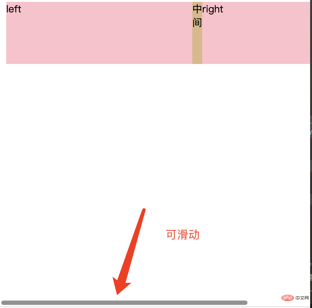
grid layout
.box{
    display: grid;
    grid-template-columns: 300px 1fr 300px;
    grid-template-rows: 100px;
}
.left,.right{
    background-color: pink;
}
.center{
    background-color: burlywood;
}
Advantages
- Easy to write
Disadvantages
- When there is content in the middle, it cannot continue to shrink
- The width will be fixed. When the width of the web page is smaller than the fixed width, the bottom can be slid

float layout
The floating flow needs to change the right and center positions
<div class="box">
    <div class="left">left</div>
    <div class="right">right</div>
    <div class="center">center</div>
</div>rrreeAdvantages
- Relatively simple, good compatibility
Disadvantages
- Two blocks floating in the same row need to be in order Write them together (i.e. the p's of left and right are written in order
- After the compression becomes smaller, a line break is generated
- The middle content will not disappear
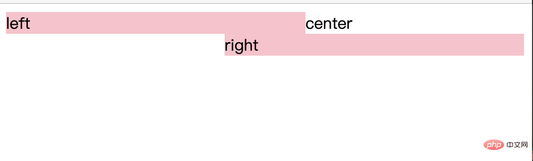
Solution
.box{
    height: 200px;
}
.left{
    float: left;
    width: 300px;
    background-color: pink;
}
.right{
    float: right;
    width: 300px;
    background-color: pink;
}
.center{
    margin:0 300px;
    background-color: burlywood;
}
The third problem
- Flex layout can expand the height of the parent element based on any internal height
- grid layout can also expand the height of the parent element according to any internal height
Learning video sharing:css video tutorial
The above is the detailed content of How to implement responsive layout in css. For more information, please follow other related articles on the PHP Chinese website!

Hot AI Tools

Undress AI Tool
Undress images for free

Undresser.AI Undress
AI-powered app for creating realistic nude photos

AI Clothes Remover
Online AI tool for removing clothes from photos.

Clothoff.io
AI clothes remover

Video Face Swap
Swap faces in any video effortlessly with our completely free AI face swap tool!

Hot Article
Hot Tools

Notepad++7.3.1
Easy-to-use and free code editor

SublimeText3 Chinese version
Chinese version, very easy to use

Zend Studio 13.0.1
Powerful PHP integrated development environment

Dreamweaver CS6
Visual web development tools

SublimeText3 Mac version
God-level code editing software (SublimeText3)
Hot Topics


 What is Autoprefixer and how does it work?
Jul 02, 2025 am 01:15 AM
What is Autoprefixer and how does it work?
Jul 02, 2025 am 01:15 AM
Autoprefixer is a tool that automatically adds vendor prefixes to CSS attributes based on the target browser scope. 1. It solves the problem of manually maintaining prefixes with errors; 2. Work through the PostCSS plug-in form, parse CSS, analyze attributes that need to be prefixed, and generate code according to configuration; 3. The usage steps include installing plug-ins, setting browserslist, and enabling them in the build process; 4. Notes include not manually adding prefixes, keeping configuration updates, prefixes not all attributes, and it is recommended to use them with the preprocessor.
 How can you animate an SVG with CSS?
Jun 30, 2025 am 02:06 AM
How can you animate an SVG with CSS?
Jun 30, 2025 am 02:06 AM
AnimatingSVGwithCSSispossibleusingkeyframesforbasicanimationsandtransitionsforinteractiveeffects.1.Use@keyframestodefineanimationstagesforpropertieslikescale,opacity,andcolor.2.ApplytheanimationtoSVGelementssuchas,,orviaCSSclasses.3.Forhoverorstate-b
 What is the conic-gradient() function?
Jul 01, 2025 am 01:16 AM
What is the conic-gradient() function?
Jul 01, 2025 am 01:16 AM
Theconic-gradient()functioninCSScreatescirculargradientsthatrotatecolorstopsaroundacentralpoint.1.Itisidealforpiecharts,progressindicators,colorwheels,anddecorativebackgrounds.2.Itworksbydefiningcolorstopsatspecificangles,optionallystartingfromadefin
 CSS tutorial focusing on mobile-first design
Jul 02, 2025 am 12:52 AM
CSS tutorial focusing on mobile-first design
Jul 02, 2025 am 12:52 AM
Mobile-firstCSSdesignrequiressettingtheviewportmetatag,usingrelativeunits,stylingfromsmallscreensup,optimizingtypographyandtouchtargets.First,addtocontrolscaling.Second,use%,em,orreminsteadofpixelsforflexiblelayouts.Third,writebasestylesformobile,the
 CSS tutorial for creating loading spinners and animations
Jul 07, 2025 am 12:07 AM
CSS tutorial for creating loading spinners and animations
Jul 07, 2025 am 12:07 AM
There are three ways to create a CSS loading rotator: 1. Use the basic rotator of borders to achieve simple animation through HTML and CSS; 2. Use a custom rotator of multiple points to achieve the jump effect through different delay times; 3. Add a rotator in the button and switch classes through JavaScript to display the loading status. Each approach emphasizes the importance of design details such as color, size, accessibility and performance optimization to enhance the user experience.
 European virtual currency trading platform ranking list 2025 latest list TOP10 inventory (recently updated)
Jul 11, 2025 pm 08:57 PM
European virtual currency trading platform ranking list 2025 latest list TOP10 inventory (recently updated)
Jul 11, 2025 pm 08:57 PM
The top ten virtual currency trading platforms in Europe in 2025 include Binance, OKX, Coinbase, etc., and are selected based on compliance, security, expenses, asset types and user experience. 1. Binance: The world has the largest transaction volume, low fees, and has obtained a license in multiple countries; 2. OKX: Comprehensive products, strong technology, registered in France; 3. Coinbase: Compliance and safety, suitable for beginners, licensed in many countries; 4. Gate.io: Has a long history, high security, registered in many European countries; 5. Bitstamp: Founded early, has strong compliance, regulated by Luxembourg; 6. eToro: Supports social transactions, diversified investment, regulated by CySEC; 7. Bitpanda: World
 What is feature detection in CSS using @supports?
Jul 02, 2025 am 01:14 AM
What is feature detection in CSS using @supports?
Jul 02, 2025 am 01:14 AM
FeaturedetectioninCSSusing@supportschecksifabrowsersupportsaspecificfeaturebeforeapplyingrelatedstyles.1.ItusesconditionalCSSblocksbasedonproperty-valuepairs,suchas@supports(display:grid).2.Thismethodensuresfuturecompatibilityandavoidsrelianceonunrel
 Integrating CSS and JavaScript effectively with HTML5 structure.
Jul 12, 2025 am 03:01 AM
Integrating CSS and JavaScript effectively with HTML5 structure.
Jul 12, 2025 am 03:01 AM
HTML5, CSS and JavaScript should be efficiently combined with semantic tags, reasonable loading order and decoupling design. 1. Use HTML5 semantic tags, such as improving structural clarity and maintainability, which is conducive to SEO and barrier-free access; 2. CSS should be placed in, use external files and split by module to avoid inline styles and delayed loading problems; 3. JavaScript is recommended to be introduced in front, and use defer or async to load asynchronously to avoid blocking rendering; 4. Reduce strong dependence between the three, drive behavior through data-* attributes and class name control status, and improve collaboration efficiency through unified naming specifications. These methods can effectively optimize page performance and collaborate with teams.
