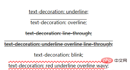
In CSS, you can achieve the strikethrough effect by setting the "text-decoration: line-through;" attribute to the text; the "text-decoration" attribute is used to "decorate" the content of the text, which can be selected Text is underlined, overlined, straight or combined.

The operating environment of this article: Windows7 system, HTML5&&CSS3 version, Dell G3 computer.
If you want to use CSS to achieve the text strikethrough effect, you can use the text-decoration attribute and set it to the line-through value. The text-decoration attribute is used to "decorate" the content of text by adding underline, overline, straight or combination lines to the selected text; it essentially decorates the text with different kinds of lines.
The text-decoration attribute specifies the decoration added to the text, where the color of the decoration is set by the "color" attribute. This property allows setting certain effects on the text, such as underlining. If the descendant element does not have its own decorations, the decorations set on the ancestor element will "extend" to the descendant elements.
Syntax:
text-decoration: none|underline|overline|line-through|blink|inherit;
Attribute values:
● none: Default, defines standard text; no lines are drawn, and any existing decorations are removed.
●underline: Draw a 1px line under the text.
● Overline: Draw a 1px line at the top of the text.
● Line-through: Draw a 1px line at the "middle" point of the text, that is, draw a line through the text.
●blink: Define blinking text. NOTE: This value is in the W3C specification, but is deprecated and does not work in any current browsers; when it works, it makes the text appear "flickering" by quickly switching between 0% and 100% opacity.
● Inherit: Inherit the value of the parent text-decoration attribute.
text-decoration as shorthand attribute
text-decoration可以与text-decoration-line、text-decoration-style和text-decoration-color组合使用,作为一个速记属性
.fancy-underline {
  text-decoration-line: underline;
  text-decoration-style: wavy;
  text-decoration-color: red;

  /* can be shortened to */
  text-decoration: underline wavy red;
}Example:
<!DOCTYPE html>
<html>
<head>
<meta charset="UTF-8">
<style>
.underline {
text-decoration: underline;
}
.overline {
text-decoration: overline;
}
.strikethrough {
text-decoration: line-through;
}
.multiple {
text-decoration: underline overline line-through;
}
.blink {
text-decoration: blink;
}
.wavy {
text-decoration: red underline overline wavy;
}
body {
padding: 1em 2em;
}
</style>
</head>
<body style="text-align:center">
<p class="underline">text-decoration: underline;</p>
<p class="overline">text-decoration: overline;</p>
<p class="strikethrough">text-decoration: line-through;</p>
<p class="multiple">text-decoration: underline overline line-through;</p>
<p class="blink">text-decoration: blink;</p>
<p class="wavy">text-decoration: red underline overline wavy;</p>
</body>
</html>Rendering:

From the above example you can As you can see, underline, overline, or line-through can be combined in a space-separated list to add multiple decorative line effects.
【Recommended learning: css video tutorial】
The above is the detailed content of css set text strikethrough. For more information, please follow other related articles on the PHP Chinese website!