Button component exists natively in WeChat applet, and the style is not ugly, and there are many extended attributes. As long as you read the documentation and try it while reading, it is still easy to construct an ideal Button comes out. WeChat mini program Button portal.
But sometimes you may feel that the configuration of the native Button component is too complicated, or it does not meet the current needs, so you may need to customize a Button component.
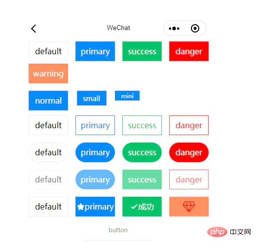
For example, if you want this effect.
 Has five different colors
Has three different sizes
Has hollow effect
Can round corners
Can be disabled
Can set icon
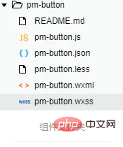
First open the editor, here open the WeChat developer tools, and then create a component, like this

I use Vscode here and then use less, and the easyLess plug-in automatically compiles less into wxss style.
Need to pay attention to the structure:
The text should be displayed in the center, so you may need to use flex layout here More convenient
You need to reserve the icon position. If it is not set, it will not be displayed
You need to set the background color control option
Pay attention to the corresponding structure and style
<button>
  <pm-icon></pm-icon>
  <slot></slot>
</button>
.pm-button {
  border-radius: 0;
  font-weight: normal;
  display: flex;
  flex-flow: row nowrap;
  justify-content: center;
  align-items: center;
  white-space: nowrap;
}
.pm-button:not([size='mini']) {
  width: 0;
}
.pm-button--normal {
  width: 80px !important;
  height: 40px;
  font-size: 16px;
}
.pm-button--normal.pm-button--round {
  border-radius: 40px;
}
.pm-button--small {
  width: 60px !important;
  height: 30px;
  font-size: 14px;
}
.pm-button--small.pm-button--round {
  border-radius: 30px;
}
.pm-button--mini {
  width: 40px !important;
  height: 20px;
  font-size: 12px;
}
.pm-button--mini.pm-button--round {
  border-radius: 20px;
}
.pm-button--primary {
  background-color: #1989fa;
  border: 1px solid #1989fa;
  color: white;
}
.pm-button--primary.pm-button--plain {
  color: #1989fa;
}
.pm-button--success {
  background-color: #07c160;
  border: 1px solid #07c160;
  color: white;
}
.pm-button--success.pm-button--plain {
  color: #07c160;
}
.pm-button--danger {
  background-color: #ee0a24;
  border: 1px solid #ee0a24;
  color: white;
}
.pm-button--danger.pm-button--plain {
  color: #ee0a24;
}
.pm-button--warning {
  background-color: #ff976a;
  border: 1px solid #ff976a;
  color: white;
}
.pm-button--warning.pm-button--plain {
  color: #ff976a;
}
.pm-button--default {
  background-color: #ffffff;
  border: 1px solid #ebedf0;
  color: black;
}
.pm-button--primary:active,
.pm-button--success:active,
.pm-button--danger:active,
.pm-button--warning:active,
.pm-button--default:active {
  opacity: 0.8;
}
.pm-button--default:active {
  background-color: #ebedf0;
}
.pm-button--plain {
  background-color: transparent;
}
.pm-button--plain:active {
  opacity: 1!important;
  background-color: #ebedf0;
}
.pm-button--disabled {
  opacity: 0.6;
}
.pm-button--disabled:active {
  opacity: 0.6 !important;
}
.pm-button--disabled.pm-button--plain:active,
.pm-button--disabled.pm-button--default:active {
  background-color: transparent;
}Component({
/**
* 组件的属性列表
*/
properties: {
size: {
type: String,
value: 'normal'
},
type: {
type: String,
value: 'primary'
},
plain: Boolean,
disabled: Boolean,
round: Boolean,
cStyle: String,
icon: String,
iconColor: String,
iconSize: String
},
/**
* 组件的方法列表
*/
methods: {
clickHandler() {
!this.data.disabled && this.triggerEvent('click', {})
}
}
})Recommended tutorial: "WeChat Mini Program 》
The above is the detailed content of Quickly implement the Button component of a WeChat applet. For more information, please follow other related articles on the PHP Chinese website!