Home > Backend Development > Python Tutorial > Efficient data processing in Python worth a look

Efficient data processing in Python worth a look

烟雨青岚
Release: 2020-06-16 17:31:59
forward
2609 people have browsed it

Efficient data processing in Python worth a look

##Worth-seeing Python efficient data processing

Pandas is a very commonly used data processing tool in Python and is very convenient to use. It is built on the NumPy array structure, so many of its operations are written through the extension modules that come with NumPy or Pandas. These modules are written in Cython and compiled into C, and are executed on C, thus ensuring the processing speed.

Today we will experience its power.

1. Create data

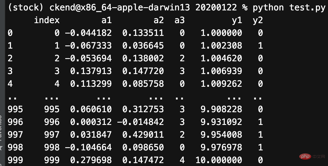
Using pandas can easily create data. Now let us create a pandas DataFrame with 5 columns and 1000 rows:

mu1, sigma1 = 0, 0.1
mu2, sigma2 = 0.2, 0.2
n = 1000df = pd.DataFrame(
    {
        "a1": pd.np.random.normal(mu1, sigma1, n),
        "a2": pd.np.random.normal(mu2, sigma2, n),
        "a3": pd.np.random.randint(0, 5, n),
        "y1": pd.np.logspace(0, 1, num=n),
        "y2": pd.np.random.randint(0, 2, n),
    }
)
Copy after login
    a1 and a2: Random samples drawn from a normal (Gaussian) distribution.
  • a3: Random integer from 0 to 4.
  • y1: uniformly distributed on a logarithmic scale from 0 to 1.
  • y2: Random integer from 0 to 1.
Generate data as shown below:

2. Draw the image

Pandas drawing function Returns a matplotlib coordinate axis (Axes), so we can customize what we need on it. For example, draw a vertical line and a parallel line. This will be very beneficial to us:

1. Draw the average line

2. Mark the important points

import matplotlib.pyplot as plt
ax = df.y1.plot()
ax.axhline(6, color="red", linestyle="--")
ax.axvline(775, color="red", linestyle="--")
plt.show()
Copy after login

We can also customize how many tables are displayed on a graph:

fig, ax = plt.subplots(2, 2, figsize=(14,7))
df.plot(x="index", y="y1", ax=ax[0, 0])
df.plot.scatter(x="index", y="y2", ax=ax[0, 1])
df.plot.scatter(x="index", y="a3", ax=ax[1, 0])
df.plot(x="index", y="a1", ax=ax[1, 1])
plt.show()
Copy after login

3. Draw a histogram

Pandas allows us to obtain the shape comparison of two graphics in a very simple way:

df[["a1", "a2"]].plot(bins=30, kind="hist")
plt.show()
Copy after login

It also allows multiple graphics to be drawn:

df[["a1", "a2"]].plot(bins=30, kind="hist", subplots=True)
plt.show()
Copy after login

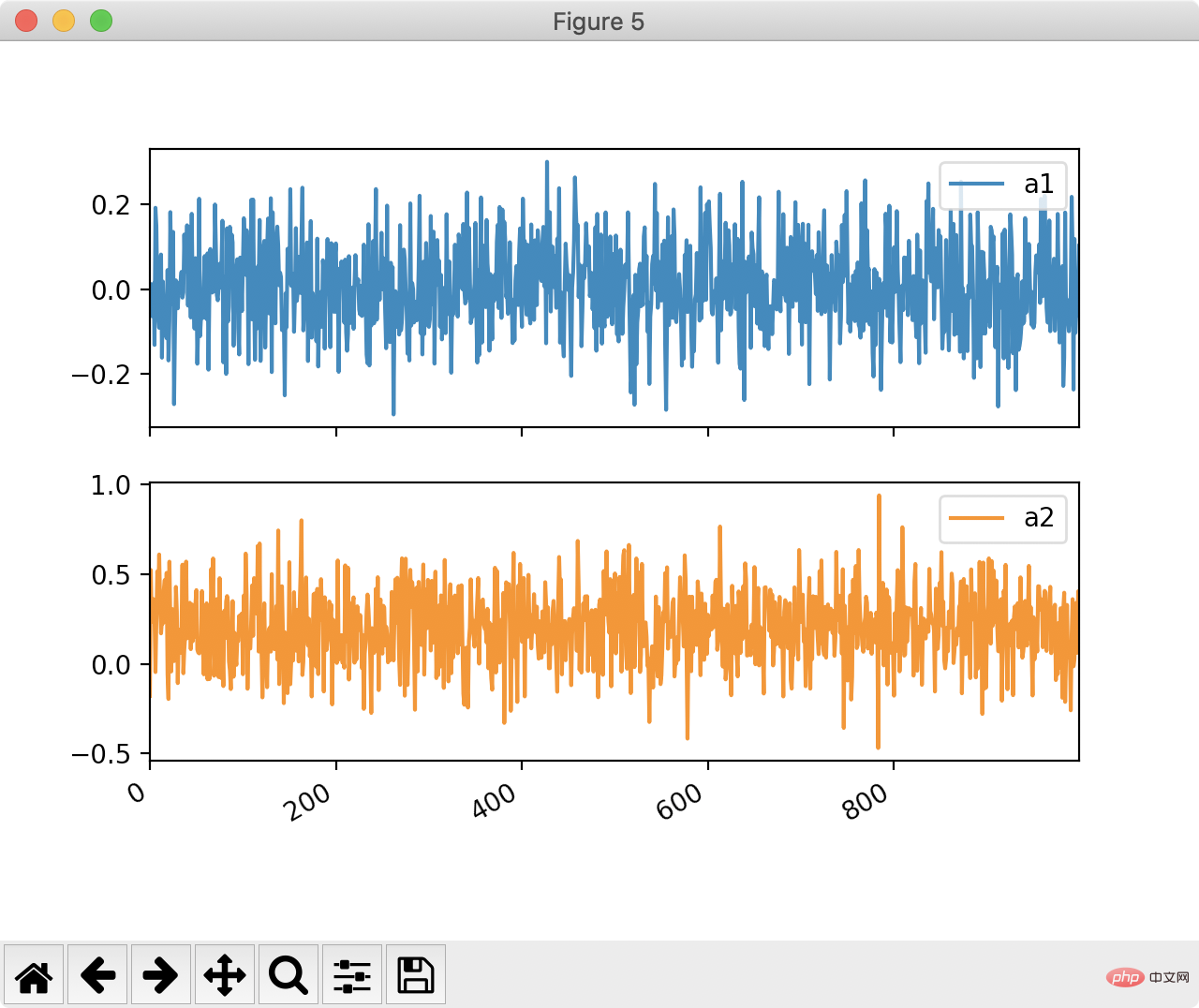
Of course, generating a line chart is not a draw either:

df[['a1', 'a2']].plot(by=df.y2, subplots=True)
plt.show()
Copy after login

4. Linear fitting

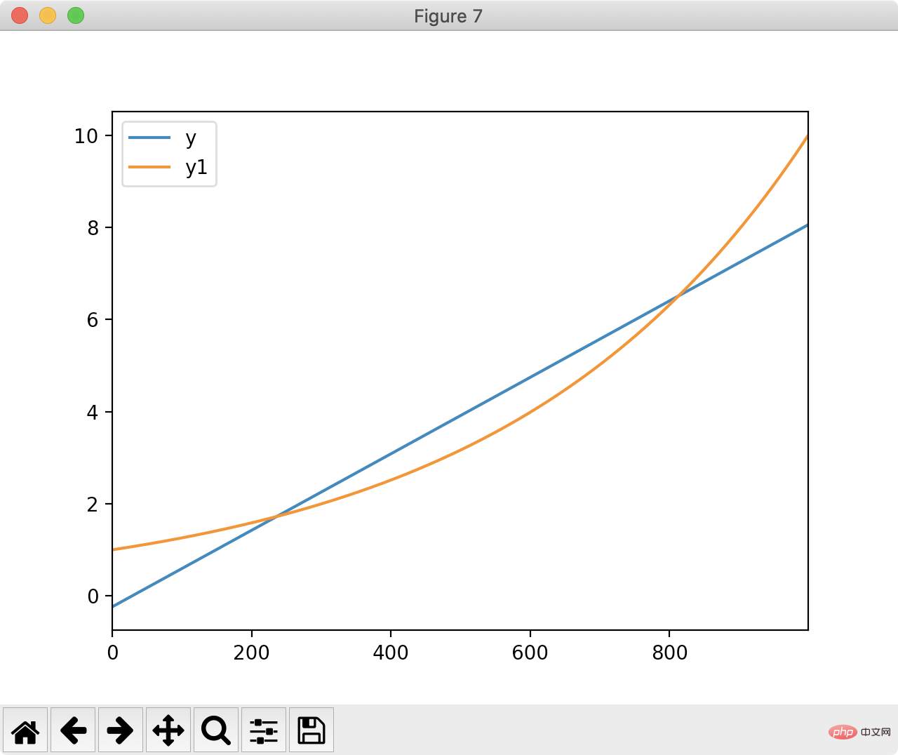
Pandas can also be used for fitting. Let us use pandas to find a straight line closest to the following figure:

The least squares method calculates the shortest straight line Distance:

df['ones'] = pd.np.ones(len(df))
m, c = pd.np.linalg.lstsq(df[['index', 'ones']], df['y1'], rcond=None)[0]
Copy after login
Draw y and the fitted straight line based on the least squares result:

df['y'] = df['index'].apply(lambda x: x * m + c)
df[['y', 'y1']].plot()
plt.show()
Copy after login

Thank you for reading, I hope you will benefit a lot.

This article is reproduced from: https://blog.csdn.net/u010751000/article/details/106735872

## Recommended tutorial: "python tutorial

"

The above is the detailed content of Efficient data processing in Python worth a look. For more information, please follow other related articles on the PHP Chinese website!

Related labels:
source:csdn.net
Statement of this Website
The content of this article is voluntarily contributed by netizens, and the copyright belongs to the original author. This site does not assume corresponding legal responsibility. If you find any content suspected of plagiarism or infringement, please contact admin@php.cn
Popular Tutorials
More>
Latest Downloads
More>
Web Effects
Website Source Code
Website Materials
Front End Template