
#How to add axis text in excel chart?
1. For the newly created icon, there are only numbers on the coordinate axis and no text labels. Therefore, when we look at the table, it is difficult to understand what the picture means.
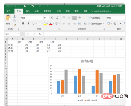
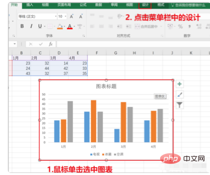
#2. Click to select the icon that needs to be changed, and then click Design on the menu bar, as shown in the red box in the figure.
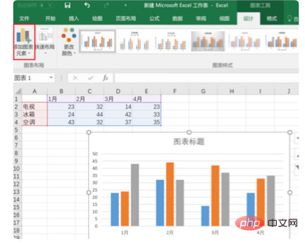
#3. Click the small triangle at the bottom right of the add icon element in the red box.
#4. Select the axis title in the pop-up drop-down option, the main vertical axis.
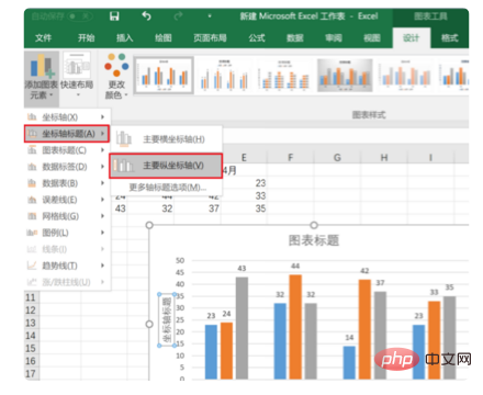
5. At this time, the area in the red box will appear in the chart. Click the area in the red box to change the text
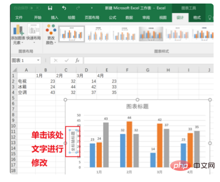
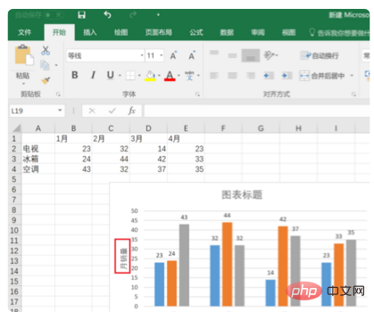
6. Enter "monthly sales volume". After editing, you can see the effect as shown below. Such icons are more readable.
For more Excel-related technical articles, please visit the Excel Basic Tutorial column!
The above is the detailed content of How to add axis text in excel chart. For more information, please follow other related articles on the PHP Chinese website!
 Compare the similarities and differences between two columns of data in excel
 excel duplicate item filter color
 How to copy an Excel table to make it the same size as the original
 Excel table slash divided into two
 Excel diagonal header is divided into two
 Absolute reference input method
 java export excel
 Excel input value is illegal


