


The principles of ppt color matching


1. Determine the color tone of the PPT page
When designing PPT color, the first step is to determine a tone , whether to use red or blue as the main color, and whether to choose cool or warm colors. If the PPT design process does not have a unified tone, it will appear chaotic.
2. Principle of Identity
Pair the same colors together to form a unified color group.
Tips: When matching PPT with the same tone, you can use gradient filling to make the PPT effect less dull.
Color number: For PPT under this principle, the color of the entire set of PPT generally does not exceed 2. Case: apple gray plus black lines, the overall effect is very strong.
3. Principle of similarity
Use similar colors to design PPT colors when designing PPT.
The meaning of similar colors: Similar colors refer to colors that have slight differences between hues and are different from the same hue.
Tips: Fix the same hue, adjust the brightness or saturation, and then determine the color of the PPT according to the occasion where your PPT is used. This will not make your PPT feel dull.
Color number: For PPT under this principle, the colors of the entire set of PPT generally do not exceed 3-4. For example: The entire set of PPT only uses 3-4 colors, dark blue, blue, and light blue.
4. Principle of contrast
Pair two or more tones that are far apart together for PPT color matching, that is, use contrasting colors for PPT color matching setting. Contrasting colors have obvious differences in color, creating a sharp visual contrast and creating a sense of contrast and coordination.
Tips: When matching PPT with contrasting tones, consider the size, saturation and brightness of the contrasting color blocks. The most important thing is to find a color that balances the relationship between them, such as black, gray tones, white, etc.
Color number: For PPT under this principle, the color of the entire set of PPT generally does not exceed 3. Case: For example: the background color is white, and all text and graphics are black or dark gray, creating a strong difference.
5. Principle of adding auxiliary colors - black, white, gray
In the PPT color matching, there are large and bright color blocks, which are easy to use. Readers generate strong stimulation and become tired of reading. At this time, it is necessary to add auxiliary colors to make the entire PPT layout smooth transition.
The above is the detailed content of The principles of ppt color matching. For more information, please follow other related articles on the PHP Chinese website!

Hot AI Tools

Undress AI Tool
Undress images for free

Undresser.AI Undress
AI-powered app for creating realistic nude photos

AI Clothes Remover
Online AI tool for removing clothes from photos.

Clothoff.io
AI clothes remover

Video Face Swap
Swap faces in any video effortlessly with our completely free AI face swap tool!

Hot Article
Hot Tools

Notepad++7.3.1
Easy-to-use and free code editor

SublimeText3 Chinese version
Chinese version, very easy to use

Zend Studio 13.0.1
Powerful PHP integrated development environment

Dreamweaver CS6
Visual web development tools

SublimeText3 Mac version
God-level code editing software (SublimeText3)


 How to remove the date that appears automatically when printing from PPT handouts
Mar 26, 2024 pm 08:16 PM
How to remove the date that appears automatically when printing from PPT handouts
Mar 26, 2024 pm 08:16 PM
1. Let me first talk about the method I used at the beginning, maybe everyone is using it too. First, open [View]——]Remarks Template[. 2. A place where you can actually see the date after opening it. 3. Select it first and delete it. 4. After deleting, click [Close Master View]. 5. Open the print preview again and find that the date is still there. 6. In fact, this date was not deleted here. It should be in the [Handout Master]. Look at the picture below. 7. Delete the date after you find it. 8. Now when you open the preview and take a look, the date is no longer there. Note: In fact, this method is also very easy to remember, because the printed handouts are handouts, so you should look for the [Handout Master].
 Introduction to the method of inserting heptagons into PPT slides
Mar 26, 2024 pm 07:46 PM
Introduction to the method of inserting heptagons into PPT slides
Mar 26, 2024 pm 07:46 PM
1. Open the PPT slide document, and in the [Outline, Slide] column on the left side of the PPT, click to select the slide where you want to insert the basic [shape]. 2. After selecting, select the [Insert] menu in the function menu bar above the PPT and click. 3. After clicking the [Insert] menu, the [Insert] submenu bar pops up below the function menu bar. Select the [Shape] menu in the [Insert] submenu bar. 4. Click the [Shape] menu to pop up the preset shape type selection page. 5. In the shape type selection page, select the [Heptagon] shape and click. 6. After clicking, move the mouse to the slide editing interface, press the mouse to draw, and release the mouse after the drawing is completed. Complete the insertion of the [heptagon] shape.
 How to deal with blanks when playing PPT slides
Mar 26, 2024 pm 07:51 PM
How to deal with blanks when playing PPT slides
Mar 26, 2024 pm 07:51 PM
1. Open the PPT file you created and select the second slide. 2. On the second slide, select one of the pictures, and then select [Animation] to add any animation effect. 3. In the start column of the animation bar, change [While Standalone] to [After Previous Animation], and you will see that the picture animation label [1] will change to [0]. Do the same for subsequent slides, and you can see the effect by playing the slide at the end.
 Restricted processing operation method is prompted when embedding fonts in PPT
Mar 26, 2024 pm 08:41 PM
Restricted processing operation method is prompted when embedding fonts in PPT
Mar 26, 2024 pm 08:41 PM
1. Open PowerPoint and edit the PPT document. 2. Find the font that cannot be embedded, select the text box, right-click - Cut/Copy. 3. Right-click the blank space of the slide and select [Paste] - Paste as picture. 4. It is simple and convenient to save the font as a picture, but the font cannot be modified. Method 2: Software FontCreatorProgram 1. Download the FontCreatorProgram software from the Internet, unzip the file, and select the [FCP.EXE] file to install. 2. Open the installed software, click [File] - Open - Installed Fonts in the window menu bar, and select PPT. For fonts that cannot be embedded, click [OK]. 3. Select [
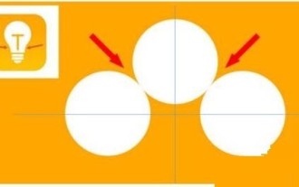 Detailed steps for designing a light bulb icon in PPT
Mar 26, 2024 pm 08:36 PM
Detailed steps for designing a light bulb icon in PPT
Mar 26, 2024 pm 08:36 PM
1. Hold down the shift key to draw a perfect circle in PPT, then copy the perfect circle twice, and stick it together as shown below. Notice in the picture below that the blue guide line exactly crosses the diameters of the three circles. (Pay attention to the arrow in the picture below). 2. The next step is very important. Insert an inverted trapezoid in the middle of the three circles. The long side of the trapezoid is at the diameter of the middle circle. (arrow in the picture below). 3. If you view the perspective version, please pay attention to the position pointed by the arrow in the picture below. Exactly tangent to both circles. 4. Next, adjust the remaining details. For example, the rounded corners at the bottom of the light bulb are actually completed with a rounded rectangle. The effect is as follows. Especially the small semicircle at the bottom is solved by arc graphics. 2 points in the picture below. 5. After using the direction arrows to fine-tune the distance between the graphics, add a T shape in the middle.
 Detailed steps for making a continuous block flow chart using PPT
Mar 26, 2024 pm 09:50 PM
Detailed steps for making a continuous block flow chart using PPT
Mar 26, 2024 pm 09:50 PM
1. Open PPT and enter its main interface. 2. Delete the Click here to add title and subtitle input boxes, and a blank page will appear. 3. Click the Insert menu and select the SmartArt tool. 4. Click Process on the Select SmartArt Graphics page, select Continuous Block Process, and press OK. 5. Insert a continuous block process into PPT. 6. Fill in text for continuous block processes. 7. If the input box is not enough, select the last shape, right-click on it, select Add Shape, and click to add a shape later. 8. Enter text content for the newly added shape. 9. At this point, a continuous block process has been created in PPT.
 Introduction to the method of locking layers in PPT
Mar 26, 2024 pm 07:31 PM
Introduction to the method of locking layers in PPT
Mar 26, 2024 pm 07:31 PM
1. First, you can see that you want to edit the text, but accidentally selecting the rectangle below will affect our editing. 2. Click on the PA plug-in. 3. Find under the design - Super Unlock. 4. Click the lock option and set the lock parameters first. 5. Select the Super Lock checkbox - Lock the checkbox and click OK. 6. Select the rectangle and click - the object is locked. After clicking, the rectangular bounding box disappears and cannot be selected. To unlock it, just click Unlock.
 Steps to create a mixed line and column chart in PPT
Mar 26, 2024 pm 09:26 PM
Steps to create a mixed line and column chart in PPT
Mar 26, 2024 pm 09:26 PM
1. Insert the data chart into the PPT and select [Clustered Column Chart] as the type. 2. Enter the source data and use only two columns of data. For example, the first column is monthly data and the second column is monthly cumulative data. 3. Change the chart type of the cumulative data series, click "Change Chart Type" under Chart Tools, click [Combine], select the line chart with data markers for the cumulative data, and check the secondary axis. 4. After clicking OK, you get Basic combination graphics. 5. Add data labels for column charts and line charts. And set different colors to show distinction. 6. Further beautify the data chart, delete unnecessary elements, highlight information, and get the final chart.