
Bootstrap has a built-in responsive, mobile-first fluid grid system. As the size of the screen device or viewport (viewport) increases, the system will automatically divide it into the largest 12 columns.
I call the grid system in Bootstrap a layout here. It creates a page layout through a series of combinations of rows and columns, and then your content can be placed into the layout you created. Here is a brief introduction to the working principle of the Bootstrap grid system:
The implementation principle of the grid system is very simple, just by defining the container size and dividing it into 12 equal parts (it can also be divided into 24 or 32 parts, but 12 is the most common), then adjust the inner and outer margins, and finally combine it with media queries to create a powerful responsive grid system. The grid system in the Bootstrap framework divides the container into 12 equal parts.
When using it, you can recompile the LESS (or Sass) source code according to the actual situation to modify the value of 12 (that is, change it to 24 or 32. Of course, you can also divide it into more, but it is not recommended to use it this way) ).
(1) Step 1: Create a container for the grid system
<div class="container-fluid">
  <div class="row">
    ...
  </div>
</div>Explanation: In order to achieve proper arrangement and padding of the grid system, each row "row" must be included In a container, we use the class name of this container as "container" or "container-fluid". These two classes are pre-designed for us by Bootstrap.
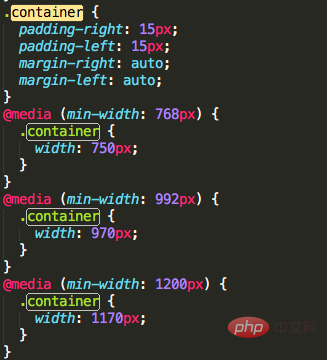
.container is a fixed width, centered display: The following is the code of the .container class in Bootstrap

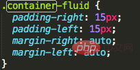
.container-fluid is 100% width: The following is the code of the .container-fluid class in Bootstrap

(2) Step 2: Create a suitable grid system
<div class="row">
  <div class="col-md-1">.col-md-1</div>
  <div class="col-md-1">.col-md-1</div>
  <div class="col-md-1">.col-md-1</div>
  <div class="col-md-1">.col-md-1</div>
  <div class="col-md-1">.col-md-1</div>
  <div class="col-md-1">.col-md-1</div>
  <div class="col-md-1">.col-md-1</div>
  <div class="col-md-1">.col-md-1</div>
  <div class="col-md-1">.col-md-1</div>
  <div class="col-md-1">.col-md-1</div>
  <div class="col-md-1">.col-md-1</div>
  <div class="col-md-1">.col-md-1</div>
</div>
<div class="row">
  <div class="col-md-8">.col-md-8</div>
  <div class="col-md-4">.col-md-4</div>
</div>
<div class="row">
  <div class="col-md-4">.col-md-4</div>
  <div class="col-md-4">.col-md-4</div>
  <div class="col-md-4">.col-md-4</div>
</div>
<div class="row">
  <div class="col-md-6">.col-md-6</div>
  <div class="col-md-6">.col-md-6</div>
</div>
Explanation: I copied the above paragraph from the Bootstrap official website. Each "row" represents a row, and the internal "col-md-number" represents a cell;
Bootstrap divides each row into 12 equal parts. The "number" in "col-md-number" is taken from 1-12. The number equals how many parts it occupies;
Select cells reasonably Configuration of the numbers, and then add the content we want to the cells, then a grid system is completed!
Related recommendations: "Bootstrap Getting Started Tutorial"
(3) Advanced: There are other options for cell classes, there are four types in total:
.c0l-xs- Regardless of the screen width, the cells are in one row, and the width is set according to the percentage; tried on mobile phones;
.col-sm- When the screen is larger than 768px, the cells The cells are displayed in one line; when the screen is smaller than 768px, they occupy one row; tried on tablets;
.col-md- When the screen is larger than 992px, the cells are displayed in one row; when the screen is smaller than 992px, they occupy one row; tried on desktops Monitor;
.col-lg- When the screen is larger than 1200px, the cells are displayed in one row; when the screen is smaller than 1200px, they occupy an exclusive row; suitable for large desktop monitors;
The above situation can be solved through the following Clear understanding of the code:
<div class="container">
  <div class="row">
    <div class="col-xs-12 col-sm-6 col-md-8">.col-xs-12 .col-sm-6 .col-md-8</div>
    <div class="col-xs-6 col-md-4">.col-xs-6 .col-md-4</div>
  </div>
  <div class="row">
    <div class="col-xs-6 col-sm-4">.col-xs-6 .col-sm-4</div>
    <div class="col-xs-6 col-sm-4">.col-xs-6 .col-sm-4</div>
    <div class="col-xs-6 col-sm-4">.col-xs-6 .col-sm-4</div>
  </div>
</div>
When the screen is larger than 992px: .col-md-8 and .col-md-4 are still within the scope, as follows:
When the screen is between 769px-992px: .col-md- is invalid, and .col-sm- is still within the scope, as follows:
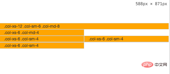
When the screen width is less than 768px, .col-sm- is invalid. Only .col-xs- is not affected by the screen width. At this time, .col-xs- takes effect, as follows:

The above is the detailed content of How to understand the bootstrap deletion system. For more information, please follow other related articles on the PHP Chinese website!