Matplotlib is a Python 2D plotting library that can generate publication-quality graphics in a variety of hardcopy formats and interactive environments on a variety of platforms.

In the previous article, we explained the legend, title and label introduction in Matplotlib. Today we start to officially draw the picture. In this tutorial we'll cover bar charts, histograms, and scatter plots. Let’s look at the bar chart first:
Bar chart
import matplotlib.pyplot as plt
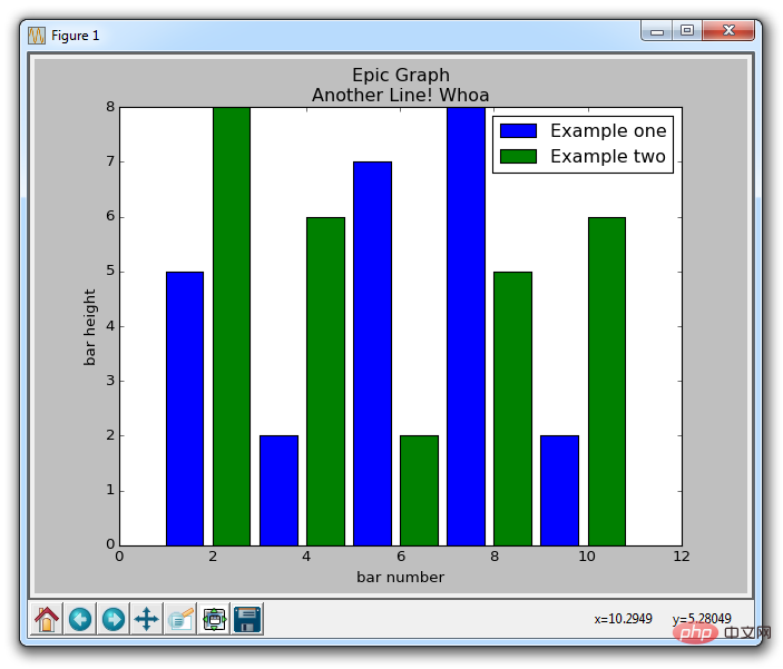
plt.bar([1,3,5,7,9],[5,2,7,8,2], label="Example one")
plt.bar([2,4,6,8,10],[8,6,2,5,6], label="Example two", color='g')
plt.legend()
plt.xlabel('bar number')
plt.ylabel('bar height')
plt.title('Epic Graph\nAnother Line! Whoa')
plt.show()
plt.bar creates a bar chart for us. If you don't explicitly select a color, all the bars will look the same despite making multiple plots. This gives us the opportunity to use a new Matplotlib customization option. You can use colors in any type of drawing, such as g for green, b for blue, r for red, etc. You can also use hexadecimal color codes, such as #191970.

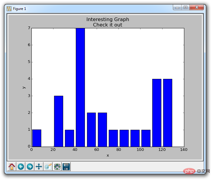
Next, we will explain the histogram. Histograms, much like bar charts, tend to show distribution by grouping segments together. This example might be age groupings, or test scores. We do not display the age of each group, but display the age according to 20 ~ 25, 25 ~ 30... and so on. Here's an example:
Histogram
import matplotlib.pyplot as plt
population_ages = [22,55,62,45,21,22,34,42,42,4,99,102,110,120,121,122,130,111,115,112,80,75,65,54,44,43,42,48]
bins = [0,10,20,30,40,50,60,70,80,90,100,110,120,130]
plt.hist(population_ages, bins, histtype='bar', rwidth=0.8)
plt.xlabel('x')
plt.ylabel('y')
plt.title('Interesting Graph\nCheck it out')
plt.legend()
plt.show()
The resulting graph is:

For plt.hist , you first need to put all the values, and then specify which bucket or container to put them into. In our example, we plotted a bunch of ages and wanted to display them in 10-year increments. We set the width of the bar to 0.8, but you can choose another width if you want the bar to be wider or narrower.
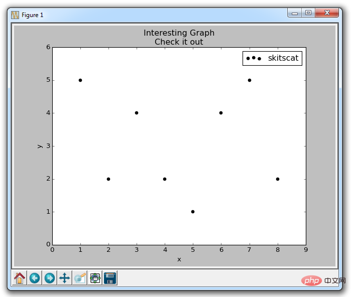
Next, we will introduce scatter plots. Scatter plots are often used to compare two variables to look for correlations or groupings, or 3 if you plot in 3 dimensions.
Scatter plot
Some sample code for scatter plot:
import matplotlib.pyplot as plt
x = [1,2,3,4,5,6,7,8]
y = [5,2,4,2,1,4,5,2]
plt.scatter(x,y, label='skitscat', color='k', s=25, marker="o")
plt.xlabel('x')
plt.ylabel('y')
plt.title('Interesting Graph\nCheck it out')
plt.legend()
plt.show()
The result is:

Tip:
plt.scatter not only allows us to draw x and y, but also lets us decide the marker color, size and type used.
The above is the detailed content of How to draw bar charts, histograms and scatter plots using Matplotlib. For more information, please follow other related articles on the PHP Chinese website!