css The flex-wrap attribute is used to specify whether the flex container is a single line or multiple lines. At the same time, the direction of the horizontal axis determines the direction of stacking of new lines. The CSS syntax is flex-wrap: nowrap|wrap|wrap-reverse|initial|inherit ;If the element is not an element of the flexbox object, the flex-wrap property has no effect.

How to use the css flex-wrap attribute?
Definition and Usage
The flex-wrap attribute specifies whether the flex container is a single row or multiple rows, and the direction of the horizontal axis determines the direction in which new rows are stacked. .
Note: If the element is not an element of the flexbox object, the flex-wrap property has no effect.
Default: nowrap
Inherited: No
Animatable: No.
Version: CSS3
JavaScript Syntax:
object.style.flexWrap="nowrap"
CSS Syntax:
flex-wrap: nowrap|wrap|wrap-reverse|initial|inherit;
Attribute value
nowrap Default value. Flexible items are stipulated not to be split into rows or columns.
wrap Specifies that flexible items be split into rows or columns when necessary.
wrap-reverse Specifies that flexible items be split into rows or columns when necessary, but in reverse order.
initial Sets this property to its default value.
inherit Inherit this property from the parent element.
Example
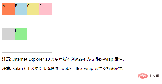
Let the flexbox element be split when necessary:
<!DOCTYPE html>
<html>
<head>
<meta charset="utf-8">
<title></title>
<style>
#main {
    width: 200px;
    height: 200px;
    border: 1px solid #c3c3c3;
    display: -webkit-flex; /* Safari */
    -webkit-flex-wrap: wrap; /* Safari 6.1+ */
    display: flex;
    flex-wrap: wrap;
}

#main div {
    width: 50px;
    height: 50px;
}
</style>
</head>
<body>

<div id="main">
  <div style="background-color:coral;">A</div>
  <div style="background-color:lightblue;">B</div>
  <div style="background-color:khaki;">C</div>
  <div style="background-color:pink;">D</div>
  <div style="background-color:lightgrey;">E</div>
  <div style="background-color:lightgreen;">F</div>
</div>

<p><b>注意:</b> Internet Explorer 10 及更早版本浏览器不支持 flex-wrap 属性。</p>
<p><b>注意:</b> Safari 6.1 及更新版本通过 -webkit-flex-wrap 属性支持该属性。</p>

</body>
</html>Effect:

The above is the detailed content of How to use css flex-wrap attribute. For more information, please follow other related articles on the PHP Chinese website!
 Solution to the problem that vscode cannot run after downloading python
 WiFi is connected but there is an exclamation mark
 What are the development tools?
 Three major characteristics of java
 Convert pdf to cad drawings
 Usage of sqrt function in Java
 Is Bitcoin trading allowed in China?
 How to close port 135