This article brings you an introduction to four methods of Python data visualization (with examples). It has certain reference value. Friends in need can refer to it. Hope it helps.
Abstract: This article describes four Python data visualization methods: heat map, two-dimensional density map, spider map, and tree map.
Data visualization is an important part of any data science or machine learning project. People often start with exploratory data analysis (EDA) to gain a deeper understanding of their data, and creating visualizations can really help make problems clearer and easier to understand, especially for those larger, high-dimensional data sets. At the end of a project, it's important to be able to present the end result in a clear, concise and convincing way that your users can understand and understand.
You may have read my previous article "5 Quick and Easy Data Visualizations in Python with Code" , which introduces 5 basic visualization methods: scatter plots, line plots, histograms, bar plots, and box plots. These five are simple yet powerful visualization methods with which you can definitely get huge gains from your data sets. In this article, we will introduce 4 other data visualization methods, but they are slightly more complicated. You can use them after reading the basic methods introduced in the previous article.

# Importing libs
importseaborn as sns
import pandas aspd
importnumpyasnp
importmatplotlib.pyplotasplt

# Create a random dataset
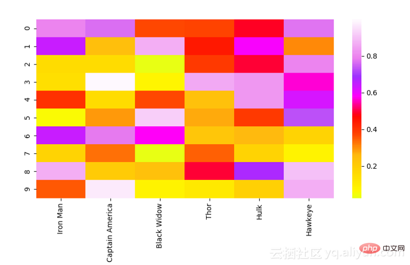
data=pd.DataFrame(np.random.random((10,6)), columns=["Iron Man","CaptainAmerica","BlackWidow","Thor","Hulk", "Hawkeye"])

print(data)

# Plot the heatmap
heatmap_plot=sns.heatmap(data, center=0, cmap='gist_ncar')

plt.show()


# Import libs
import pandas aspd
importseabornassns
importnumpyasnp
importmatplotlib.pyplotasplt

# Get the data
df=pd.read_csv("avengers_data.csv")
print(df)

"""
   #             Name  Attack  Defense  Speed  Range  Health
0  1         Iron Man      83       80     75     70      70
1  2  Captain America      60       62     63     80      80
2  3             Thor      80       82     83    100     100
3  3             Hulk      80      100     67     44      92
4  4      Black Widow      52       43     60     50      65
5  5          Hawkeye      58       64     58     80      65

"""

# Get the data for Iron Man
labels=np.array(["Attack","Defense","Speed","Range","Health"])
stats=df.loc[0,labels].values

# Make some calculations for the plot
angles=np.linspace(0, 2*np.pi, len(labels), endpoint=False)
stats=np.concatenate((stats,[stats[0]]))
angles=np.concatenate((angles,[angles[0]]))

# Plot stuff
fig=plt.figure()
ax=fig.add_subplot(111, polar=True)
ax.plot(angles, stats, 'o-', linewidth=2)
ax.fill(angles, stats, alpha=0.25)
ax.set_thetagrids(angles *180/np.pi, labels)
ax.set_title([df.loc[0,"Name"]])
ax.grid(True)

plt.show()Pokemon with stats data set from Kaggle based on statistics:
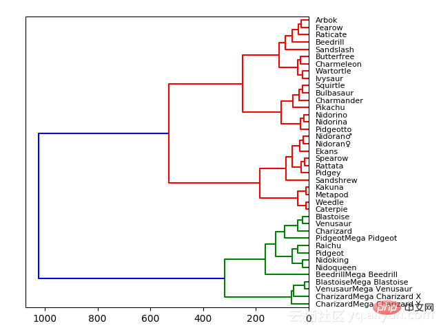
HP, Attack, Defense, Special Attack, Special Defense, Speed因此,与stats wise最匹配的Pokemon将紧密连接在一起。例如,我们看到,在顶部,Arbok和Fearow是直接连接的,而且,如果我们查看数据,Arbok总共有438个,而Fearow有442个,非常接近。但是一旦我们移动到Raticate,我们得到的总数是413,这与Arbok和Fearow的差别很大,这就是它们被分开的原因。当我们移动树的时候,基于相似性,Pokemon被分的组越来越多。在绿色组中的Pokemon相互之间比红色组中的更相似,即使没有直接的绿色连接。

对于树形图,我们实际上要使用Scipy的。在查看了数据集之后,我们将去掉字符串类型的列。我们这么做只是为了要得到正确的可视化结果,但在实践中,最好是把这些字符串转换成分类变量,为了得到更好的结果和进行比较,我们还设置了数据帧索引,以便能够适当地用它作为引用每个节点的列。最后,在Scipy中计算和绘制树形图是非常简单的事了。
# Import libs
import pandas aspd
frommatplotlibimportpyplotasplt
fromscipy.clusterimport hierarchy
importnumpyasnp
# Read in the dataset
# Drop any fields that are strings
# Only get the first 40 because this dataset is big
df=pd.read_csv('Pokemon.csv')
df=df.set_index('Name')
del df.index.name
df=df.drop(["Type 1", "Type 2", "Legendary"], axis=1)
df=df.head(n=40)
# Calculate the distance between each sample
Z =hierarchy.linkage(df, 'ward')
# Orientation our tree
hierarchy.dendrogram(Z, orientation="left", labels=df.index)
plt.show()
The above is the detailed content of Introduction to four methods of Python data visualization (with examples). For more information, please follow other related articles on the PHP Chinese website!