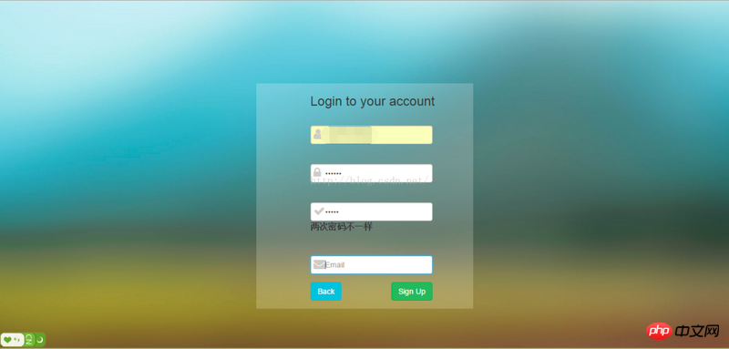
This article brings you a detailed explanation of bootstrap to create a login registration page. It has certain reference value. Friends in need can refer to it. I hope it will be helpful to you.
The content of this chapter is to use bootstrap to create a login registration page, and use jquery-validate for form verification.
Technology: bootstrap, font-awesome, jquery-validate;
Features: Responsive layout, form validation, background image adaptive screen Size;
Purpose: Learn knowledge from actual combat.
Rendering: 

The import of third-party resources is done using cdn; of course, you can also download it yourself and import it locally.
nbsp;html>


        <meta>
        <title>bootstrap案例</title>
        <!--用百度的静态资源库的cdn安装bootstrap环境-->
        <!-- Bootstrap 核心 CSS 文件 -->
        <link>
        <!--font-awesome 核心我CSS 文件-->
        <link>
        <!-- 在bootstrap.min.js 之前引入 -->
        <script></script>
        <!-- Bootstrap 核心 JavaScript 文件 -->
        <script></script>
        <!--jquery.validate-->
        <script></script>
        <script></script>
        <style>
            body{background: url(img/4.jpg) no-repeat;background-size:cover;font-size: 16px;}
            .form{background: rgba(255,255,255,0.2);width:400px;margin:100px auto;}
            #login_form{display: block;}
            #register_form{display: none;}
            .fa{display: inline-block;top: 27px;left: 6px;position: relative;color: #ccc;}
            input[type="text"],input[type="password"]{padding-left:26px;}
            .checkbox{padding-left:21px;}
        </style>


        <!--
            基础知识:
            网格系统:通过行和列布局
            行必须放在container内
            手机用col-xs-*
            平板用col-sm-*
            笔记本或普通台式电脑用col-md-*
            大型设备台式电脑用col-lg-*
            为了兼容多个设备,可以用多个col-*-*来控制;
        -->
    <div>
        <div>
            <form>
                <h3>Login to your account</h3>
                <div>
                    <div>
                        <i></i>
                        <input>
                    </div>
                    <div>
                            <i></i>
                            <input>
                    </div>
                    <div>
                        <label>
                            <input> Remember me
                        </label>
                        <hr>
                        <a>Create an account</a>
                    </div>
                    <div>
                        <input>
                    </div>
                </div>
            </form>
        </div>

        <div>
            <form>
                <h3>Login to your account</h3>
                <div>
                    <div>
                        <i></i>
                        <input>
                    </div>
                    <div>
                            <i></i>
                            <input>
                    </div>
                    <div>
                            <i></i>
                            <input>
                    </div>
                    <div>
                            <i></i>
                            <input>
                    </div>
                    <div>
                        <input>
                        <input>
                    </div>
                </div>
            </form>
        </div>
        </div>
    <script></script>
$().ready(function() {
    $("#login_form").validate({
        rules: {
            username: "required",
            password: {
                required: true,
                minlength: 5
            },
        },
        messages: {
            username: "请输入姓名",
            password: {
                required: "请输入密码",
                minlength: jQuery.format("密码不能小于{0}个字 符")
            },
        }
    });
    $("#register_form").validate({
        rules: {
            username: "required",
            password: {
                required: true,
                minlength: 5
            },
            rpassword: {
                equalTo: "#register_password"
            },
            email: {
                required: true,
                email: true
            }
        },
        messages: {
            username: "请输入姓名",
            password: {
                required: "请输入密码",
                minlength: jQuery.format("密码不能小于{0}个字 符")
            },
            rpassword: {
                equalTo: "两次密码不一样"
            },
            email: {
                required: "请输入邮箱",
                email: "请输入有效邮箱"
            }
        }
    });
});
$(function() {
    $("#register_btn").click(function() {
        $("#register_form").css("display", "block");
        $("#login_form").css("display", "none");
    });
    $("#back_btn").click(function() {
        $("#register_form").css("display", "none");
        $("#login_form").css("display", "block");
    });
});①bootstrap layout:
bootstrap uses grid layout, using col-x-x
Conditions of use: It can be used under .container and .row. The structure is as follows:
<div>
   <div>
      <div></div>
      <div></div>
   </div>
   <div>...</div>
</div>
col-xs-*: less than 768px, mobile phone
col-sm- *: Greater than 768px, tablet
col-md-*: Greater than 998px, ordinary computer, notebook, etc.
col-lg-*: Greater than 1200px, generally large desktop computer
can be used simultaneously to achieve cross- Multiple device effects
Offset: col-
-offset-
The form here is not much different from the ordinary form, so I won’t say more .
The 4.3.0 version is used, and the usage method is
<i></i>
More icon reference: http:// fontawesome.dashgame.com/
This is the key point I want to talk about,
The first step: First import jquery-validate third-party resources,
Step 2: Create the form form and initialize validate
$("#login_form").validate({
        rules: {
            username: "required",
            password: {
                required: true,
                minlength: 5
            },
        },
        messages: {
            username: "请输入姓名",
            password: {
                required: "请输入密码",
                minlength: jQuery.format("密码不能小于{0}个字 符")
            },
        }
});required: true means that the field is required,
minlength: means that the length is at least 5, maxlength is html5 Supported, so there is no need to set it here
equalTo: means the same as XX, followed by the first value, "#id" or ".class"
message: The corresponding content is followed by Prompt text information.
I was looking for documentation everywhere before I knew it, but after knowing it I found it is so simple, that is background-size:cover; This way, the background image can be the same size as the browser . It's very simple!
bootstrap tutorial column on the php Chinese website! ! !
The above is the detailed content of Detailed explanation of bootstrap making a login registration page. For more information, please follow other related articles on the PHP Chinese website!