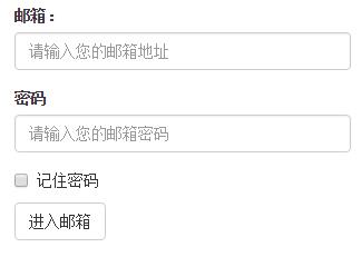
1. Basic form
 <form >
 <div class="form-group">
 <label>邮箱:</label>
 <input type="email" class="form-control" placeholder="请输入您的邮箱地址">
 </div>
 <div class="form-group">
 <label >密码</label>
 <input type="password" class="form-control" placeholder="请输入您的邮箱密码">
 </div>
 <div class="checkbox">
 <label>
 <input type="checkbox"> 记住密码
 </label>
 </div>
 <button type="submit" class="btn btn-default">进入邮箱</button>
 </form>

In addition to these elements, the form also has input, select, textarea and other elements. In the Bootstrap framework, a class name `form-control` is customized. That is to say, if these elements use The class name "form-control" will achieve some design customization effects.
1. The width becomes 100%
2. Set a light gray (#ccc) border
3. Rounded corners with 4px
4. Set the shadow effect, and when the element gets focus, the shadow and border effects will change
5. Set the placeholder color to #999
2. Horizontal Form
The default form of the Bootstrap framework is a vertical display style, but many times we need a horizontal form style (labels on the left, form controls on the right).
<form class="form-horizontal" role="form">
 <div class="form-group">
 <label for="inputEmail3" class="col-sm-2 control-label">邮箱:</label>
 <div class="col-sm-4">
 <input type="email" class="form-control" id="inputEmail3" placeholder="请输入您的邮箱地址">
 </div>
 </div>
 <div class="form-group">
 <label for="inputPassword3" class="col-sm-2 control-label">密码:</label>
 <div class="col-sm-4">
 <input type="password" class="form-control" id="inputPassword3" placeholder="请输入您的邮箱密码">
 </div>
 </div>
 </form>

To achieve horizontal form effects in the Bootstrap framework, the following two conditions must be met:
1. In the
If you add a label in front of the input, it will cause the input to wrap in another line. If you must add such a label and don't want the input to wrap, you need to also place the label in the container "form-group".
The above is the first article of a comprehensive analysis of how to use Bootstrap forms. More content will be updated in the future. I hope you will continue to pay attention.


