 Web Front-end
 CSS Tutorial
 How to achieve gradient effect in css? Implementation of css background color gradient and text gradient effects (code example)
How to achieve gradient effect in css? Implementation of css background color gradient and text gradient effects (code example)
When developing front-end web pages, some gradient effects are often used, which can make the front-end page more beautiful. So how are these gradient effects implemented using css code? This chapter will show you how to achieve gradient effect in css? Implementation of css background color gradient and text gradient effects (code example) , introduces css gradient style and how to implement css gradient. It has certain reference value. Friends in need can refer to it. I hope it will be helpful to you.
1. css background color gradient style
##1. css linear background gradient styleSyntax:
background-image: linear-gradient(<point> || <angle>, <stop>, <stop> , <stop>)
The first parameter is the starting point or corner of the gradient. The second parameter is a color stop point (color stops). At least two colors are required (starting point and end point), and you can add any color to increase the richness of the color gradient. The color stop point can be defined as a color, or a color plus a percentage.
Code (considering browser compatibility):
<!DOCTYPE html>
<html>
<head>
<meta charset="UTF-8">
<title>css背景渐变--线性渐变</title>
<style>
.demo{
width:500 ;
height: 300;
margin: 50px auto;
}
.demo *{
width: 200px;
height: 200px;
margin: 20px;
text-align: center;
line-height: 200px;
color: #fff;
font-size: 16px;
float: left;
}
.demo1{
/* 底色 */
background-color: #fd0d0d;
/* chrome 2+, safari 4+; multiple color stops */
background-image:-webkit-gradient(linear, left bottom, left top, color-stop(0.32, #fd0d0d), color-stop(0.66, #d89e3c), color-stop(0.83, #97bb51));
/* chrome 10+, safari 5.1+ */
background-image: -webkit-linear-gradient(#fd0d0d, #d89e3c, #97bb51);
/* firefox; multiple color stops */
background-image: -moz-linear-gradient(top,#fd0d0d, #d89e3c, #97bb51);
/* ie 6+ */
filter: progid:DXImageTransform.Microsoft.gradient(startColorstr='#fd0d0d', endColorstr='#d89e3c');
/* ie8 + */
-ms-filter: "progid:DXImageTransform.Microsoft.gradient(startColorstr='#fd0d0d', endColorstr='#d89e3c')";
/* ie10 */
background-image: -ms-linear-gradient(#fd0d0d, #d89e3c, #97bb51);
/* opera 11.1 */
background-image: -o-linear-gradient(#fd0d0d, #d89e3c, #97bb51);
/* 标准写法 */
background-image: linear-gradient(#fd0d0d, #d89e3c, #97bb51);
}
.demo2{
/* 底色 */
background-color:#d41a1a;
/* chrome 2+, safari 4+; multiple color stops */
background-image:-webkit-gradient(linear, left bottom, right top, color-stop(0.32, #d41a1a), color-stop(0.66, #d9e60c), color-stop(0.83, #5c7c99));
/* chrome 10+, safari 5.1+ */
background-image:-webkit-linear-gradient(45deg, #d41a1a, #d9e60c, #5c7c99);
/* firefox; multiple color stops */
background-image:-moz-linear-gradient(45deg, #d41a1a, #d9e60c, #5c7c99);
/* ie10 */
background-image: -ms-linear-gradient(45deg, #d41a1a 0%, #d9e60c 100%);
/* opera 11.1 */
background-image: -o-linear-gradient(45deg, #d41a1a, #d9e60c);
/* 标准写法 */
background-image: linear-gradient(45deg, #d41a1a, #d9e60c);
}
</style>
</head>
<body>
<div class="demo">
<div class="demo1">基本线性渐变--自上而下</div>
<div class="demo2">基本线性渐变--45度角</div>
</div>
</body>
</html>Rendering:
 You can see two The difference between the two linear gradients is that the first color value (#fd0d0d) of the three color values in background-image: linear-gradient(); becomes the angle value: 45deg.
css radial color gradient (Radial Gradients) and linear gradient (linear gradients), it does not gradient along one direction, but takes a point as the center and radiates gradients around, 360 degrees. Currently, all browsers except IE support css radial color gradient (Radial Gradients), but they also have their own different syntax
Syntax:
background-image: radial-gradient([<position> || <angle>],[<shape> || <size>],<stop>,<stop>,<stop>)
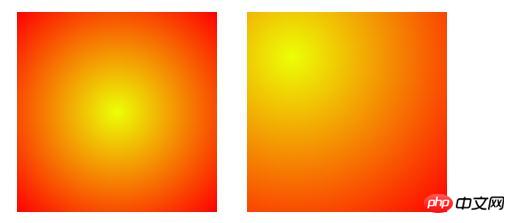
Code example (consider browser compatibility):
<!DOCTYPE html>
<html>
	<head>
		<meta charset="UTF-8">
		<title>css背景渐变--径向渐变</title>
		<style>
			.demo{
				width:500px ;
				height:200px;
				margin: 50px auto;
			}
			.demo *{
				width:200px ;
				height:200px;
				margin: 50px 15px;
				float: left;
			}
			.demo1{
				background-image: -moz-radial-gradient(#ecff05, red);
				background-image: -webkit-gradient(radial, center center, 0, center center, 220, from(#ecff05), to(red)); /* old */
				background-image: -webkit-radial-gradient(#ecff05, red); /* new syntax */
				background-image: radial-gradient(#ecff05, red);
			}
			.demo2{
				background-image: -moz-radial-gradient(45px 45px 45deg, circle cover, #ecff05 0%, orange 100%, red 95%);
				background-image: -webkit-radial-gradient(45px 45px, circle cover, #ecff05, red);
				background-image: radial-gradient(45px 45px 45deg, circle cover, #ecff05 0%, orange 100%, red 95%);
			}
		</style>
	</head>
	<body>
		<div class="demo">
			<div class="demo1"></div>
			<div class="demo2"></div>
		</div>
	</body>
</html>
Rendering:

2. CSS font text gradient styleCode example (consider browser compatibility):
<!DOCTYPE html>
<html>
	<head>
		<meta charset="UTF-8">
		<title>css字体文字渐变</title>
		<style>
			.demo{
				width:500px ;
				height:200px;
				margin: 50px auto;
				font-size: 20px;
				background-image: -webkit-gradient(linear, left 0, right 0, from(rgb(166, 4, 249)), to(rgb(251, 223, 11)));
			   /*必需加前缀 -webkit- 才支持这个text值 */
			    -webkit-background-clip: text;
			    /*text-fill-color会覆盖color所定义的字体颜色: */
			    -webkit-text-fill-color: transparent;
			}
		</style>
	</head>
	<body>
		<div class="demo">css字体文字渐变,css字体文字渐变</div>
	</body>
</html>
Rendering:

background-image: Define the gradient color used Scope;
-webkit-background-clip: text----Use the text in the block as the cropping area to crop outwards. The background of the text is the background of the block, and the area outside the text will be cropped. ;-webkit-text-fill-color: transparent---Retrieve or set the text fill color in the object.
Since the current text-fill-color attribute seems to be supported by webkit core browsers, the two demo pages can only be used in Chrome browser or The gradient effect can only be seen in Safari browser. Solid color under Firefox browser, not to mention under IE.
The above is the detailed content of How to achieve gradient effect in css? Implementation of css background color gradient and text gradient effects (code example). For more information, please follow other related articles on the PHP Chinese website!

Hot AI Tools

Undress AI Tool
Undress images for free

Undresser.AI Undress
AI-powered app for creating realistic nude photos

AI Clothes Remover
Online AI tool for removing clothes from photos.

Clothoff.io
AI clothes remover

Video Face Swap
Swap faces in any video effortlessly with our completely free AI face swap tool!

Hot Article

Hot Tools

Notepad++7.3.1
Easy-to-use and free code editor

SublimeText3 Chinese version
Chinese version, very easy to use

Zend Studio 13.0.1
Powerful PHP integrated development environment

Dreamweaver CS6
Visual web development tools

SublimeText3 Mac version
God-level code editing software (SublimeText3)
 How to change the list style in CSS
Aug 17, 2025 am 10:04 AM
To change the CSS list style, first use list-style-type to change the bullet or numbering style. 1. Use list-style-type to set the bullet of ul to disc, circle or square, and the number of ol is decimal, lower-alpha, upper-alpha, lower-roman or upper-roman. 2. Remove the tag completely with list-style:none. 3. Use list-style-image:url('bullet.png') to replace it with a custom image. 4. Use list-style-position:in
 How to create a responsive testimonial slider with CSS
Aug 12, 2025 am 09:42 AM
It is feasible to create a responsive automatic carousel slider with pure CSS, just combine HTML structure, Flexbox layout, and CSS animation. 2. First build a semantic HTML container containing multiple recommendation terms, each .item contains reference content and author information. 3. Use the parent container to set display:flex, width:300% (three slides) and apply overflow:hidden to achieve horizontal arrangement. 4. Use @keyframes to define a translateX transformation from 0% to -100%, and combine animation: scroll15slinearinfinite to achieve seamless automatic scrolling. 5. Add media
 How to create a dotted border in CSS
Aug 15, 2025 am 04:56 AM
Use CSS to create dotted borders, just set the border attribute to dotted. For example, "border:3pxdotted#000" can add a 3-pixel-wide black dot border to the element. By adjusting the border-width, the size of the point can be changed. The wider borders produce larger points. You can set dotted borders for a certain side, such as "border-top:2pxdottedred". Dotted borders are suitable for block-level elements such as div and input. They are often used in focus states or editable areas to improve accessibility. Pay attention to color contrast. At the same time, different from dashed's short-line style, dotted presents a circular dot shape. This feature is widely used in all mainstream browsers.
 How to change the cursor in CSS
Aug 16, 2025 am 05:00 AM
Usebuilt-incursortypeslikepointer,help,ornot-allowedtoprovideimmediatevisualfeedbackfordifferentinteractiveelements.2.ApplycustomcursorimageswiththecursorpropertyusingaURL,optionallyspecifyingahotspotandalwaysincludingafallbacklikeautoorpointer.3.Fol
 How to create a glassmorphism effect with CSS
Aug 22, 2025 am 07:54 AM
To create a glass mimicry effect of CSS, you need to use backdrop-filter to achieve background blur, set a translucent background such as rgba(255,255,255,0.1), add subtle borders and shadows to enhance the sense of hierarchy, and ensure that there is enough visual content behind the elements; 1. Use backdrop-filter:blur(10px) to blur the background content; 2. Use rgba or hsla to define the transparent background to control the degree of transparency; 3. Add 1pxsolidrgba(255,255,255,0.3) borders and box-shadow to enhance the three-dimensionality; 4. Ensure that the container has rich backgrounds such as pictures or textures to present a blurred penetration effect; 5. It is compatible with old browsers
 How to use CSS gradients for backgrounds
Aug 17, 2025 am 08:39 AM
CSSgradientsprovidesmoothcolortransitionswithoutimages.1.Lineargradientstransitioncolorsalongastraightlineusingdirectionsliketobottomorangleslike45deg,andsupportmultiplecolorstopsforcomplexeffects.2.Radialgradientsradiatefromacentralpointusingcircleo
 How to use grid-template-areas in CSS
Aug 22, 2025 am 07:56 AM
Thegrid-template-areaspropertyallowsdeveloperstocreateintuitive,readablelayoutsbydefiningnamedgridareas;eachstringrepresentsarowandeachwordacolumncell,withgrid-areanamesonchildelementsmatchingthoseinthetemplate,suchas"headerheaderheader"for
 How to add a box shadow in CSS
Aug 18, 2025 am 11:39 AM
To add box shadows, use box-shadow attribute; 1. The basic syntax is box-shadow: horizontal offset vertical offset blur radius expansion radius shadows in color; 2. The first three values are required, the rest are optional; 3. Use rgba() or hsla() to achieve transparent effect; 4. The positive expansion radius expands shadows and the negative value is reduced; 5. Multiple shadows can be added by commas separation; 6. Overuse should be avoided to ensure that visibility is tested on different backgrounds; this attribute is well supported by the browser, and reasonable use can improve the design texture.


