


This article mainly introduces the detailed information on how to use :before :after to write small triangles in CSS. The editor thinks it is quite good, so I will share it with you now and give it as a reference. Let’s follow the editor to take a look, I hope it can help everyone.
The triangles written before are always in the same color and have no border style. As follows:

The CSS code is as follows:
.tri-up{width: 0;height:0;border-left:20px solid transparent;border-right: 20px solid transparent;border-bottom: 20px solid red; } .tri-left{width: 0;height:0;border-top:20px solid transparent;border-bottom: 20px solid transparent;border-left: 20px solid red;} .tri-right{width: 0;height:0;border-top:20px solid transparent;border-bottom: 20px solid transparent;border-right: 20px solid red;} .tri-down{width: 0;height:0;border-left:20px solid transparent;border-right: 20px solid transparent;border-top: 20px solid red; }
To write the following small triangle, you need to use pseudo Class:before :after
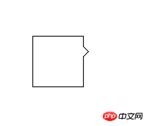
CSS code:
#demo { margin: 100px;; width: 100px; height: 100px; background-color: #fff; position: relative; border: 2px solid #333; } //方框的样式 #demo:after, #demo:before { border: solid transparent; content: ' '; height: 0; left: 100%; //根据三角形的位置,可以随意更改。 position: absolute; width: 0; } #demo:after { border-width: 10px; border-left-color: #fff; top: 20px;//根据三角的位置改变 }//此处是一个白色的三角 #demo:before { border-width: 12px; border-left-color: #000; top: 18px; }此处是一个黑色的三角 //当#demo:after和#demo:before的样式重合以后,由于top值的大小不同,就可以得到中间是白色,但是边框的三角形。如上图。
If To change to the style of the picture below:
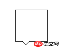
The CSS code is as follows:
#demo { margin: 100px;; width: 100px; height: 100px; background-color: #fff; position: relative; border: 2px solid #333; } #demo:after, #demo:before { border: solid transparent; content: ' '; height: 0; top: 100%; position: absolute; width: 0; } #demo:after { border-width: 10px; border-top-color: #fff; left: 20px; } #demo:before { border-width: 12px; border-top-color: #000; left: 18px; }
Related recommendations:
How to use CSS to achieve the small triangle effect_html/css_WEB-ITnose
Use CSS3 to implement a div box with a small triangle (without pictures)_html/css_WEB-ITnose
The above is the detailed content of CSS uses :before :after to write small triangle examples to share. For more information, please follow other related articles on the PHP Chinese website!
 The difference between insertbefore and before
 Mysql database migration method
 What are the design patterns used by laravel?
 How to solve server load incompatibility
 How to implement CSS carousel function
 How to use nanosleep function
 Reasons for excessive traffic on overseas website servers
 Dogecoin trading platform


![[Web front-end] Node.js quick start](https://img.php.cn/upload/course/000/000/067/662b5d34ba7c0227.png)


