


Grid system Grid system is called "grid systems" in English, and some people translate it as "grid system". It uses a fixed grid to design the layout. Its style is neat and concise. It became very popular after World War II and has become a popular publication in today's publishing industry. One of the mainstream styles of object design. This article mainly shares with you an example of the responsive framework Bootstrap grid system. It has a good reference value and I hope it will be helpful to everyone. Let’s follow the editor to take a look, I hope it can help everyone.
【Related video recommendation: Bootstrap tutorial】
The example is as follows:
<!DOCTYPE html>
<html>
<head lang="en">
<meta charset="UTF-8">
<title></title>
<meta name="viewport" content="width=device-width, initial-scale=1">
<link rel="stylesheet" href="css/bootstrap.min.css" rel="external nofollow" />
<script language="JavaScript" src="js/jquery-3.js"></script>
<style type="text/css">
*{
top: 0px;
padding: 0px;
text-decoration: none;
list-style-type: none;
}
.top-styl{
height: 50px;
border: 1px solid red;
background-color: #000000;
}
.img-styl{
width: 174px;
height: 50px;
background: url("imges/logo.png")no-repeat 0px 3px;
background-size: contain;
float: left;
}
.sousuo-styl{
width: 187px;
float: left;
}
.top-search-input{
width: 150px;
padding: 0 5px;
height: 30px;
border: 0;
background: #363636;
float: left;
color: #ccc;
}
.top-search-submit{
width: 30px;
height: 30px;
border: 0;
background: green url("imges/zoom.gif")center center no-repeat;
float: left;
cursor: pointer; //光标指针
}
.dao-styll{
float: left;
font-size: 16px;
width: 329px;
margin-left: 33px;
margin-top: 11px;
}
.dao-styll li{
float: left;
position: relative; //相对定位
text-align: center;
padding: 0 7px;
}
.dao-styll >li:hover{
background-color: #999;
}
.dao-styll >li >a{
color: #FFF;
width: 100%;
height: 34px;
text-decoration: none; //取消下划线
}
.dz-styl{
float: right;
margin: -19px -9px 6px 21px;
}
.imgs-styl{
padding: 11px 0px 0px 114px;
float: right;
margin: 0px -98px -3px 8px;
}
.green-styl{
color: green;
}
.zc-styl{
color: white;
}
a{
text-decoration: none;
}
</style>
</head>
<body>
<p class="container-fluid"> //fluid表示用 百分比
<p class="row"> //row 行
<p class="top-styl col-md-12"> //col-md-12 每行桌面占12列
<p class="row">
<p class=" col-md-offset-1 col-md-9"> //col-md-offset-1 列偏移1列
<p class="row">
<p class="col-md-3 col-xs-4">
<p class="img-styl"></p>
</p>
<p class="col-md-3 ">
<p class="sousuo-styl" style="padding-left: 7px; margin: 8px auto;">
<input class="top-search-input" value="" type="text"><input
class="top-search-submit" type="submit" value="" />
</p>
</p>
<p class="col-md-4 hidden-xs" style="padding: 0px">
<ul class="dao-styll">
<li class=""><a href="#" rel="external nofollow" rel="external nofollow" rel="external nofollow" rel="external nofollow" rel="external nofollow" rel="external nofollow" >风格</a>
</li>
<li class=""><a href="#" rel="external nofollow" rel="external nofollow" rel="external nofollow" rel="external nofollow" rel="external nofollow" rel="external nofollow" >造型师</a></li>
<li class=""><a href="#" rel="external nofollow" rel="external nofollow" rel="external nofollow" rel="external nofollow" rel="external nofollow" rel="external nofollow" >众分享</a>
</li>
<li class=""><a href="#" rel="external nofollow" rel="external nofollow" rel="external nofollow" rel="external nofollow" rel="external nofollow" rel="external nofollow" >我的美丽衣橱</a></li>
</ul>
</p>
<p class="col-md-2">
<p class="imgs-styl">
<img src="imges/sina.gif">
</p>
<p class="dz-styl">
<span><a href="#" rel="external nofollow" rel="external nofollow" rel="external nofollow" rel="external nofollow" rel="external nofollow" rel="external nofollow" class="green-styl">登录</a> | </span><span>
<a href="#" rel="external nofollow" rel="external nofollow" rel="external nofollow" rel="external nofollow" rel="external nofollow" rel="external nofollow" class="zc-styl">注册</a></span>
</p>
</p>
</p>
</p>
</p>
</p>
</p>
<p class="row">
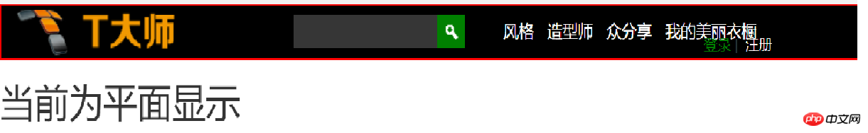
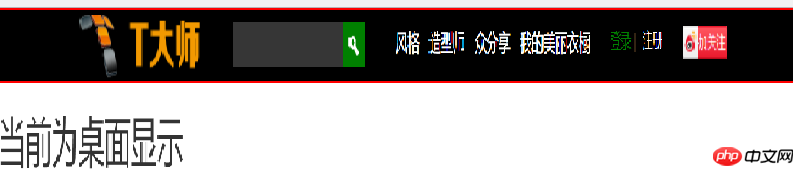
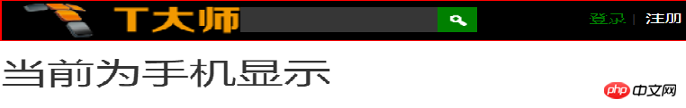
<p class="visible-md"><h1>当前为桌面显示</h1></p> //visible默认占满整行
<p class="visible-sm"><h1>当前为平面显示</h1></p>
<p class="visible-xs"><h1>当前为手机显示</h1></p>
</p>
</p>
</body>
</html>The effect display picture:
Related recommendations:
Detailed explanation of front-end responsive layout, Responsive images, and homemade grid system
Bootstrap grid system study notes
Learn to use bootstrap3 grid system_javascript skills
The above is the detailed content of Examples to explain the responsive framework Bootstrap grid system. For more information, please follow other related articles on the PHP Chinese website!
 Introduction to the framework used by vscode
 What does screen recording mean?
 Folder exe virus solution
 How to locate someone else's cell phone location
 Excel generates QR code
 Introduction to the main work content of the backend
 How to solve the problem that document.cookie cannot be obtained
 What are the applications of the Internet of Things?


![[Web front-end] Node.js quick start](https://img.php.cn/upload/course/000/000/067/662b5d34ba7c0227.png)


