This article mainly introduces the usage of tabBar in WeChat mini program, and analyzes the function, configuration item usage and operation precautions of tabBar in WeChat mini program in detail with examples. I hope it can help everyone.
1. Effect display

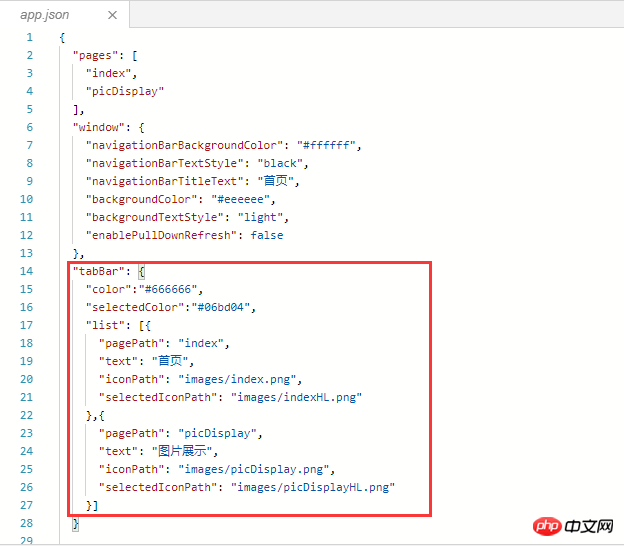
##2. Principle: Configure the tabBar attribute in app.json
{
 "pages": [
  "index",
  "picDisplay"
 ],
 "window": {
  "navigationBarBackgroundColor": "#ffffff",
  "navigationBarTextStyle": "black",
  "navigationBarTitleText": "首页",
  "backgroundColor": "#eeeeee",
  "backgroundTextStyle": "light",
  "enablePullDownRefresh": false
 },
 "tabBar": {
  "color":"#666666",
  "selectedColor":"#06bd04",
  "list": [{
   "pagePath": "index",
   "text": "首页",
   "iconPath": "images/index.png",
   "selectedIconPath": "images/indexHL.png"
  },{
   "pagePath": "picDisplay",
   "text": "图片展示",
   "iconPath": "images/picDisplay.png",
   "selectedIconPath": "images/picDisplayHL.png"
  }]
 }
}##3. Key code
"tabBar": {
  "color":"#666666",
  "selectedColor":"#06bd04",
  "list": [{
   "pagePath": "index",
   "text": "首页",
   "iconPath": "images/index.png",
   "selectedIconPath": "images/indexHL.png"
  },{
   "pagePath": "picDisplay",
   "text": "图片展示",
   "iconPath": "images/picDisplay.png",
   "selectedIconPath": "images/picDisplayHL.png"
  }]
}4. Operation methodCreate a new project, open the app.json file, and add the key code Copy to "window": {}, after which, note the comma before the braces of window, as shown below
 Configure the tabBar attribute value
"tabBar": {
  //设置tabBar文字默认颜色
  "color":"#666666",
  //设置tabBar文字被选中是的颜色
  "selectedColor":"#06bd04",
  //tab列表,数组类型,改数组内至少要有两个但不大于5个的tab对象
  "list": [{
   //设置tab跳转页面链接
   "pagePath": "index",
   //设置tab上的文字
   "text": "首页",
   //设置tab上的默认图标
   "iconPath": "images/index.png",
   //设置tab被选中时的图标
   "selectedIconPath": "images/indexHL.png"
  },{
   "pagePath": "picDisplay",
   "text": "图片展示",
   "iconPath": "images/picDisplay.png",
   "selectedIconPath": "images/picDisplayHL.png"
  }]
}1)
color: No font color selected 2)
selectedColor:Select the font color3)
borderStyle:The color of the line above the tabbar white (only white and black are supported) 4)
backgroundColor:tabbar background color5)
list: Set rab list items (minimum 2, maximum 5 tabs).
In addition, list is an array attribute, and each item is an object. List can set 4 attributes:①
text: Set the text on the tab ②
iconPath: Set the image path displayed when the tab is inactive. ③
selectedIconPath: Set the image path when the tab is active (iconPath and selectedIconPath image size limits are both 40KB) ④
pagePath: Set the jump page path when tab is pressed (This page must be configured in pages) Related recommendations:
The above is the detailed content of Examples to explain the usage of WeChat applet tabBar. For more information, please follow other related articles on the PHP Chinese website!
 Mini program path acquisition
 Garbled characters starting with ^quxjg$c
 Why the computer keeps restarting automatically
 Usage of SetTimer function
 head command usage
 How much is Dimensity 6020 equivalent to Snapdragon?
 How to solve the problem of garbled characters when opening a web page
 Cryptocurrency trading platform rankings


