This article mainly introduces the detailed use of CSS3 elastic layout content alignment (justify-content) attribute, which has certain reference value. If you are interested, you can learn about the
content alignment (justify-content) attribute application. On the flex container, align the flex items along the main axis of the flex container.
This operation occurs after the elastic length and automatic margins are determined. It is used to allocate remaining space when it exists, and also affects the alignment of items when content overflows.
Note: There are two basic terms main axis and cross axis in elastic layout. Generally speaking, we can regard them as the row direction and column direction on the screen (but Strictly speaking, this is related to the write mode and the elastic flow direction).
Then main-start and main-end can be regarded as the left and right sides of the elastic container respectively.
justify-content syntax is as follows:
justify-content: flex-start | flex-end | center | space-between | space-around
The parameter description is as follows:
flex-start
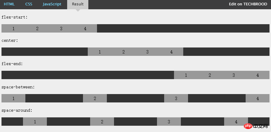
Flex items are filled next to each other toward the beginning of the line. This is the default value. The main-start margin edge of the first flex item is placed on the main-start edge of the row, and subsequent flex items are placed flush in sequence.
flex-end
Flex items are filled next to the end of the line. The main-end margin edge of the first flex item is placed on the main-end edge of the row, and subsequent flex items are placed flush in sequence.
center
The flex item is centered next to the padding. (If the remaining free space is negative, the flex items will overflow in both directions).
space-between
Flex items are evenly distributed across the row. If the remaining space is negative or there is only one flex item, this value is equivalent to flex-start. Otherwise, the margins of the first flex item are aligned with the main-start edge of the row, and the margins of the last flex item are aligned with the main-end edge of the row, and then the remaining flex items are distributed on the row, adjacent to each other. Items are equally spaced.
space-around
Flex items are evenly distributed on the row, leaving half the space on either side. If the remaining space is negative or there is only one flex item, this value is equivalent to center. Otherwise, the flex items are distributed along the row with equal intervals between each other (for example, 20px), while leaving half the space between the first and last sides and the flex container (1/2*20px=10px).
Justify-content attribute value effect example

The above figure intuitively demonstrates the effects and differences of the above five values.
The above is the detailed content of Detailed explanation of content alignment method when using CSS3 for flexible layout. For more information, please follow other related articles on the PHP Chinese website!


