


Source of the article:
Flexbox is a CSS3 box model. As the name suggests, it is a flexible box. Why has this attribute been used recently? What about getting red? The main reason is that the CSS3 specification has finally become popular (or IE has finally failed), and the development of mobile devices has promoted the rise of responsive layout. Flexbox, which has considerable flexibility in adaptive length and width, has taken advantage of this trend.
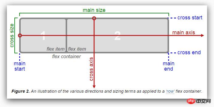
The first step is to look at the Flexbox box model. According to the W3C article, the flex box model is presented in the figure below. The difference from the general box model is that the Flexbox box model has a horizontal starting point. and end point (main start, main end), vertical start point and end point (cross start, cross end), horizontal axis and vertical axis (main axis, cross axis), and then the element has horizontal size and vertical size (main size, cross size ), these are very important layout planning.
Let’s first take a look at what attributes Flexbox has. You can also refer to MDN’s use of CSS flexible boxes
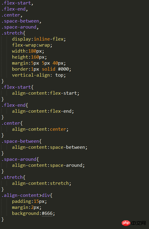
display
flex-direction
justify-content
align-items
align-self
align-content
flex-wrap
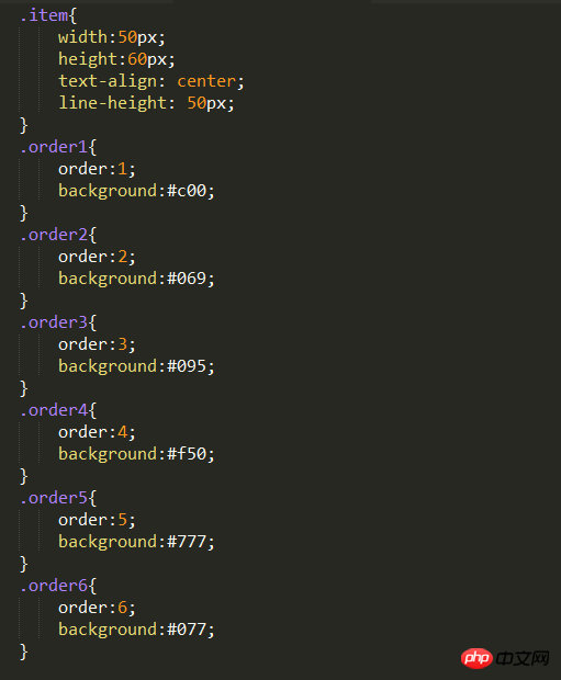
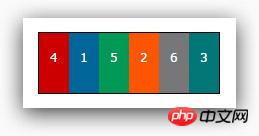
order
flex
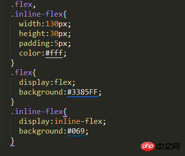
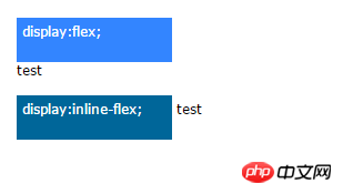
display is the CSS we are familiar with For Flexbox, there are two more ways to set attributes. The default is "flex". Its layout method is almost similar to block. It will force line breaks, but the child elements that set display: flex have more Flexible settings.
Another way is "inline-flex", which is almost the same as inline-block. In the sense, a display:flex element covers the display:inline attribute, and the rear element There will be no line breaks.
Doing this defines the element as a flex container and its child elements as flex items. The value flex makes the flex container a block-level element. The value inline-flex makes the flex container a single, indivisible inline-level element.
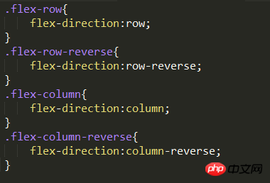
flex-direction represents the "arrangement direction" of Flexbox content elements, respectively. The following four types.
row: Default value, from left to right, top to bottom
row-reverse: opposite to row
column: from top to bottom, then left to right
column-reverse: opposite to column
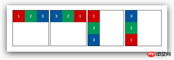
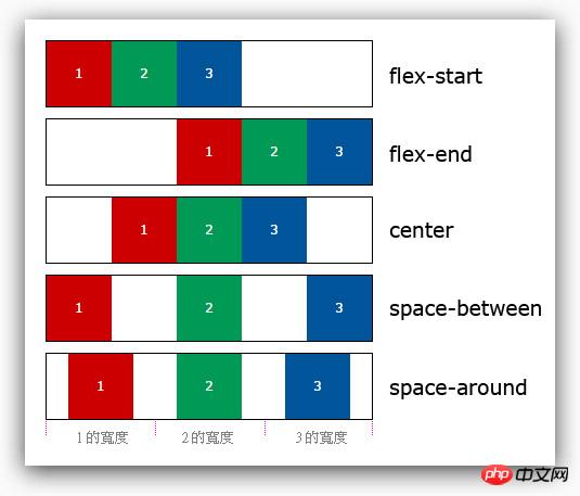
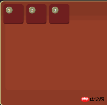
justify-content determines the "horizontal alignment" position of the content element and the entire Flexbox. Recall what was said above The Flexbox box model has two endpoints: main start and main end. Justify-content is set in this way, and there are a total of five setting values:
flex-start: Default value, align the leftmost main start
flex-end: Align the leftmost main end
center: horizontally centered
space-between: distribute content elements evenly, the left and right elements will be aligned with main start and main end
space-around: Evenly distribute content elements, and the spacing is also evenly distributed
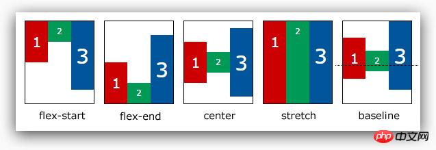
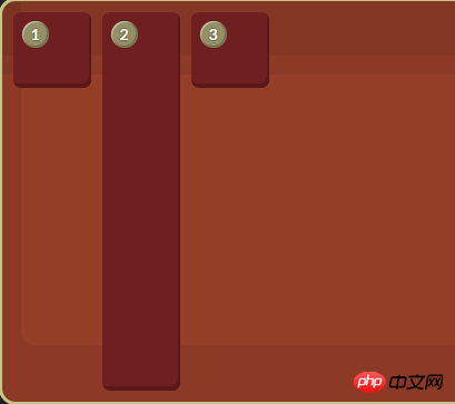
align-items is just the opposite of justify-content. align-items determines the "vertical alignment" position of the content element and the entire Flexbox. Recall the Flexbox box mentioned above The model has two endpoints, cross start and cross end. align-items and align-self are set in this way. There are a total of five setting values.
flex-start: Default value, align the top cross start
flex-end: Align the bottom cross end
center: vertically center
stretch: stretch all content elements to the height of Flexbox
baseline: Use the baseline of all content elements as the alignment standard
The setting of align-self is the same as align-items, but the purpose is different. The function of align-self is to overwrite the attributes that have been applied to align-items. If we follow our previous As written, because align-items is for child elements, it must be overridden with align-self. It will be clear if we directly use the previous example to modify it.
auto
is set to the align-items value of the parent element. If the element has no parent element, it is set to stretch.
flex-start
The flex element will be aligned to the beginning of the cross-axis.
flex-end
The flex element will be aligned to the end of the cross-axis.
center
The flex element will be aligned to the middle of the cross-axis. If the cross-size of the element Sizes larger than the flex container will overflow equally in both directions.
baseline
All flex elements will be aligned along the baseline.
stretch
The flex element will be based on the width and height of the container, according to the cross-size of its own margin box Stretch.
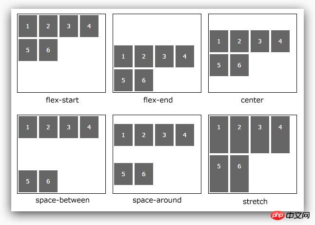
The align-items just mentioned are processed for elements with single-line content. If When encountering multi-line elements, you must use the align-content attribute. This attribute has a total of six settings. (Example: css-flexbox-demo6.html, W3C description)
flex-start: Default value, align the top cross start
flex-end: align the bottom cross end
center: vertically center
space-between: align the first line with The last line is aligned to the top and bottom respectively
space-around: evenly distribute spacing between each line
stretch: all content elements are stretched
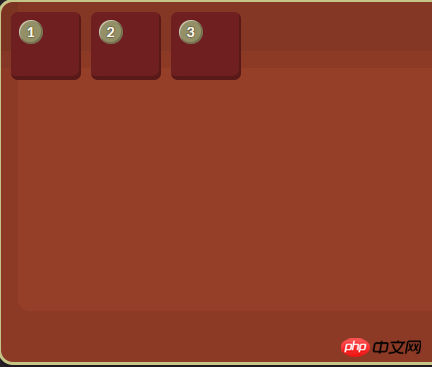
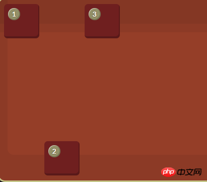
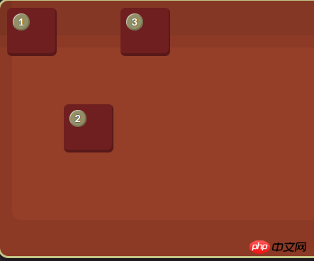
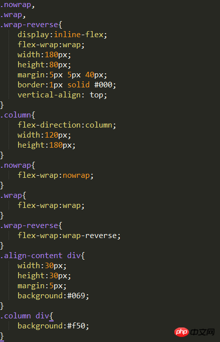
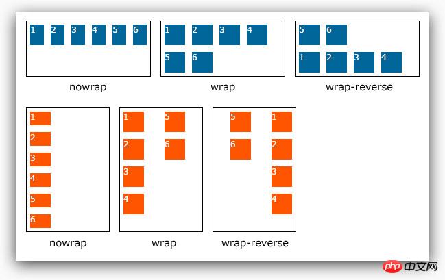
I saw a flex-wrap in the example just now attribute, this attribute is responsible for letting the content elements wrap. Because when we set the display of the parent element to flex or inline-flex, the child element will elastically fill the parent element in a single line, so it is necessary Use flex-wrap to wrap lines. There are three settings. (Example: css-flexbox-demo7.html)
nowrap: default value, single line
wrap: multiple lines
wrap-reverse: Multiple lines, but the content elements are reversed
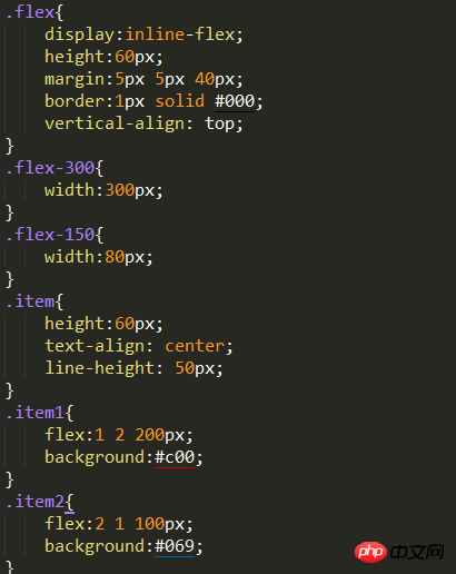
flex-grow: Number, no unit, when The flex-basis length of the child element is "smaller" than the length allocated to the parent element. The corresponding "stretch" ratio is allocated according to the number. The default value is 1. If it is set to 0, there will be no elastic change. It cannot is a negative value.
flex-shrink: Number, unitless, when the flex-basis length of the child element is "larger" than the length allocated to it in the parent element, the corresponding " "Compression" ratio distribution, the default value is 1, if set to 0, there will be no elastic change, and it cannot be a negative value.
flex-basis: The basic size of the child element, as the size comparison basis of the parent element, the default value is 0, and because the default value is 0, when this attribute is not set, The flex-grow attribute will be used directly. flex-basis can also be set to auto. If set to auto, it means that the child elements are based on their own basic size. .
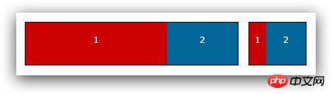
The three attributes can be set separately, or they can be set together using a flex. The following example shows the same Flexbox. At different widths, the child elements will be presented in different sizes.
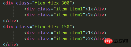
HTML code:
CSS code:
The above is the detailed content of How to use CSS3 Flexbox?. For more information, please follow other related articles on the PHP Chinese website!


![[Web front-end] Node.js quick start](https://img.php.cn/upload/course/000/000/067/662b5d34ba7c0227.png)


